

Te Papa Museum: Climate Converter
As a response to the ever expanding debate addressing climate issues and creating a greater awareness for the natural beauty we have in New Zealand, Te Papa Museum in Wellington engaged digital designers to create experiences that would inform users about our environment through tactile immersion.
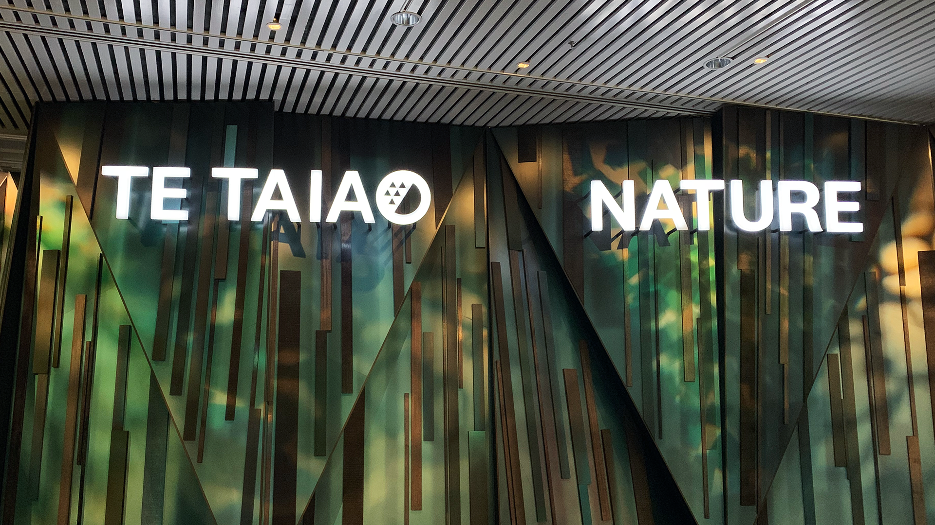
To develop exhibits for this new Te Taiao Nature wing, Te Papa recruited interactive studio, Dot Dot to work with them in designing a space that would teach users about how our actions as a country ultimately affect climate - giving people and insight into the multiple facets of the discussion to hopefully spark debate.
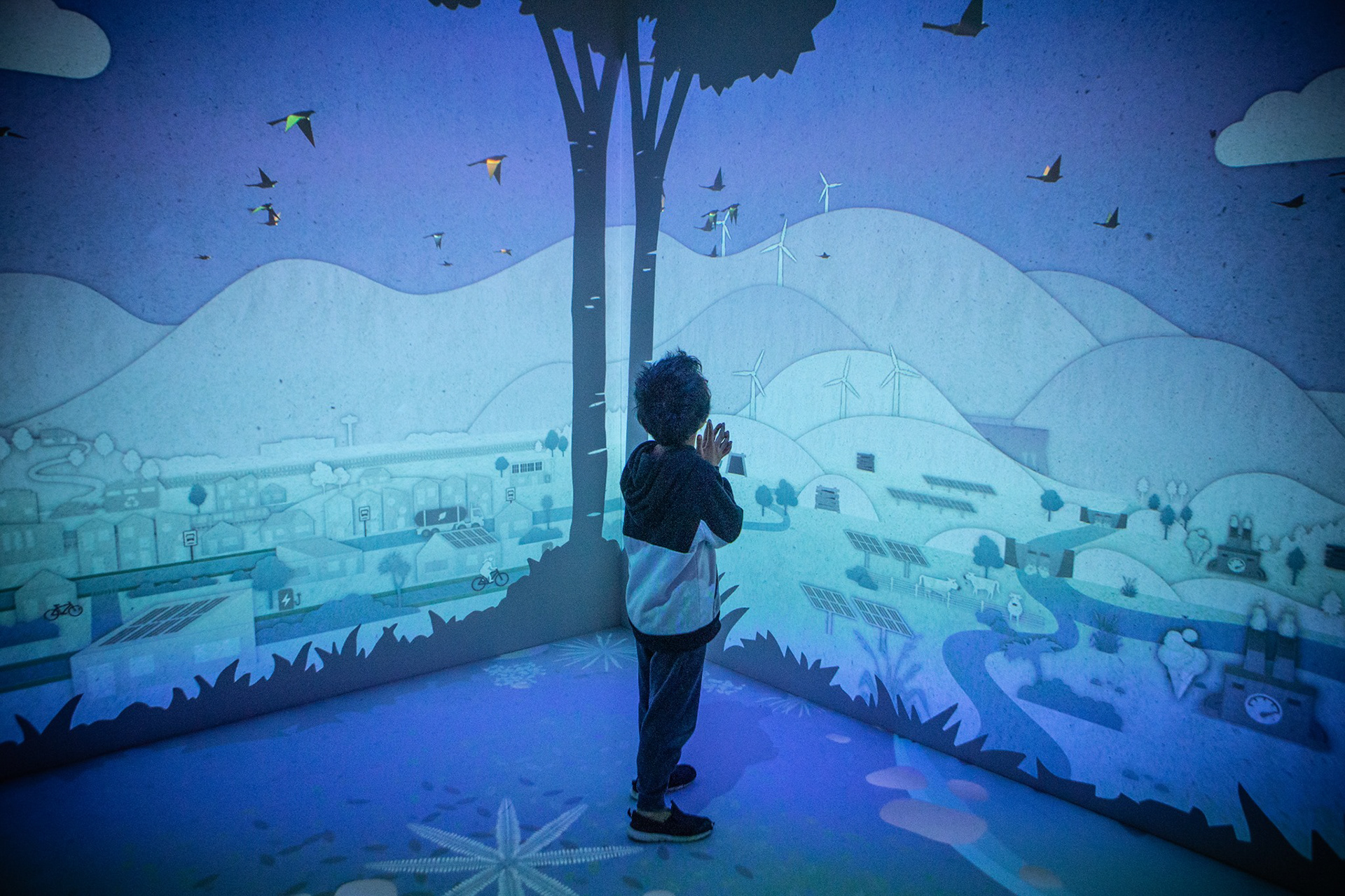
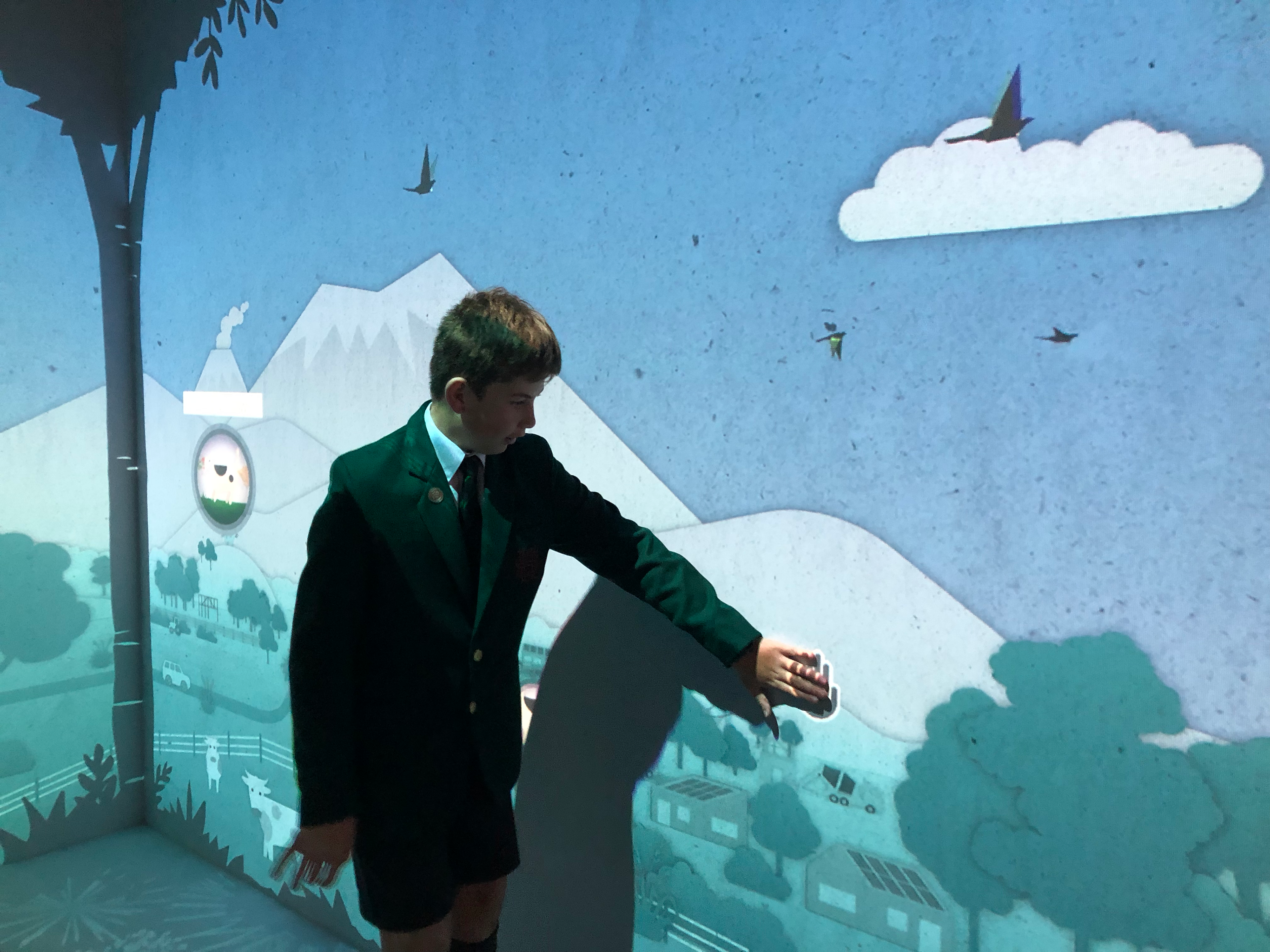
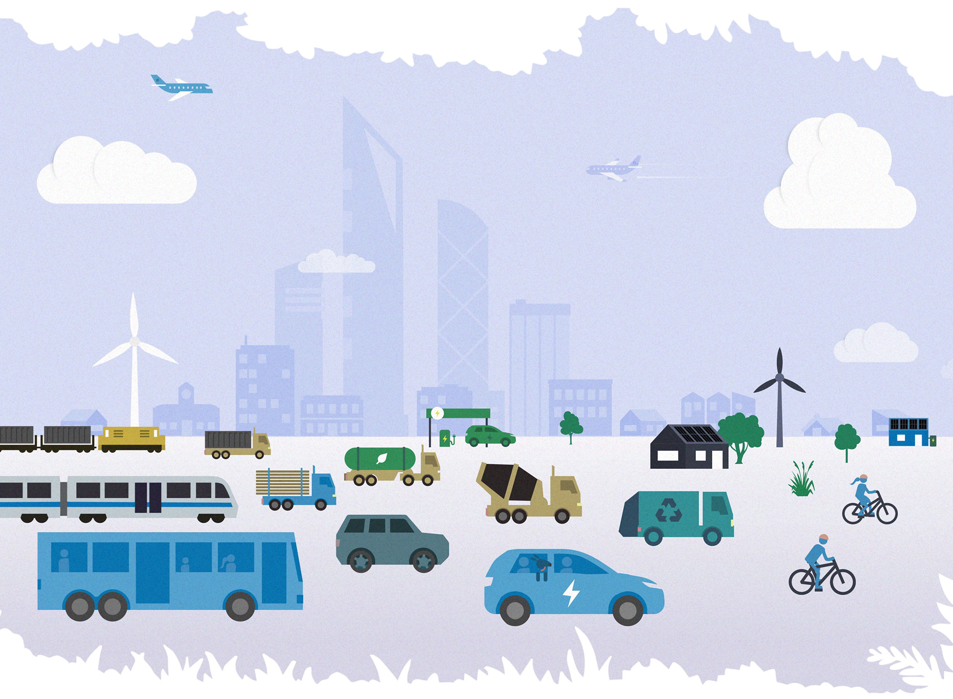
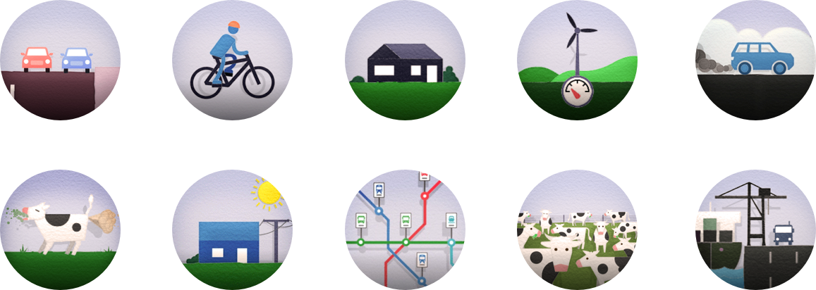
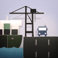
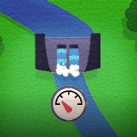
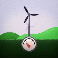
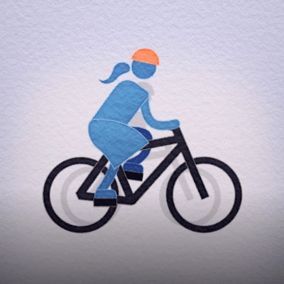
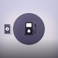
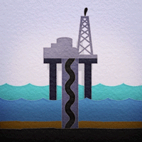
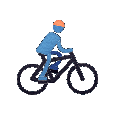
Dot Dot developed the idea of creating an intuitive simulation of a landscape, where visitors to the exhibit collaborated together to make decisions that would help prevent disasters. As users employed more environmentally friendly initiatives (eg: more solar power, creating cycling lanes, reducing coal mining etc), the environment would eventually lead to a carbon-zero future.
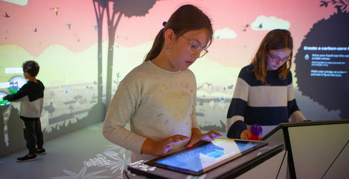
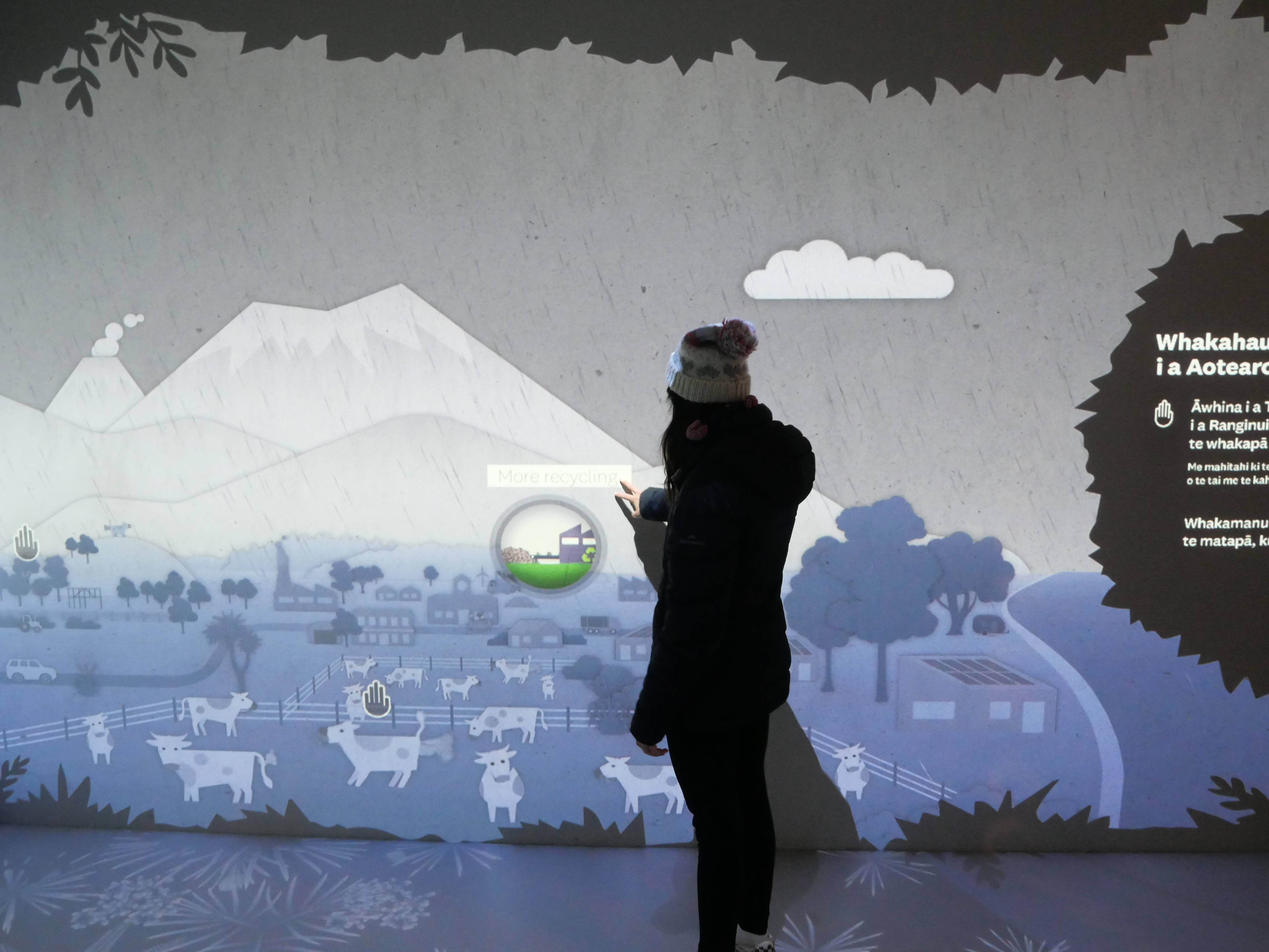
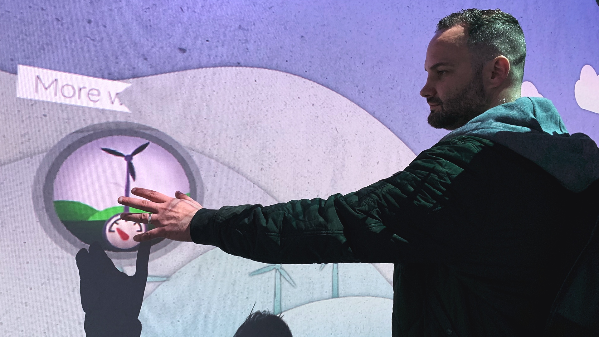
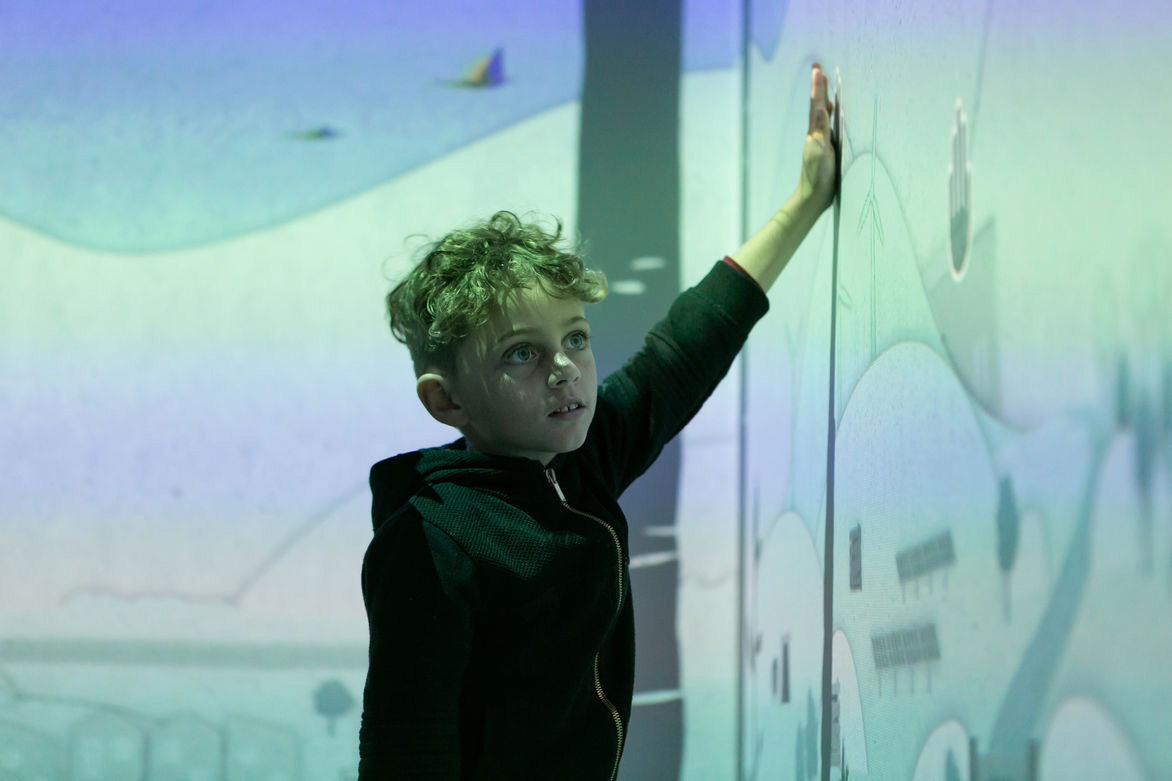
The room had interactive projections on all the walls and floor where users touched small animated icons that visually described a new environmental initiative. Once touched, the detail would be added to the landscape, allowing the user to leave their additions to the room for others to add to as well.
It was important in the design that not only do users come away from the experience with a sense of understanding the issues around climate, but also for them to look inwardly to think about what small actions they can do to help move things in the right direction.
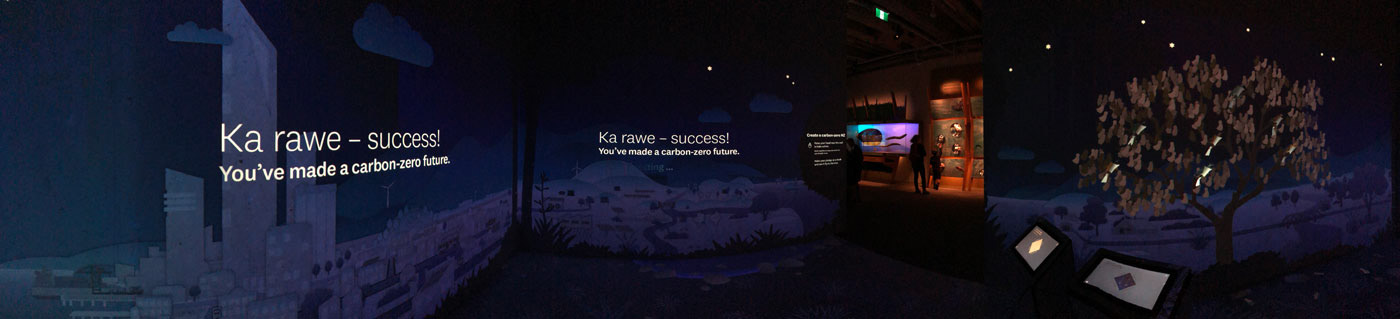
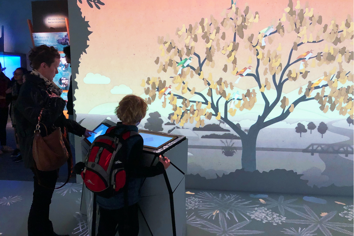
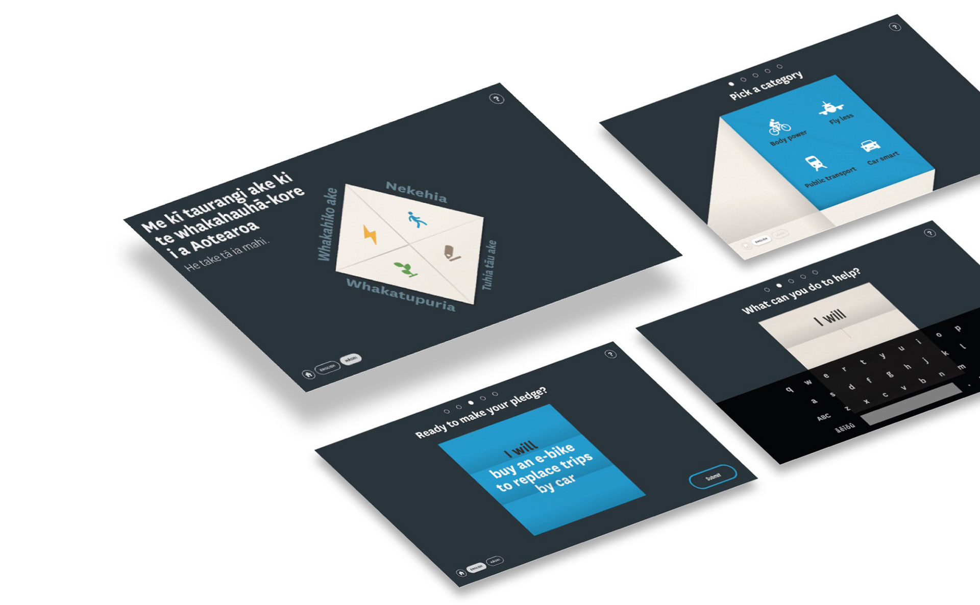
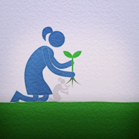
With that in mind, the Dot Dot team created two touchscreen plinths - here the users could make a note of a small promise they’d keep to help improve the environment on a small square bit of paper. When finished, the piece of paper would fold up into a small origami bird that would flutter from the touchscreen onto a tree in the projected digital world. The tree is crowded with promises from all the visitors who’ve pledged something. A lovely way for people to feel like they’ve made a promise and left their mark.
The team at Dot Dot enlisted the help of Frontier Design and Watermark Creative to help them in developing the visual look and animations for the project. As a team, Frontier and Watermark worked closely together to create the animated touch-points that would appear on the interactive walls.
Design
It was important that the experience was a visual one, where users of all ages and backgrounds (including international visitors) could understand what was being communicated at each point. Working with Frontier, we developed a system of colour and icons for each touchpoint that helped to explain the concept in a simple animated loop.
With each icon - it was imperative to establish a clear story that would be legible at first glance. Since we were working in an illustrative space, we could have fun and play with abstraction and perspective to help the story, but ensuring that each image maintained clarity.
As a process, we’d work through sketching out each small animation as a very quick storyboard - allowing us to iterate on the idea for each one and ensure that there was design continuity across the entire set. We didn’t want some animations to be too complex or others to be too simple.
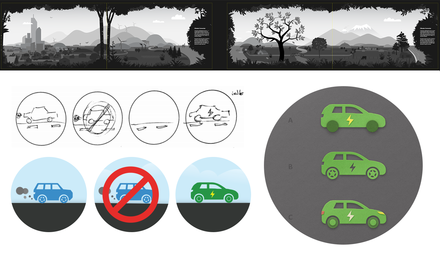
The scale of the objects in the scene had to feel relative as well. With icon design, it’s important that there’s equal balance in the forms and silhouettes of each graphic and a similar amount of visual tension (we didn’t want some to feel empty and others to feel crammed).
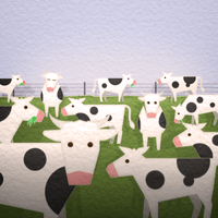
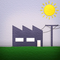
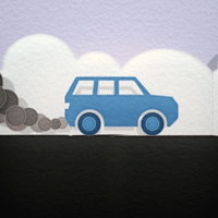
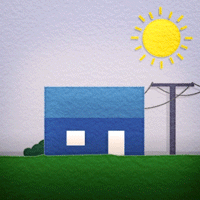
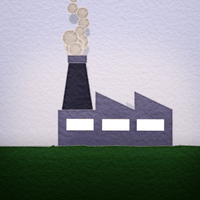
To ensure communication was consistent across the different vignettes we used colour as signifiers for different properties: yellow = energy; blue = our current state; green = environmentally friendly state etc.
Animation
Since the entire experience is a simulation thought experiment, the visual aesthetic was one where everything felt like it was made out of paper.
This concept extended from the layered paper feel of the background artwork, through to the origami bird. With this in mind, we developed a style for the design of the icons that would help it retain it’s clean, clear reading - but also feel like they were created from small folded, pieces of paper. This would also inform the animation direction as well - which was a mix of sliding and folding paper.
The end deliverables was a large bundle of small animations that would be integrated into the experience. Small animated details from the icons were extrapolated out and used across the end experience to tie the icons in with what the rest of the teams were working on.


Result
With the Dot Dot team working on site to create the installation in Wellington and our design team working with Frontier in Auckland, we only had the pleasure of seeing it all come together at the very end so it was a fresh and inspiring surprise to see the result of everyone’s incredible work.
Wanted to thank Dot Dot and Frontier for bringing us onboard - we thoroughly enjoyed working on the project.
Credits
Client
Museum of New Zealand Te Papa Tongarewa
Creative Director
Chris White (Dot Dot)
Design Directors
Jacques Foottit
Kate Stevenson
Chris Andersen
Cornelius Blank (Frontier)
Team Members
Shannon Jahnel Lanktree (Watermark Creative)
Dave Way (Watermark Creative)
Justin Treadwell (Frontier)
Alex Christensen
Matt Forsyth
Stephen Gallagher
Austin O’Brien
Chris Ward
Contributors
Frith Williams
Jen Craddock
Leon Perrie
Ralph Upton
Bas van Druten
Robin Marshall
Piet Asplet
Clayton McGregor
Piers Gilbertson