Code Ninja - Kids Designing the Future
" In 15 years, we’ll be teaching programming just like reading and writing, and wondering why we didn’t do it sooner. "
— Mark Zuckerberg, Facebook founder
My journey with with Code Ninja began when I was approached to create a logo for this small startup school with an awesome mission. I supported the cause and was on board from the get go.
The logo had to include a friendly ninja character, represent the school as a fun environment, and stand out enough to attract passers by.
The artwork below is the final result.
Logo Concepts
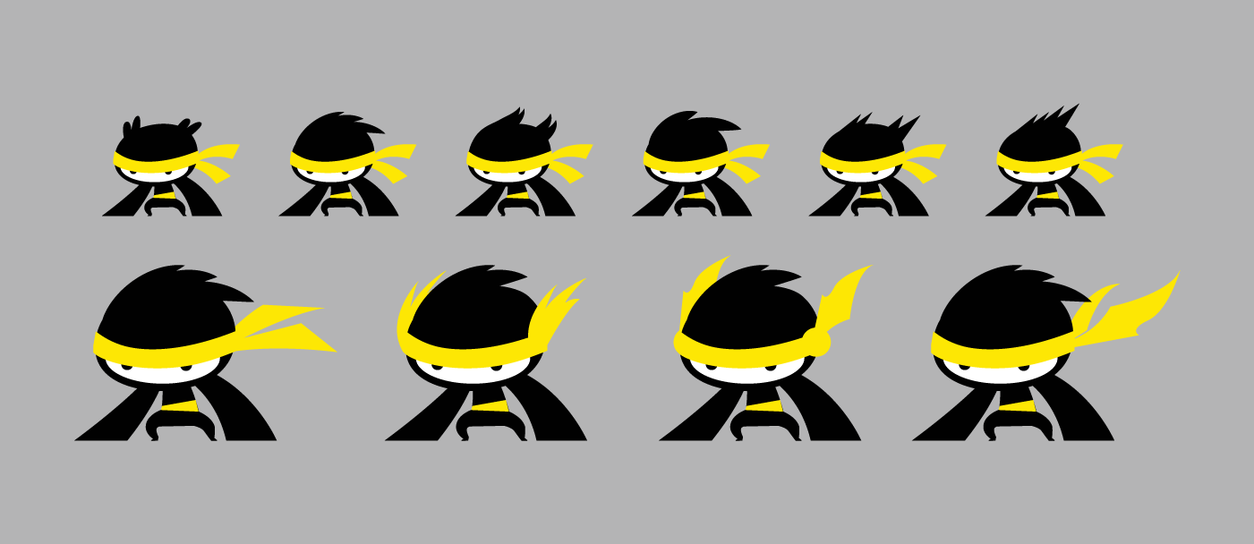
I explored a couple of character designs as well as logo options before developing the ideas into final art. The students at Code Ninja had a hand in choosing their favourite characters. This was an interesting process, as it meant the target audience was directly involved, and gave me a different perspective to work with.
Logo Development
Once I had feedback from the teacher and his students with a preferred character and logo concept, I went onto develop this further. I ended up with three different options using the same character.
To help visualise how the logo could be used, I also sent over options of it stamped in stationary and other media which related to the academic environment.
Characters!
The brand grew, and the idea of a family of characters came to life. These were to be designed in a style similar to the main character on the logo, which would also need further development.
These characters were to represent the 5 different stages of learning at Code Ninja, from beginner to pro.
Thus, Tiny, Dash, Colossus, Sage, and Ace came to be, and became an integral part of the brand, as well as a fun way to help kids strive to achieve success.
Each character was created with their own personality, which also reflected their levels of learning:
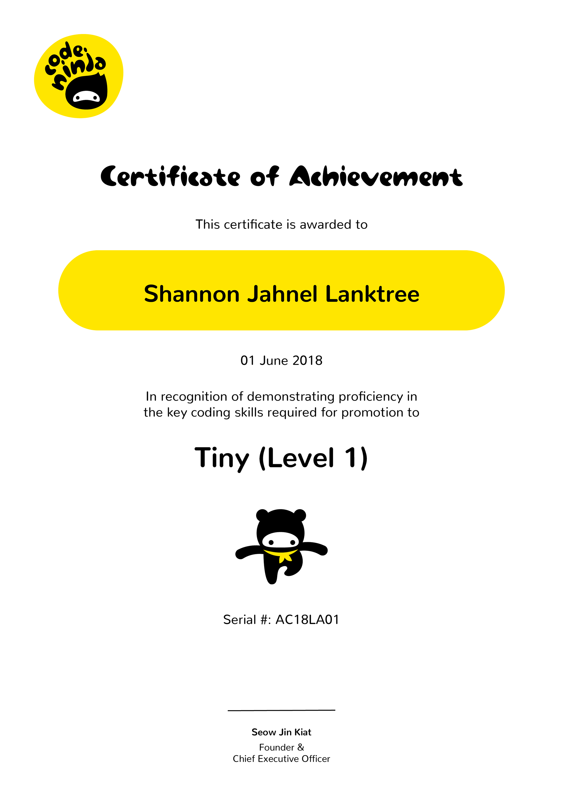
Tiny - Perseveres to master the basics.
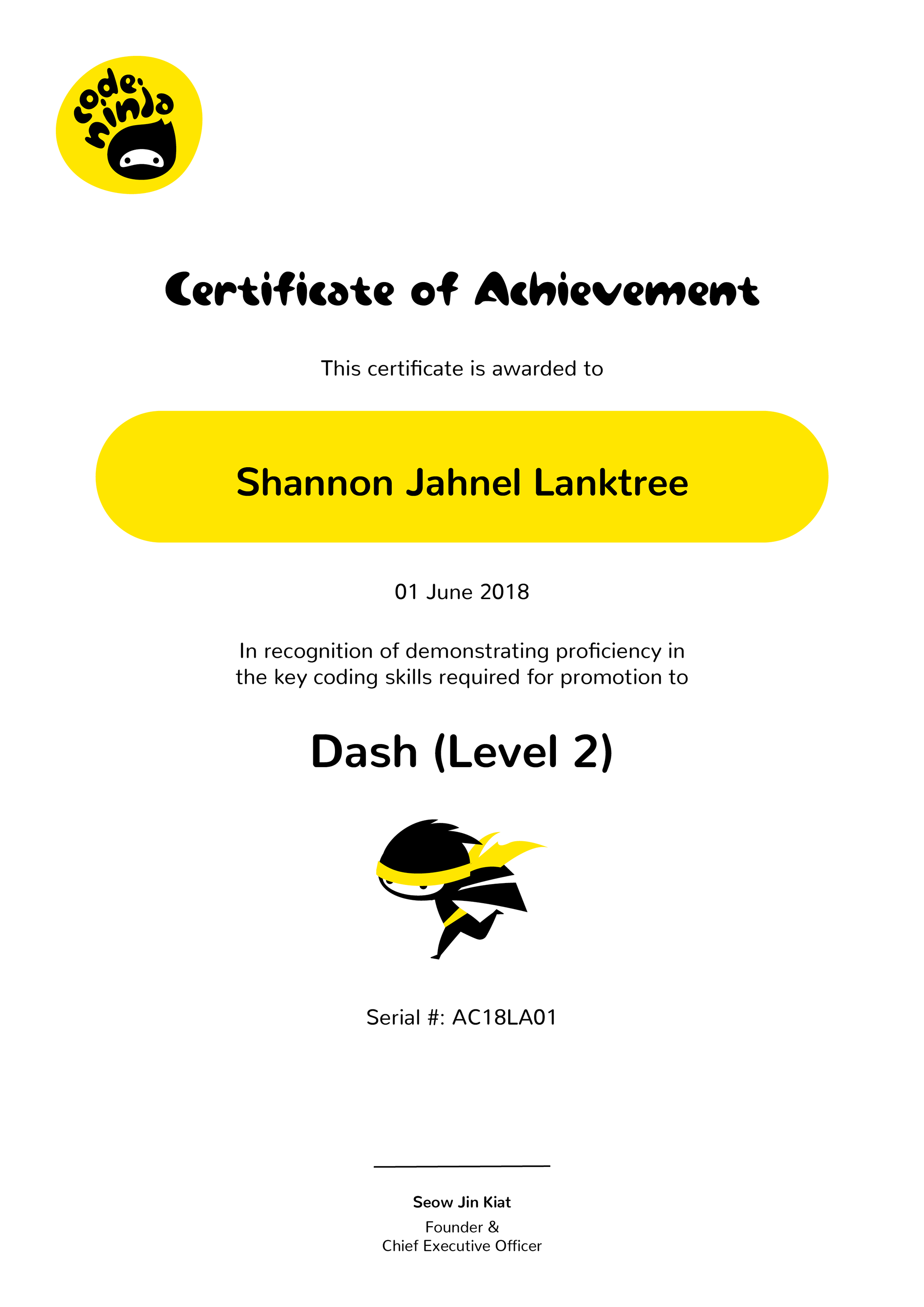
Dash - Eager to tell stories through animations.
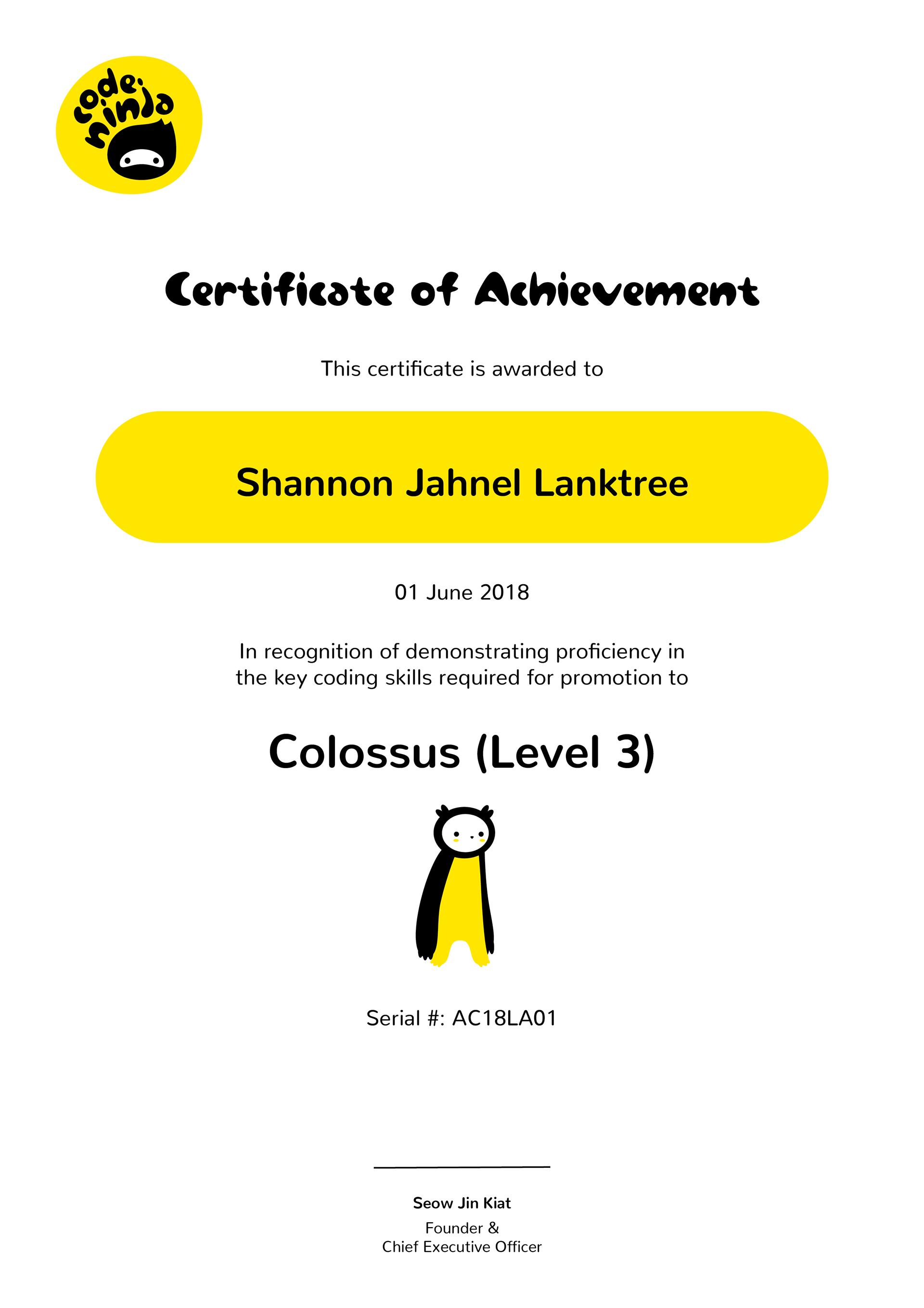
Colossus - Loves creating 2-player games for family and friends.
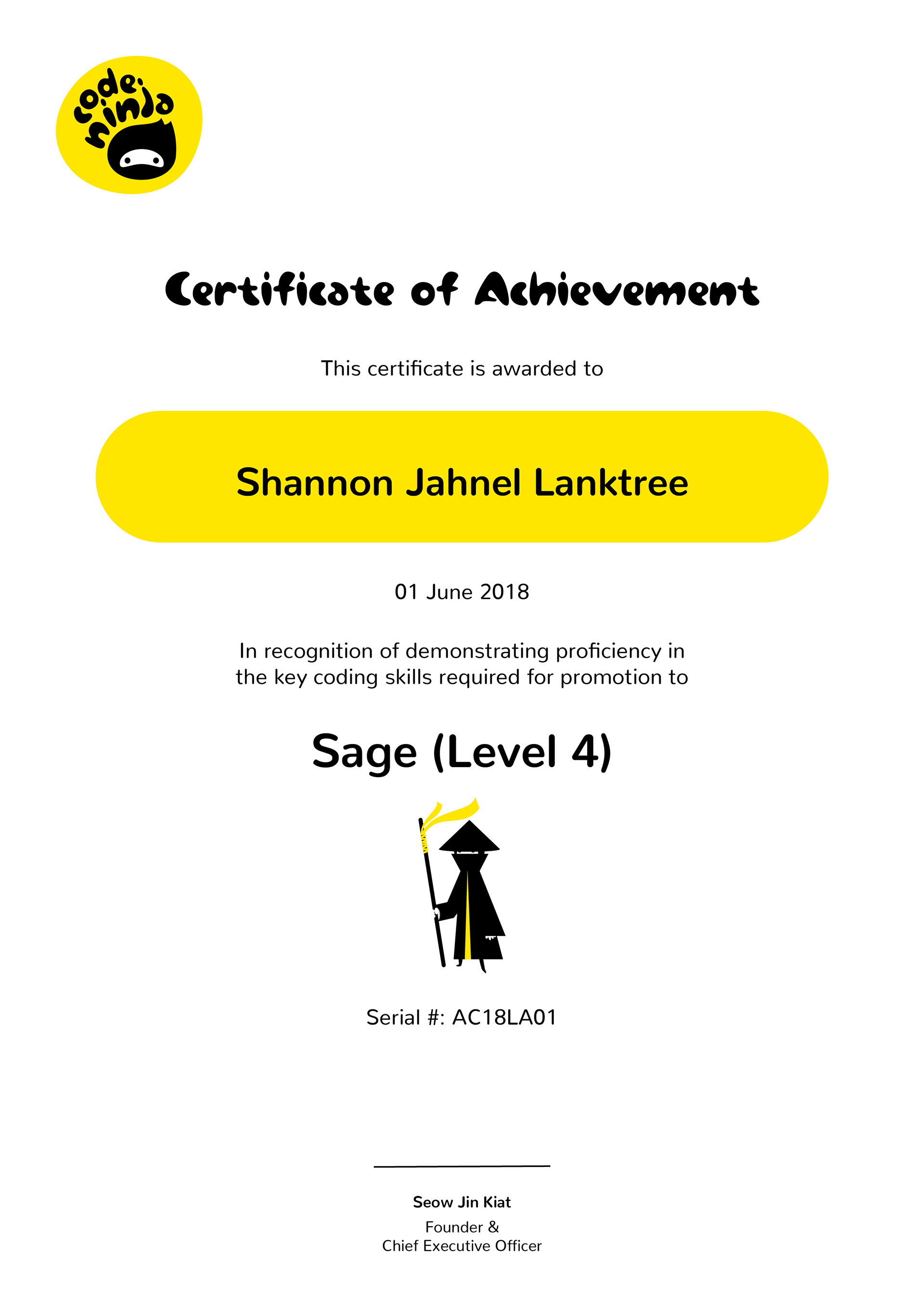
Sage - Crafts challenging games with confidence.
Ace - Collaborates with teammates to design and craft complex projects.
Characters: Concepts & Development
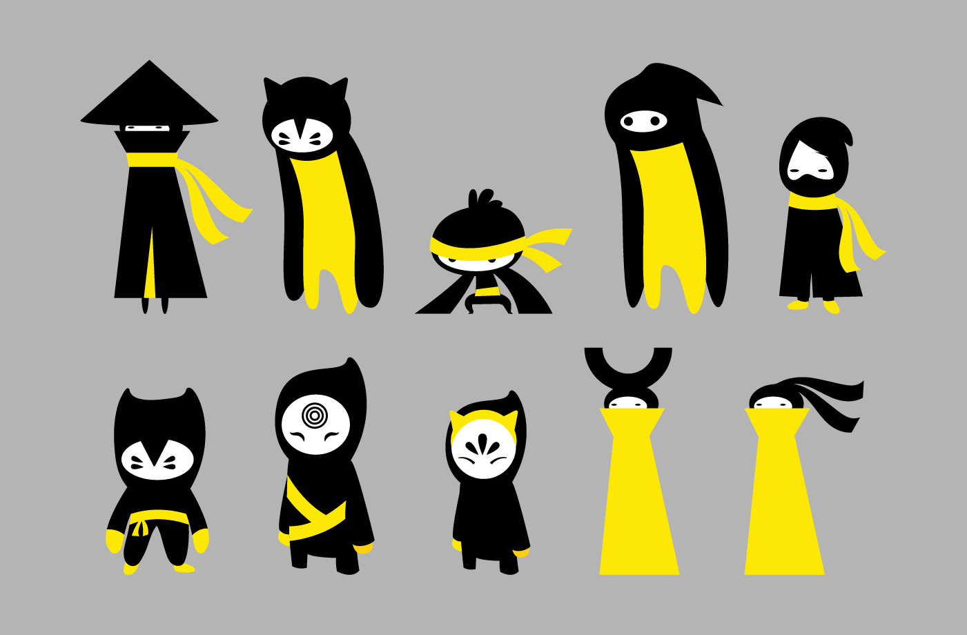
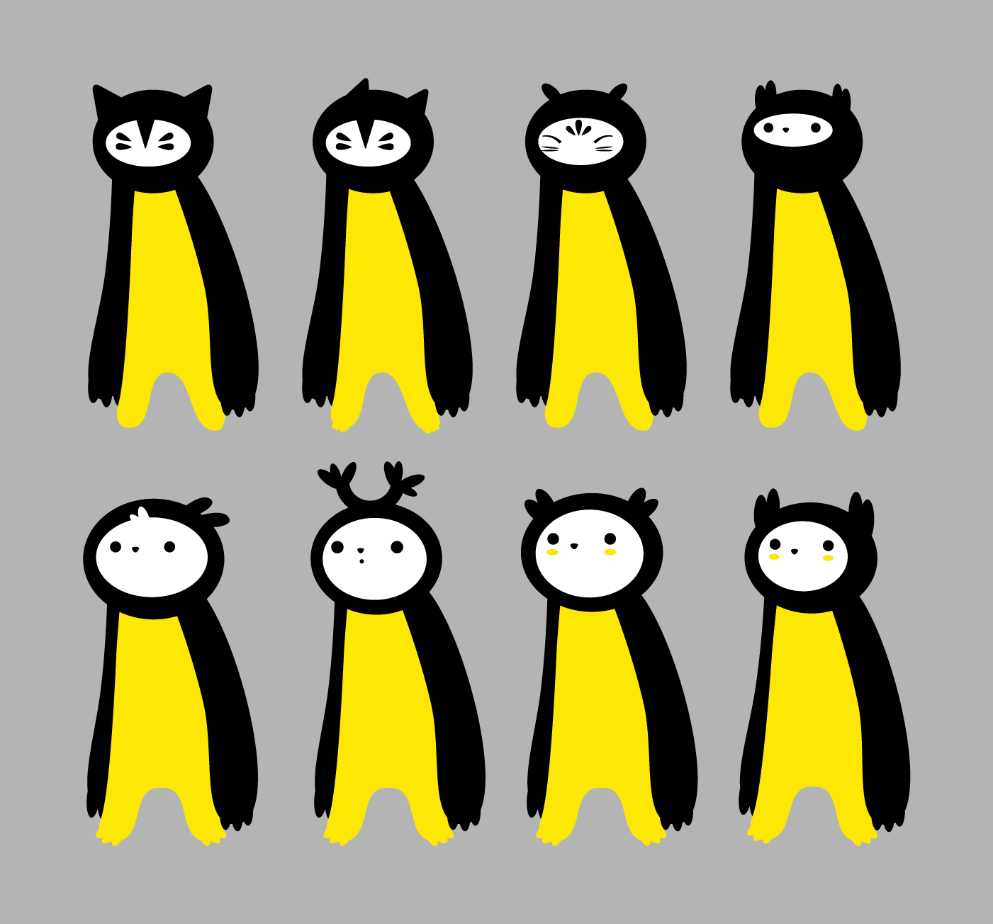
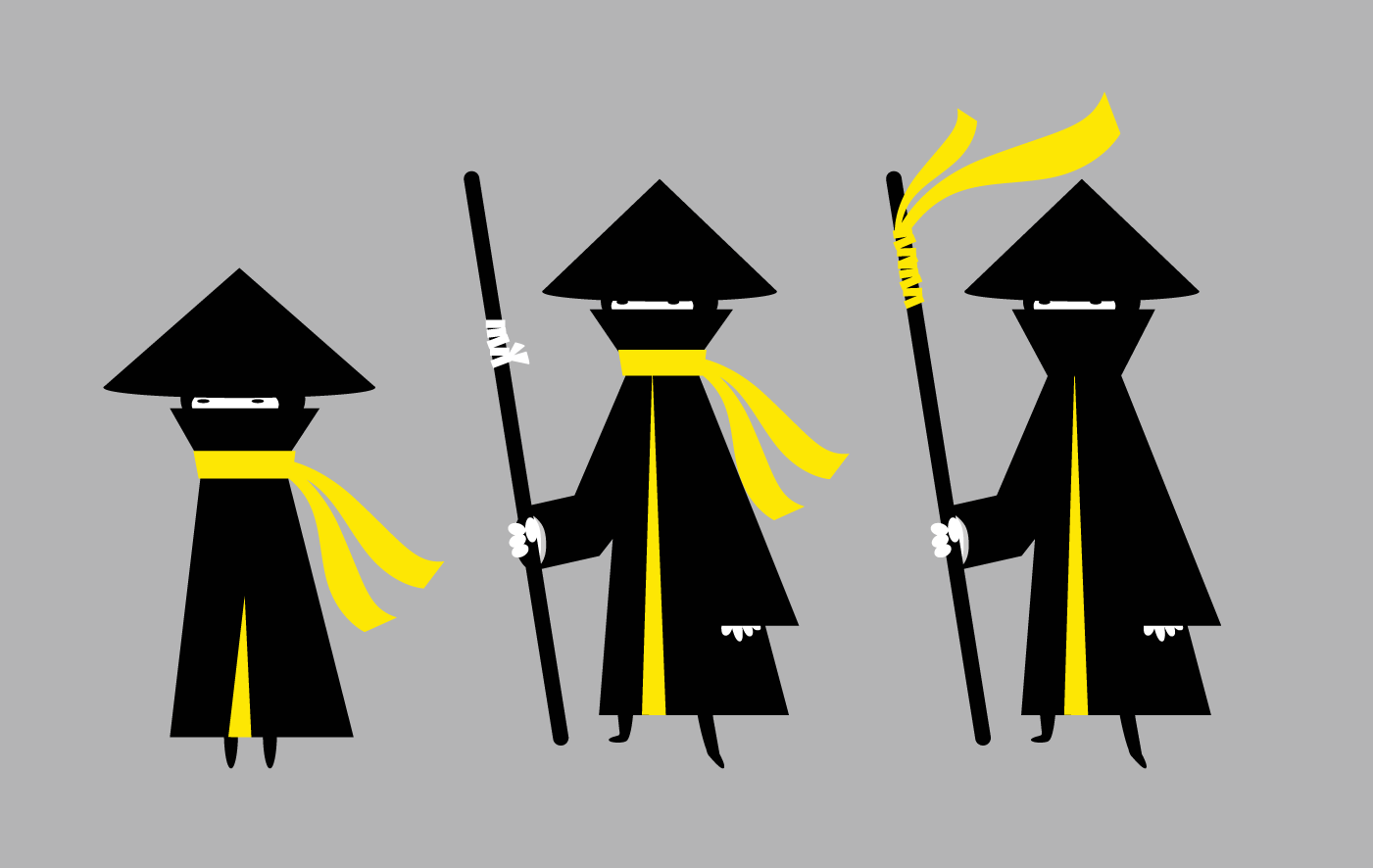
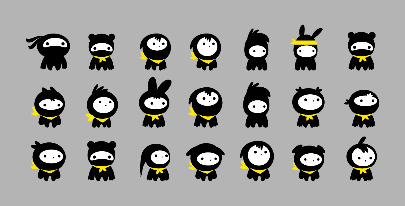
As with the logo, I went through a process of creating some character concepts first, which would then be developed further.
I played around with different ninja accessories such as masks and hoods, as well as other Japanese icons. I also liked the idea of having some animal or non-human character as part of the team.
Decal and Poster
As mentioned, the characters were to become an integral part of the brand. Their first appearance was on this storefront decal I designed and illustrated.
The idea was to attract passers by with a bright and striking illustration that would inspire curiosity, as well as reflect the fun environment inside for kids and parents.
Along with the characters, I developed a visual look for the world they lived in. I took inspiration from some of my favourite platform style video games, using simple shapes and patterns for hills and clouds. I wanted to create a sense of energy and animation, so I embellished the world with flying coding symbols and ninja stars.
This environment also became an important part of the brand, and would appear in future collateral.
Website Re-Design
The next step was to re-design the Code Ninja website. It was agreed that we would develop this using a predefined template on Squarespace, a responsive and straight forward platform for designers to work on, without having to worry about the need to know code, or fret about other potential technical issues.
The challenge was to keep a good colour balance - too much yellow reduces its impact where its needed, and too much black can be dismal. Therefore a fair amount of white was used in order to achieve the required colour balance, whilst a couple fun illustrations populated the site.
To visit the site go to www.codeninja.sg
Comic Strip
As a way of keeping the website blog and social media rolling, I was asked to create a simple comic strip with the idea that 'even with coding, some things never change'.
The comic strip was designed in the same visual style as the Code Ninja brand, with a few adaptations to suit this medium.
Hoping that there will soon be more to come!
T-Shirts
Kids T-shirts were designed to give to students (and myself!) as a gift. To keep it bright and aimed at kids, I decided to use yellow as the main colour instead of black or white, showing all the characters on the front of the t-shirt and logo only on the back.
Certificates
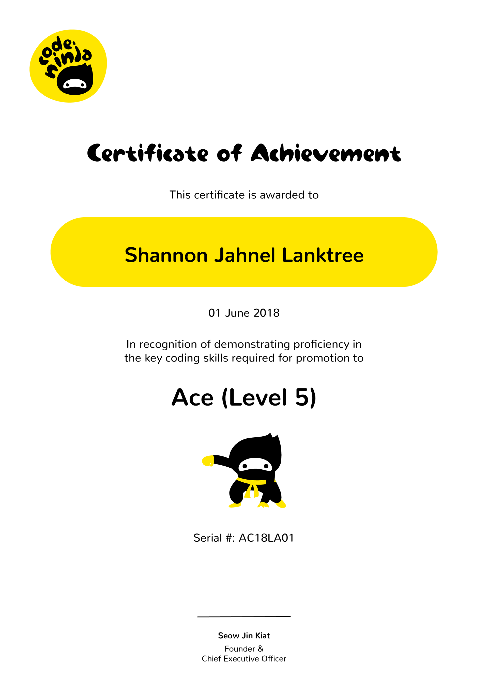
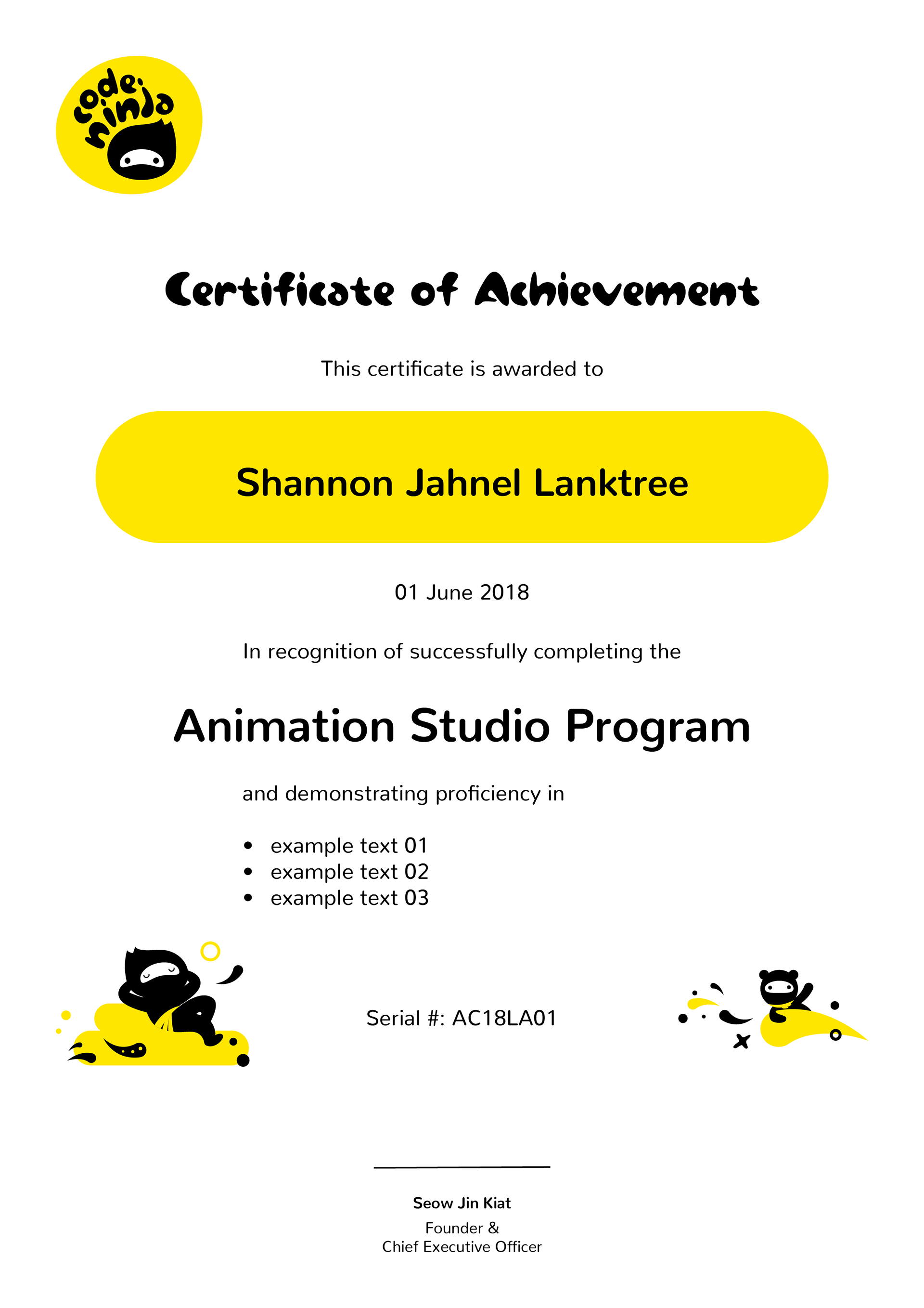
As well as t-shirts, certificates were also designed to give to students who complete each level of the Code Ninja curriculum, from Tiny (level 1) through to Ace (level 5). These had to have editable text for different students, dates, etc. Certificates for general courses also had to be designed in a way that the client would be able to change it digitally for each course.
Ciao for Now
My journey with Code Ninja so far has been absolutely awesome. It's great to know that my skills have been useful in pushing to help a cause I support, be it by creating characters that kids will resonate with, or illustrating a brightly coloured decal that will attract parents to the school.
I've loved working on the very creative briefs, and look forward to whatever comes next :) !
