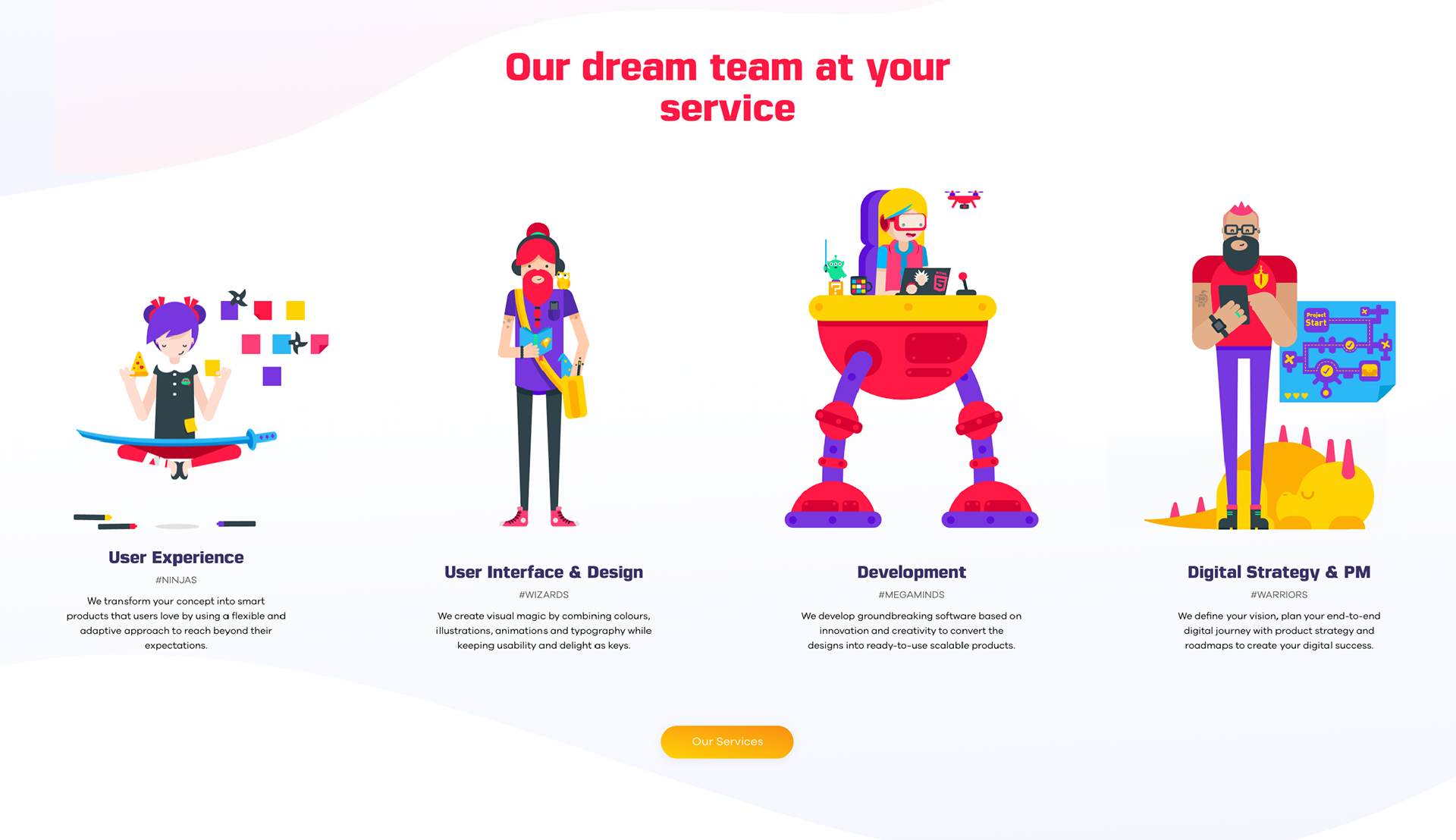
EndUser Illustrations
I was approached to create a variety of characters for EndUser, that represent some of the archetypes you will usually find at tech companies such as UI and UX designers, project managers and developers - but with a twist 😉.
A main header image for the website was also part of this project, to be illustrated in the same graphic style as the characters.
Character Design Process
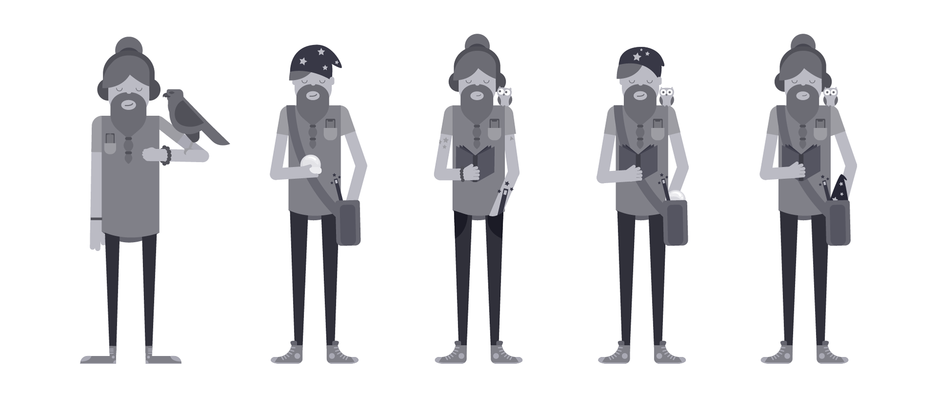
The Design Wizard
The first character to be worked up was the 'Design Wizard'. This was to set a precedent for the rest of the project. There was no gender set for each character to begin with, so I came up with a few male and female concepts. This was a good exercise as it helped set a style for the next characters to come.
The challenge of this brief was to walk the line between a real 'designer', and fictional 'wizard' character, making sure that the hybrid between the two was clear, but not overly exaggerated.
My approach was to pick out elements from each archetype, and see how they could be used together.
Wizard Elements Examples:
Pipe, pet / nature, beard, cloak, hat, book, satchel, etc.
Designer Elements Examples:
Coffee, hoodie / jacket, skinny jeans, chuck taylors, glasses, tech, beard, hipster, etc.
Some elements like 'hats' and 'beards' overlapped, so it was just a matter of combining the items I thought most relevant to each character type and seeing how they worked together.
A few of the 'designer' related props were inspired by my fellow creatives as well as some of my personal traits, whilst the wizarding ones came from traditional wizard characters and Harry Potter.
Initial Character Concepts
Once a favourite initial character design was chosen, it was developed further. At this stage I continued to play with elements from a designer's and wizard's closet, to see what would work.
I worked very closely with the client to get the right balance and tone for each character, and we continuously threw ideas back and forth to come up with solutions we both thought worked well for the illustration style and brief.
Character Development
A few initial colour options were explored early on, to gauge the type of tone the character was to have, from abstracted hues, to more realistic options.
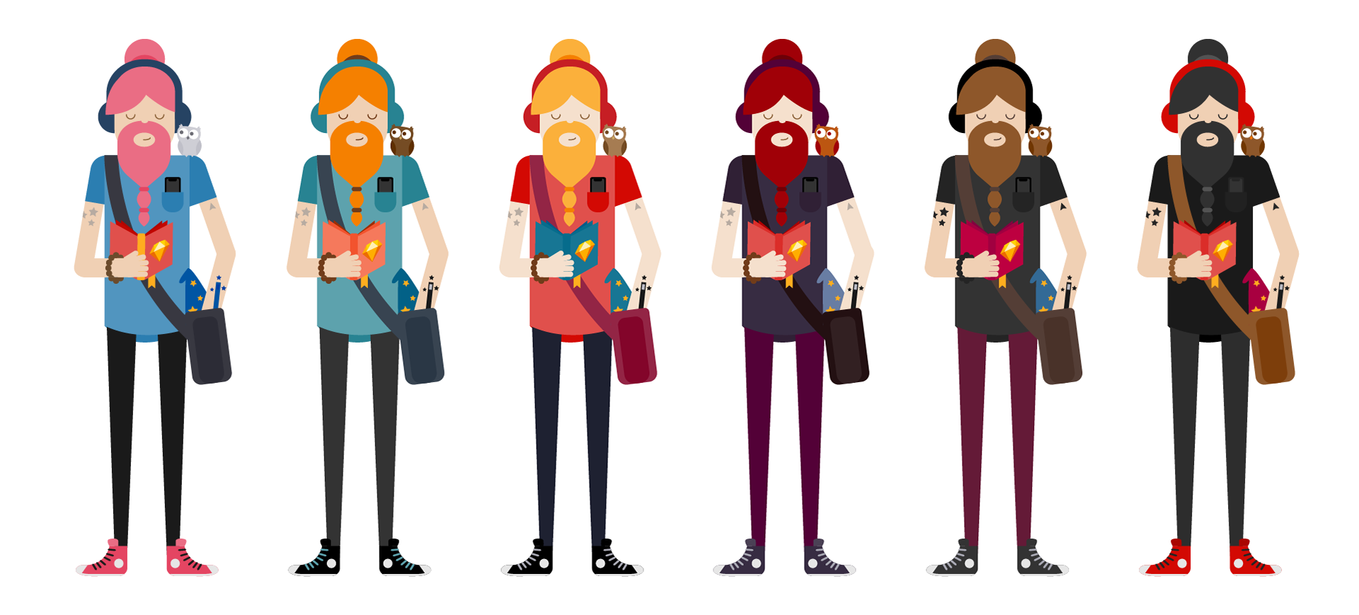
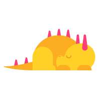
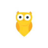
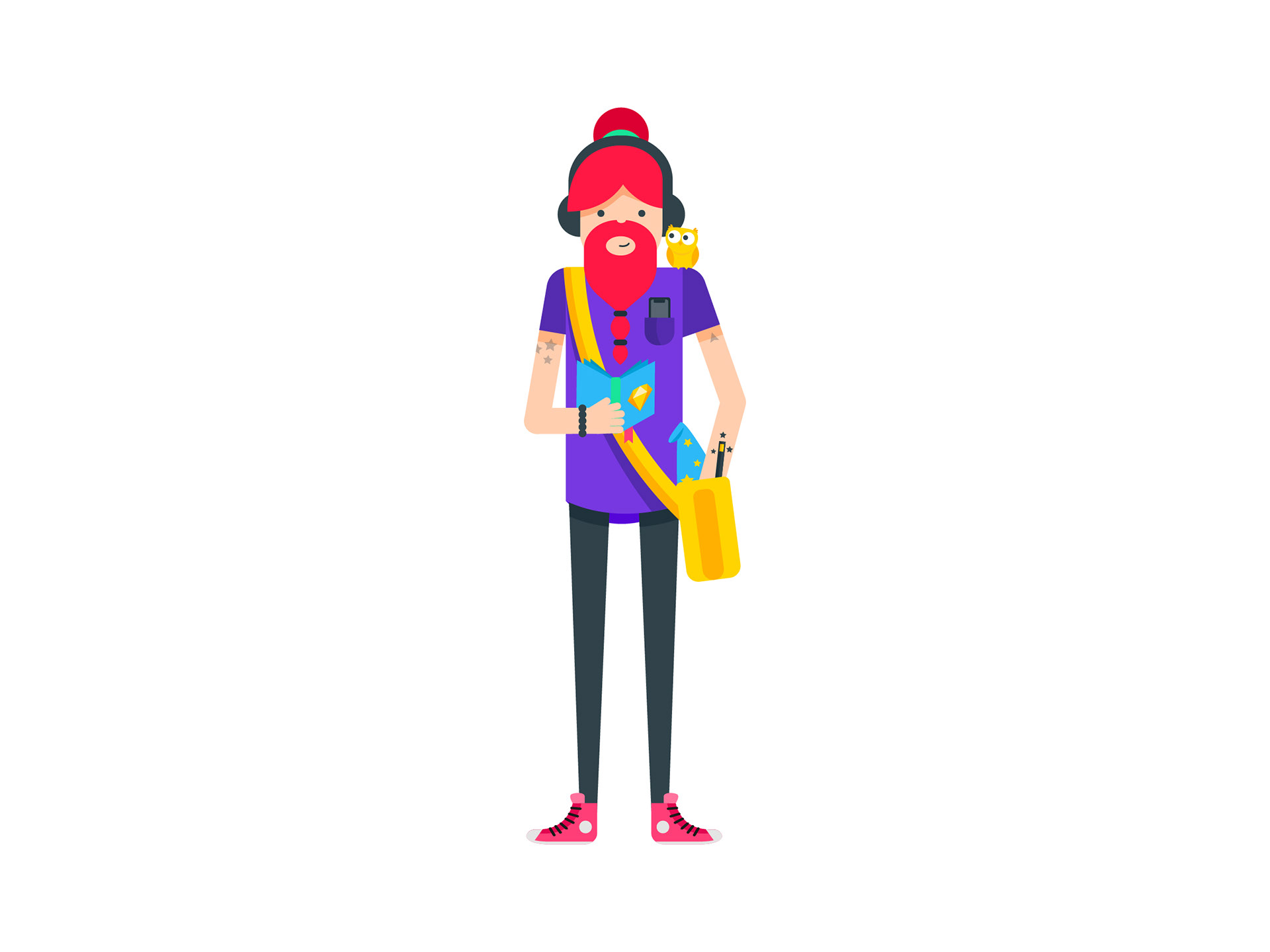
In the end, the colours chosen for the characters were bright and bold. This is the final Design Wizard, in all his full red bearded glory, with his pet owl.
Final Wizard Character
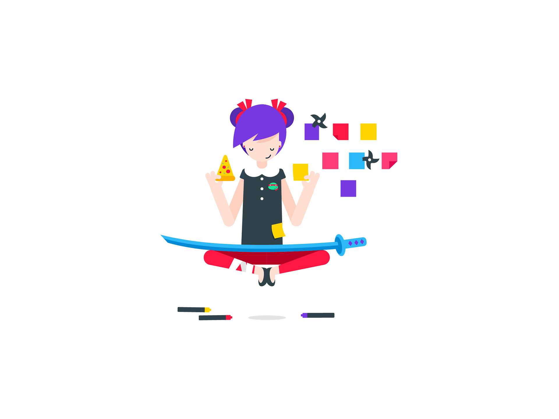
The UX Ninja
Once the first character design was complete, the rest became a lot quicker and easier to do. I had created a design language that I could now use, and my original concepts were re-visited to give me ideas for new characters.
These are concepts for the UX Ninja. It was decided early that she would be a female, and like the first character and the next characters to come, she had to be a hybrid between two personality types.
Character concepts
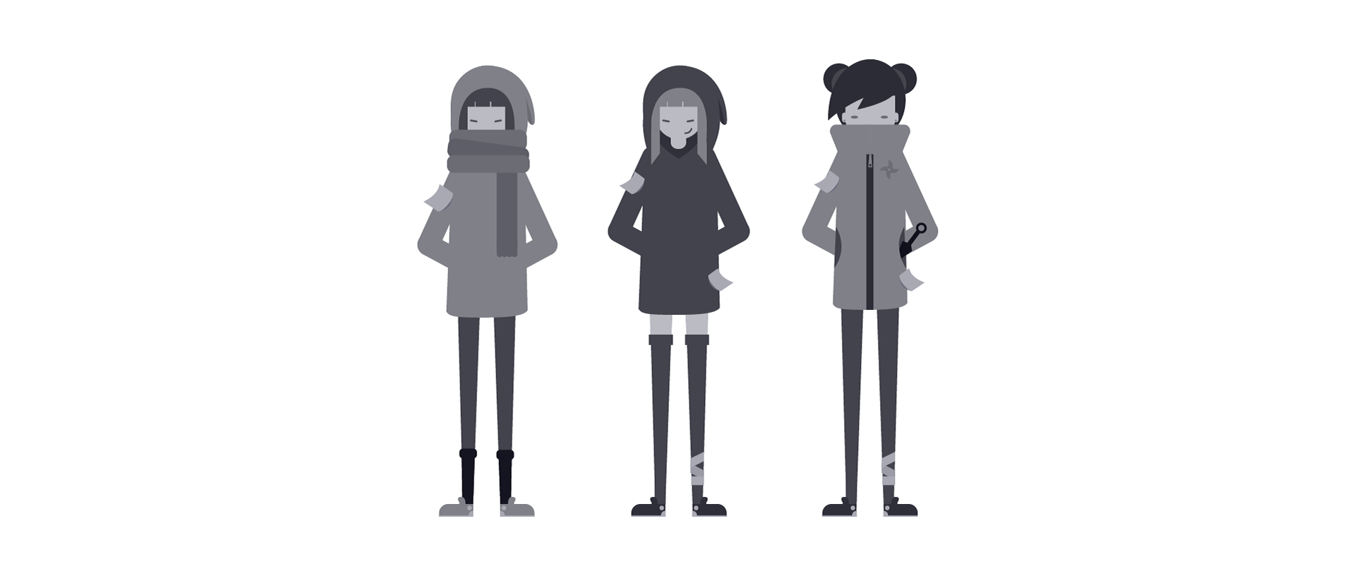
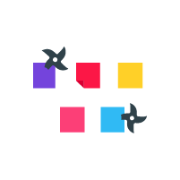
Some of the initial elements I played around with for this character was her clothing and hairstyle. I thought that 'sticky notes' were the typical UX designer's tool, so had some fun with those as well. In the end, a few more ninja props were added to the illustration, as well as some pop culture references.
Final UX Ninja
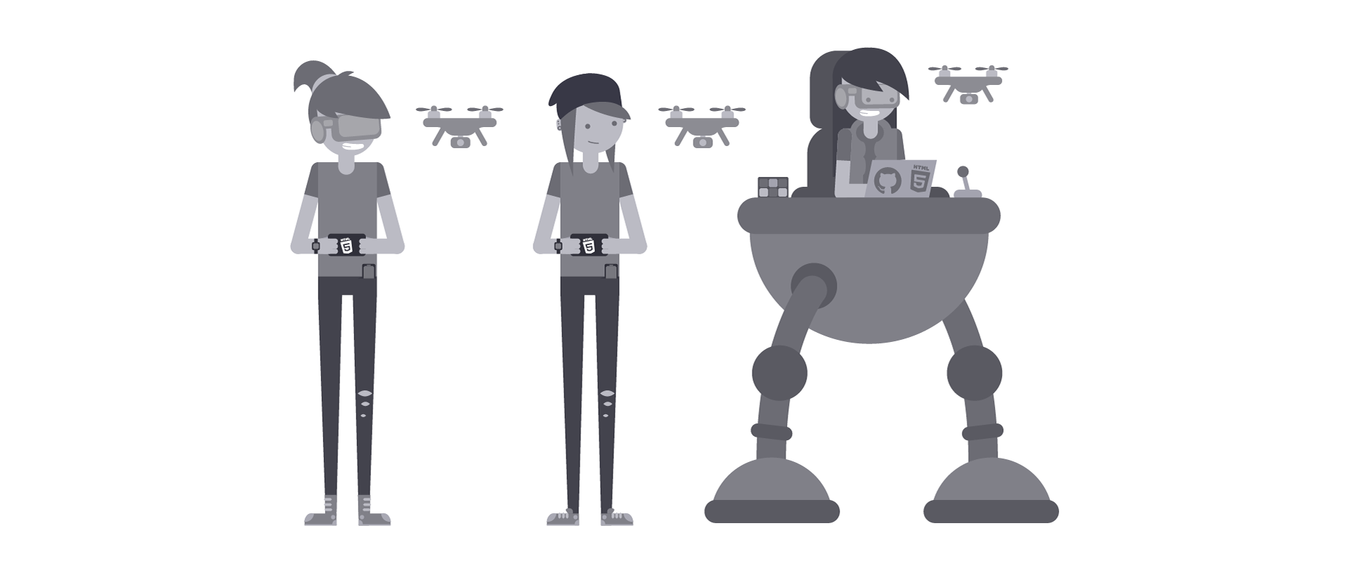
Megamind Developer
The Megamind Developer was very fun to work on. She is the culmination of a trendy geek pop culture fan who's intelligent and tech savvy.
I had to find the right balance between cool, geeky, retro and modern, and although this could be a challenge, being a part of the tech industry meant I had personal and first-hand insights into developer habits and cliches, which I could get inspiration from.
Megamind Developer concepts
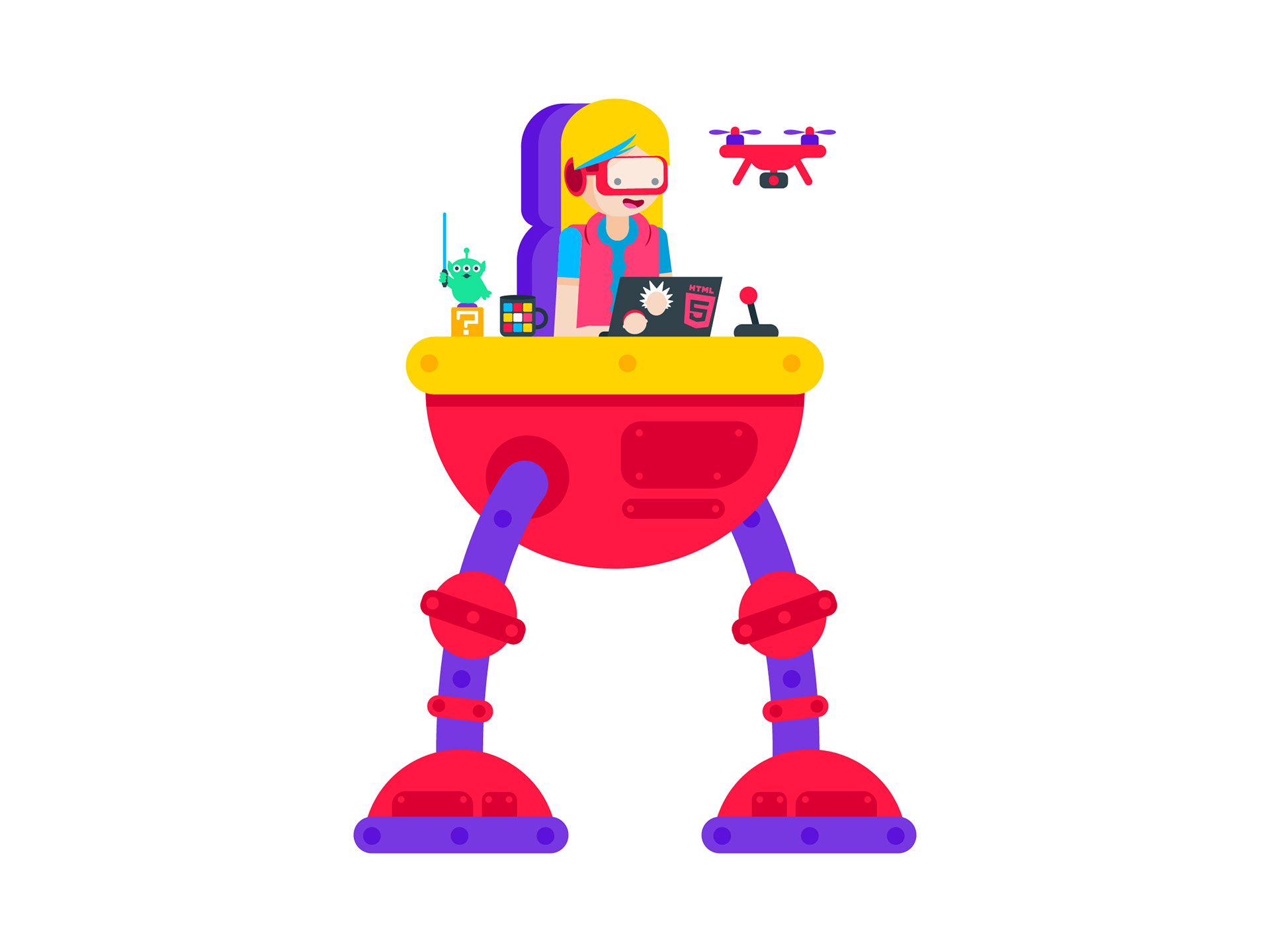
This here is the final Megamind Developer, and she's awesome. Tech savvy, fun, and a toy collector, I am sure a lot of people in the tech and creative industry can relate to her.
The colours were very tricky to get right in this illustration due to the amount of elements it has compared to some of the others. I had to ensure that colours didn't merge into one another, and the the brand's bright red remained key.
Final Megamind Developer
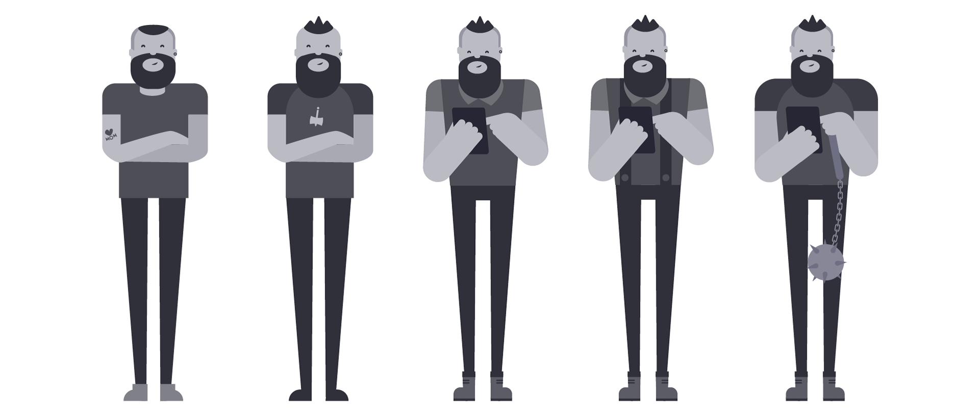
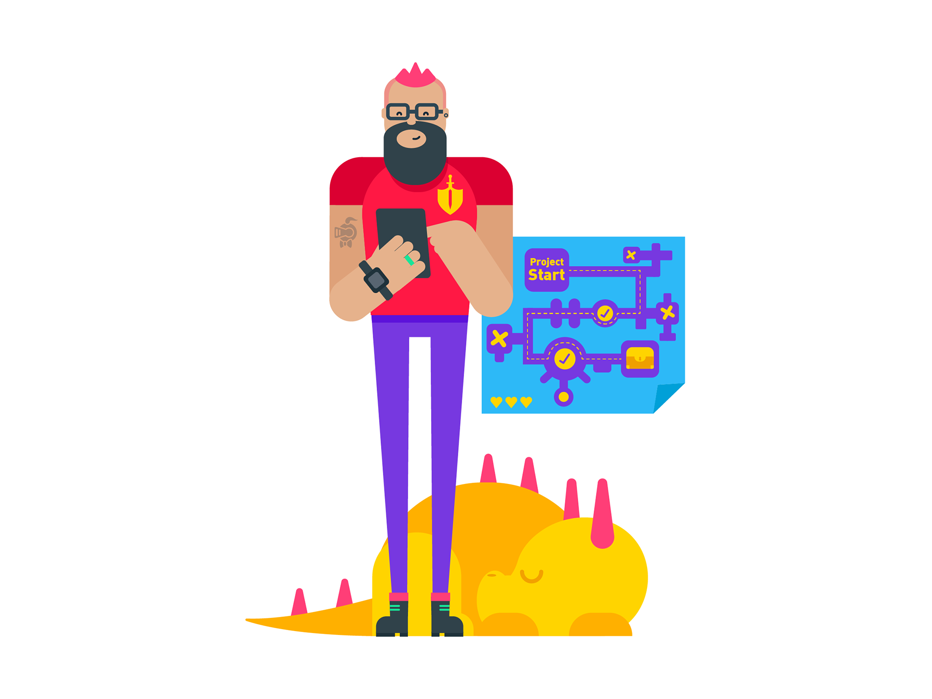
Warrior Project Manager
The Project Manager is the hero, the warrior that fights for the the devs, UI and UX designers, the planner, the knight in shining armour.
This character had to be bigger and stronger than the others, but not necessarily a ripped gym junkie or Spartan warrior. He still had to appeal to a general audience, and fit in the same context as the others, as a friendly character who you wouldn't necessarily want to pick a fight with.
Below are some initial character concepts and development.
Warrior Project Manager Concepts
Here is the final Warrior Project Manager, with his pet dragon, iPad, and a Dungeon map to help his team get to treasure at the end.
Final Warrior Project Manager
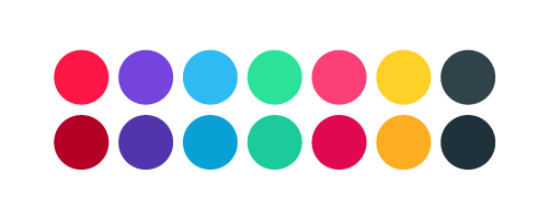
Colour Exploration
There was a lot of exploration to find a suitable colour palette for the character designs, and later the header image as well. The brand's strong red was a starting point, with the other hues then stemming from that.
Final Colour Palette
Final Characters Lineup
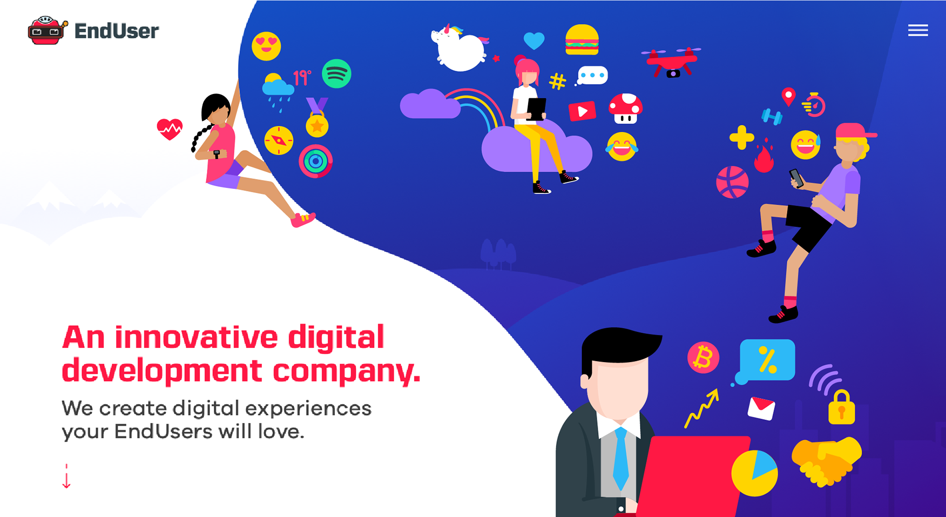
Header Image Illustration
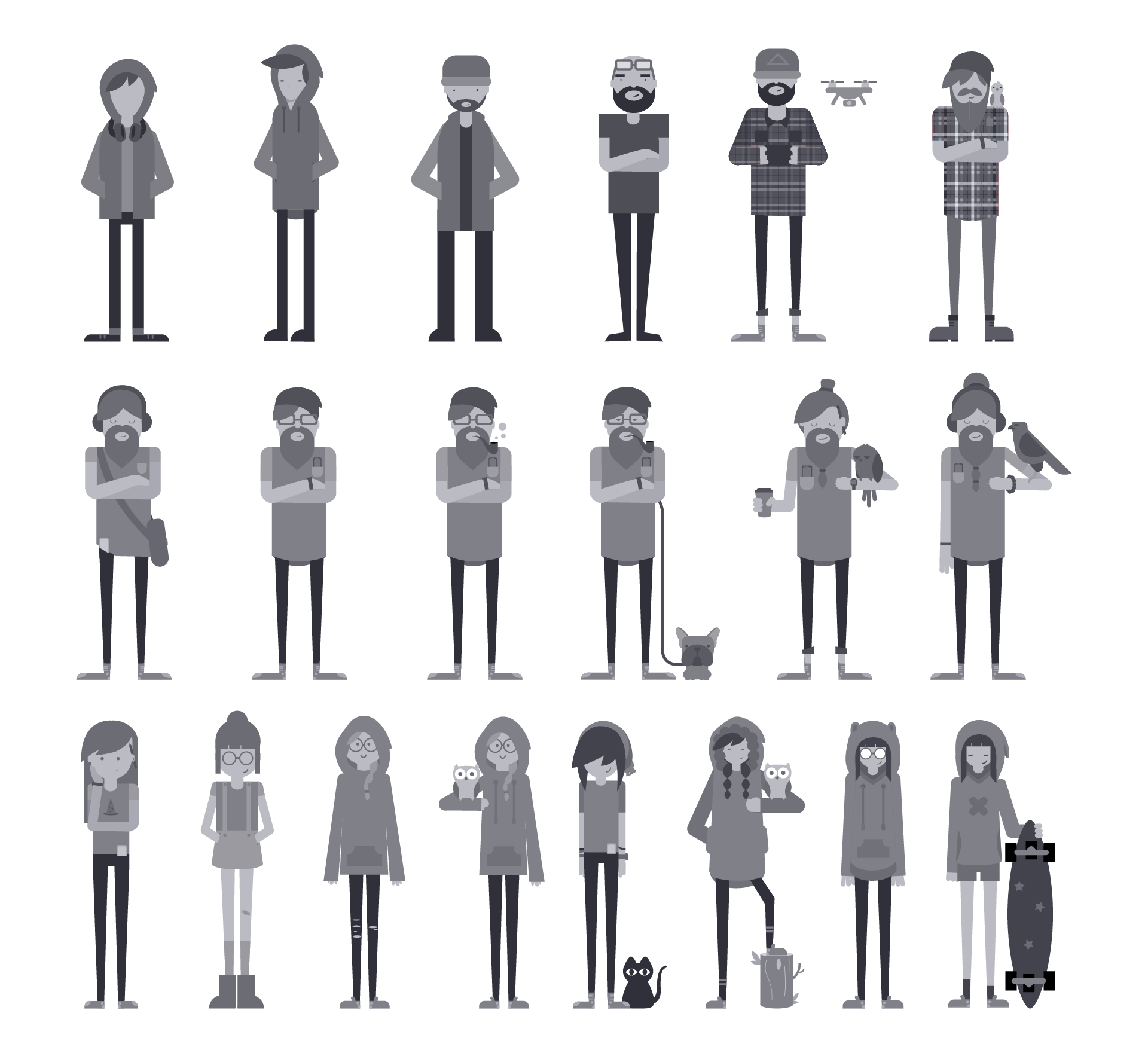
A different part of the brief was to illustrate the website's header image depicting EndUser's...well... End user 😇.
The idea was to use the same style of illustration as the characters, depicting a variety of ways in which different people use technology. The image shouldn't represent any one type of person, but rather groups of people that represent an audience.
Some iconography would help to illustrate the idea of how these different users apply technology to their daily lives, which had to be taken into consideration when designing the layout.
Design Process
Part of the design process for this illustration was working out the type of composition that would work well for the website. Some very quick sketches were done in order to get an idea of how different types of layouts could tell a story.
Header Image Concepts
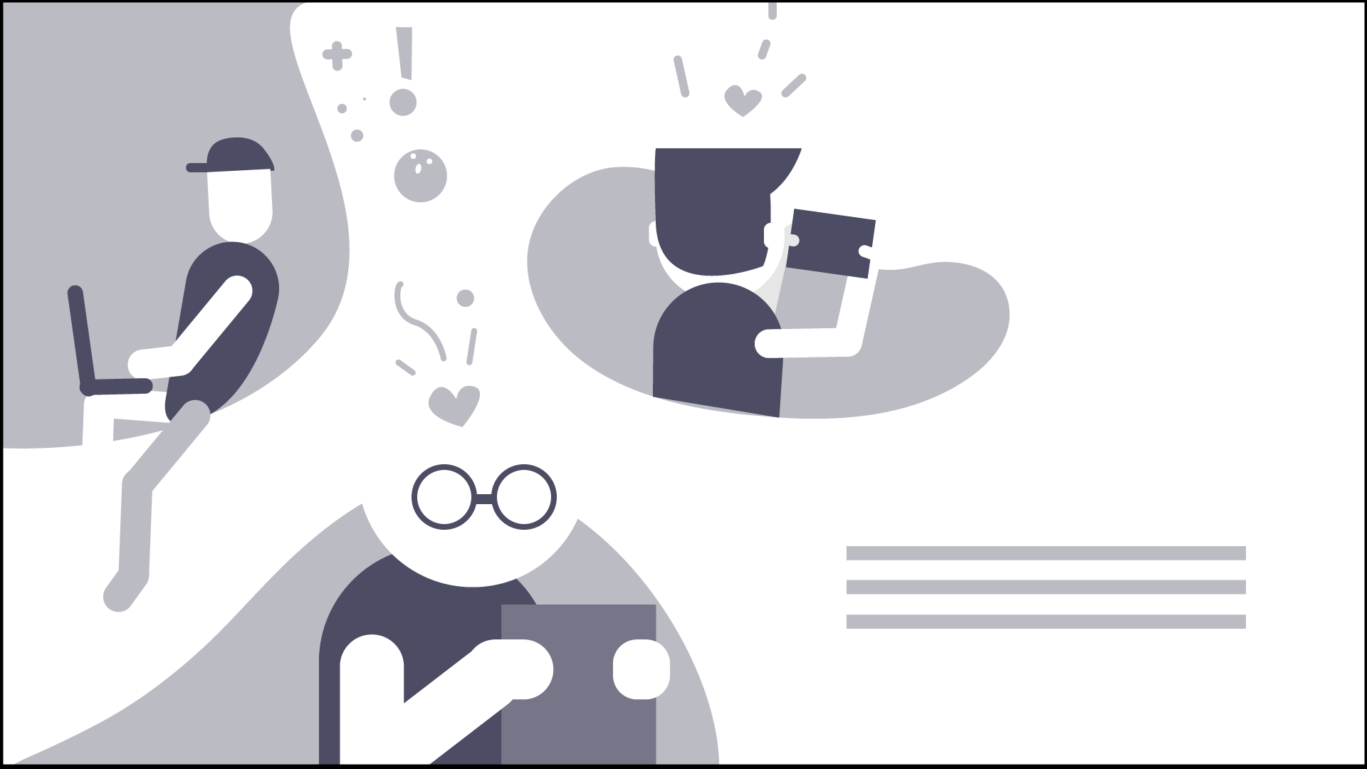
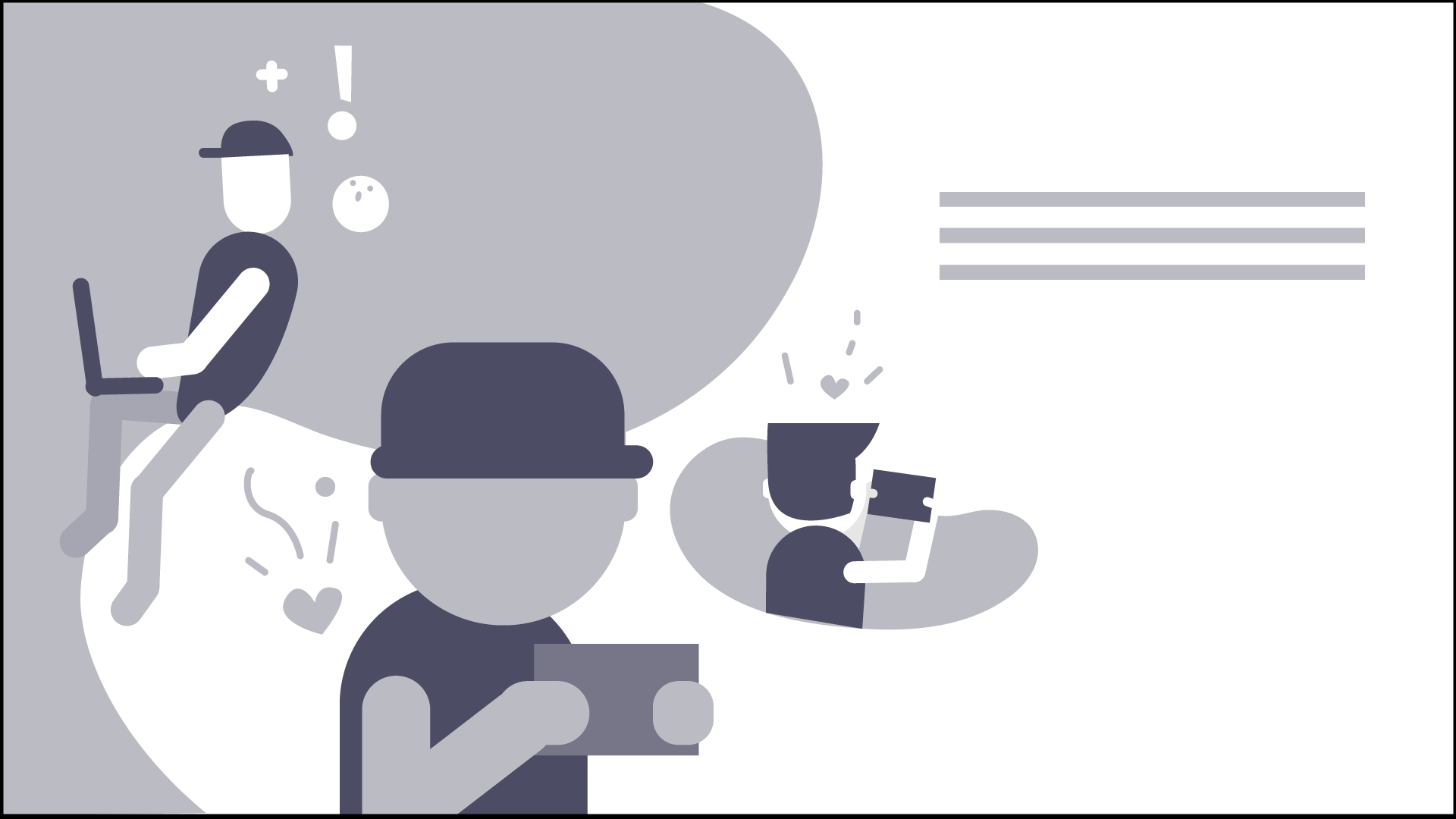
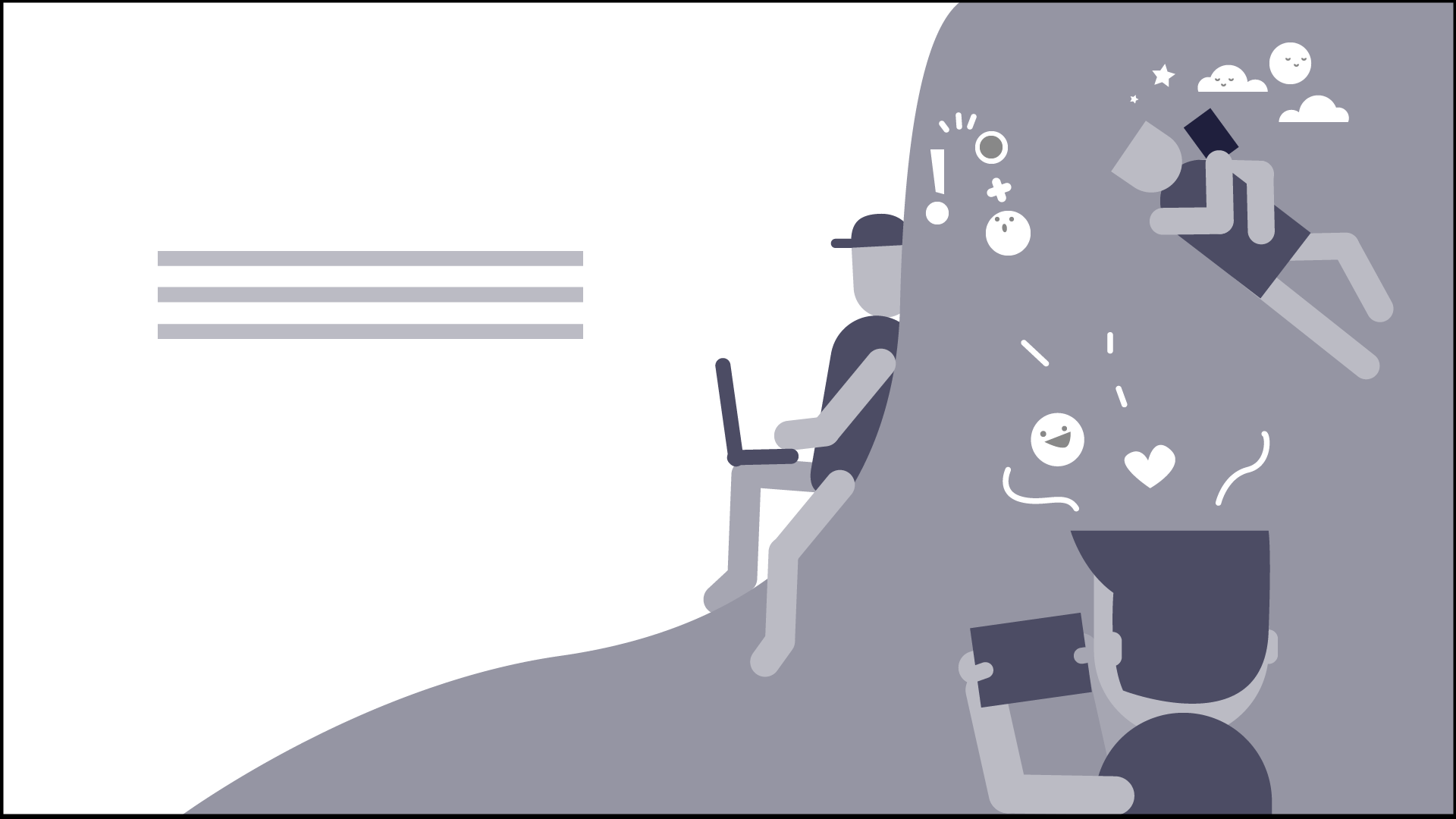
The final illustration became a combination of a couple of the ideas from the original sketches. The same colour palette used in the characters was applied here, with subtle shifts in hues to suit the darker background.
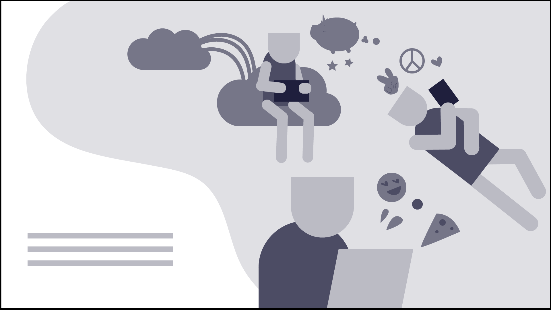
Final Header Image Illustration
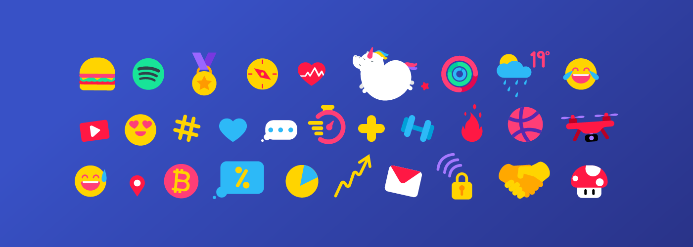
A collection of icons was designed for each end user, which would appear at different stages on the website, so the scene didn't look too cluttered.
These icons were divided into categories to help visually identify some of the ways in which end users incorporate tech products into their daily lives. Some of these included nature / outdoors, games, entertainment, sport / fitness, and business.
Final Icon Illustrations
Ciao for Now
Working on this project was a lot of fun.
I enjoyed the challenge of trying to bring together elements from real and fantasy archetypes, using my place in the tech and creative industry, as well as pop culture references, as a fountain of inspiration from which I could create some cool characters and illustrations.
I look forward to the possibility of animating these in the future 😀!