
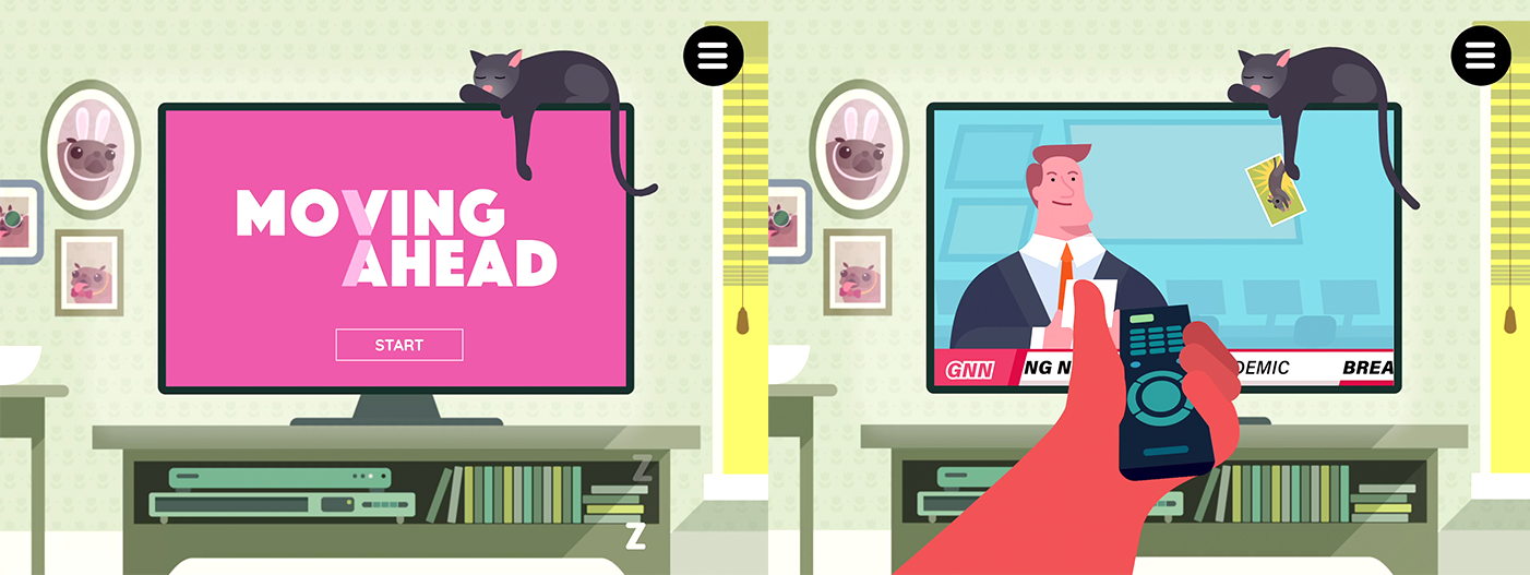
We were approached by McCann Sydney to work with them in developing an interactive tool to provide information to patients who have been diagnosed with Wet AMD and are undergoing treatment. The experience was tailored specifically for patients who would be waiting at a clinic to undergo treatment - and was designed to deliver important information about the condition and treatment.
ABOUT THE APP
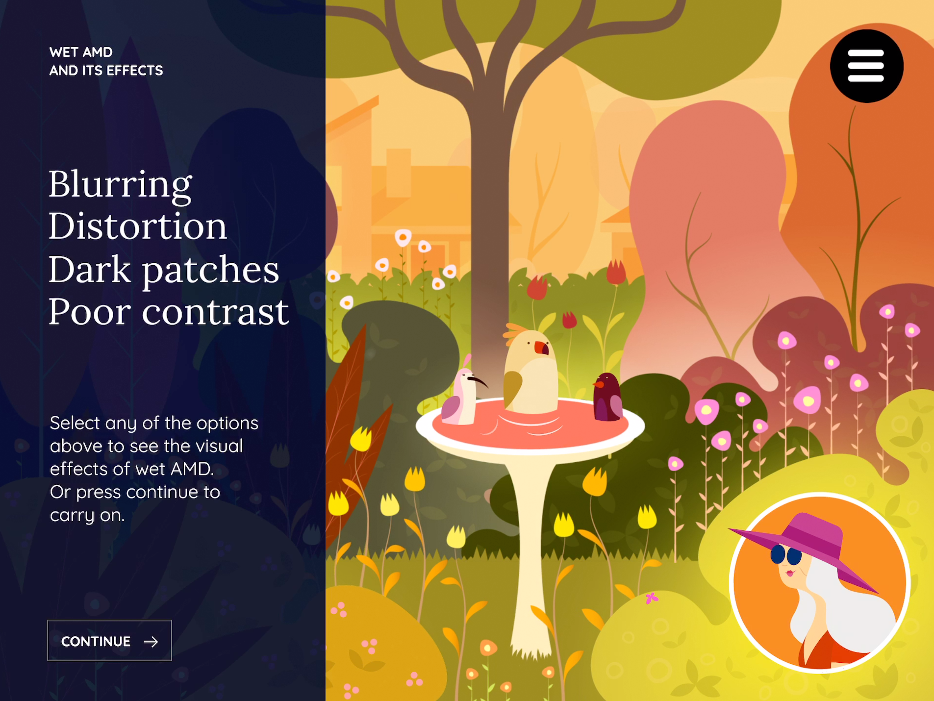
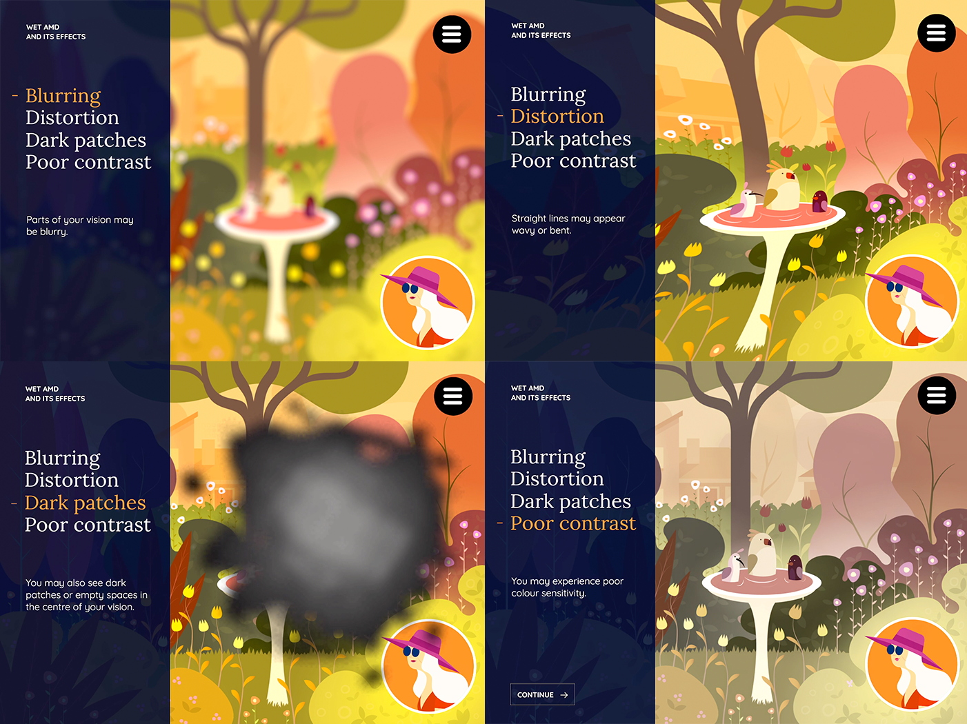
For those who don’t know - wet AMD is a common vision condition that affects people in their 50’s (or older), where their eyesight slowly starts to deteriorate over time. The symptoms include: loss of colour, loss of contrast, blurriness, visual distortion and specs appearing in the center of your vision.
The condition isn’t curable nor reversible at this stage, but the symptoms are treatable and manageable. This makes regular visits to an ophthalmologist incredibly important for patients to maintain the health of their vision.
However - there is a catch.
The treatment is an injection through the white of the eye. This sounds incredibly uncomfortable and very off putting for many people.
With such an unnerving treatment, the message stressing the importance of the treatment becomes critical to patients. Our aim was to encourage people to stick to their treatment schedule to maintain the highest quality of life for as long as possible.
Our task was therefore to work with the McCann team in not only creating an experience that delivered the information in a clear and easily digestible format, but also to distract the user temporarily from the treatment they were just about to undergo.


THE CREATIVE PROCESS
There were 3x major creative tasks that we were to undertake.
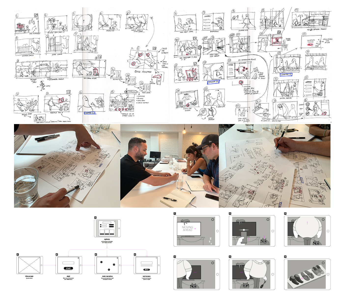
The first was to define the story. McCann started the process by laying down a script for us to work with. Since this needed to convey medical information, clarity and tone was a top priority.
We worked with them through an iterative process of storyboarding out the narrative and visualising how we’d display each scene through InVision. This was a great tool for mapping out the sequence of events, but also capturing people’s feedback (both internally and externally) in a very shareable format.
Rather than making the entire story a purely one-way experience, we added small moments of interactivity that gave the user a little more agency over what happens and a bit more engagement with the content.
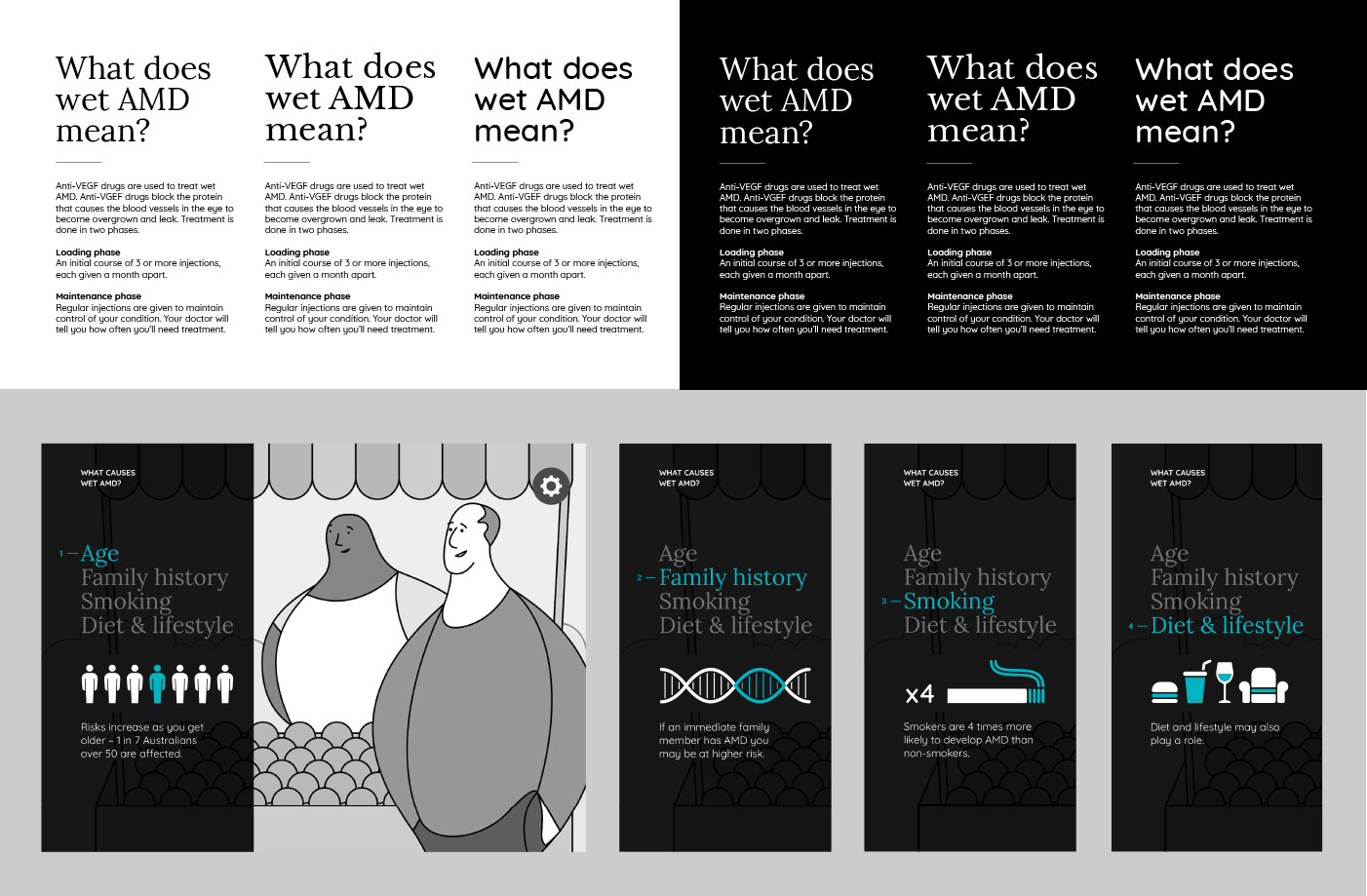
The second major task was the illustrative visual design of the experience. Apart from the usual aesthetic considerations, the major factor we needed to design for was the visual comfort of the user.
Since we were likely creating content for users that are experiencing a variety of subtle visual impairments, we needed to develop a look and feel that would:
- Have strong silhouettes and easily recognizable forms.
- Have strong colour and contrast.
- Avoid having critical information situated in the center of the screen (some of the target users have become accustomed to using their peripheral vision to read).
With the above visual design criteria in mind, the illustrative tones needed to feel contemporary and modern without feeling pretentious; it needed to be approachable, light-hearted; but not too kiddy or comical.
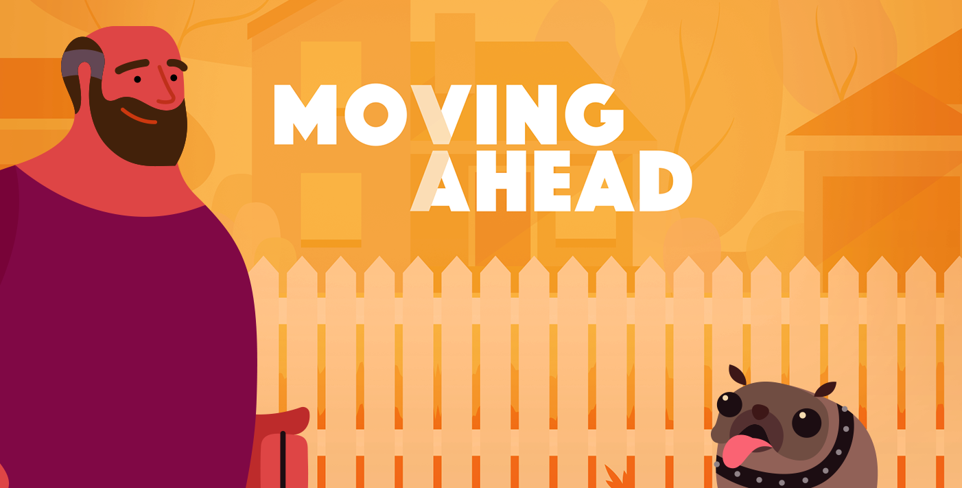
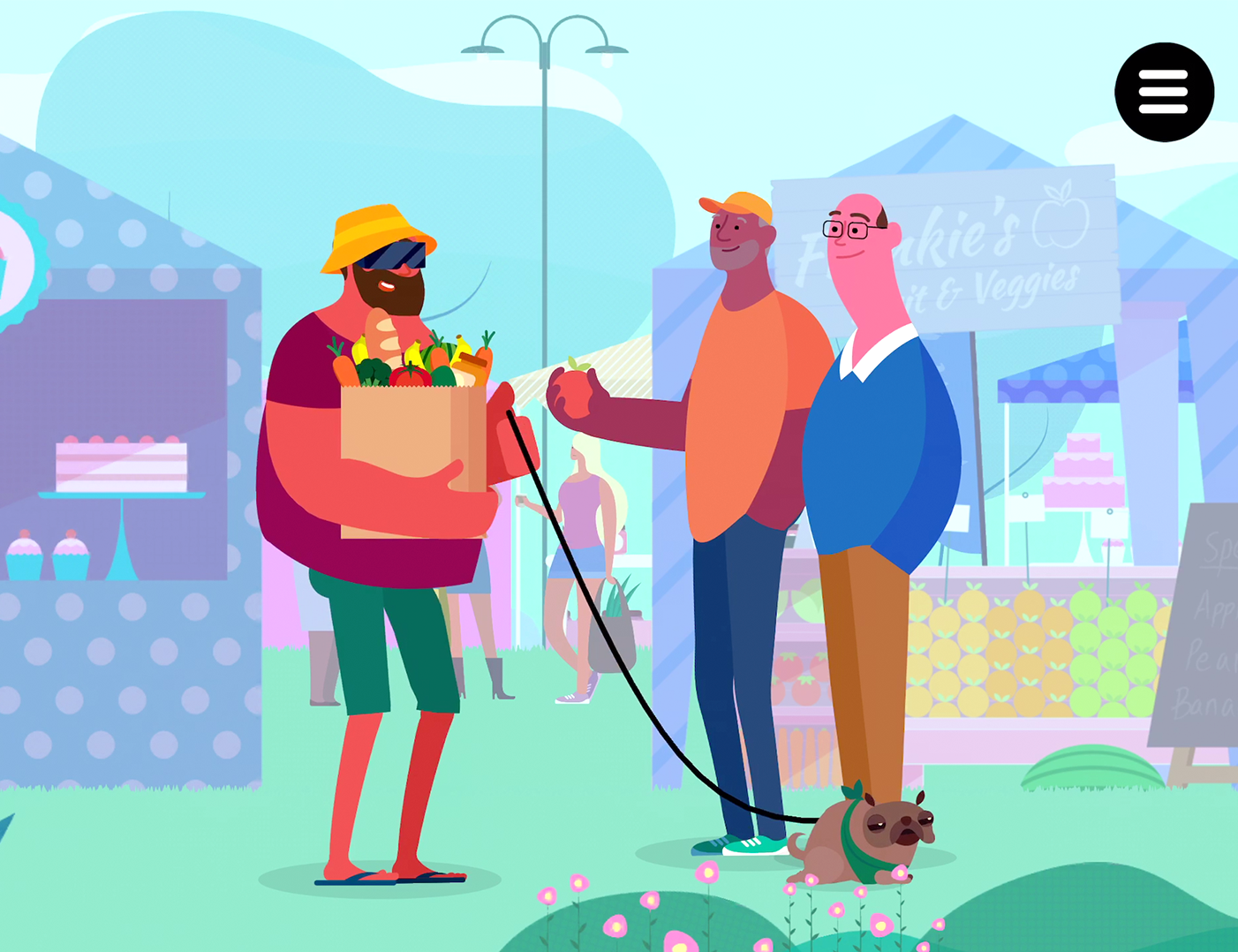
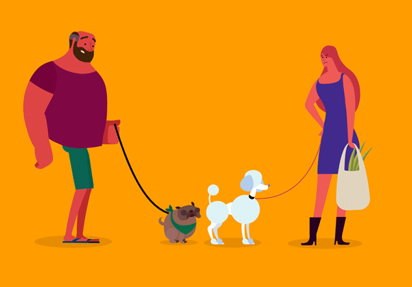
GEORGE & RALF
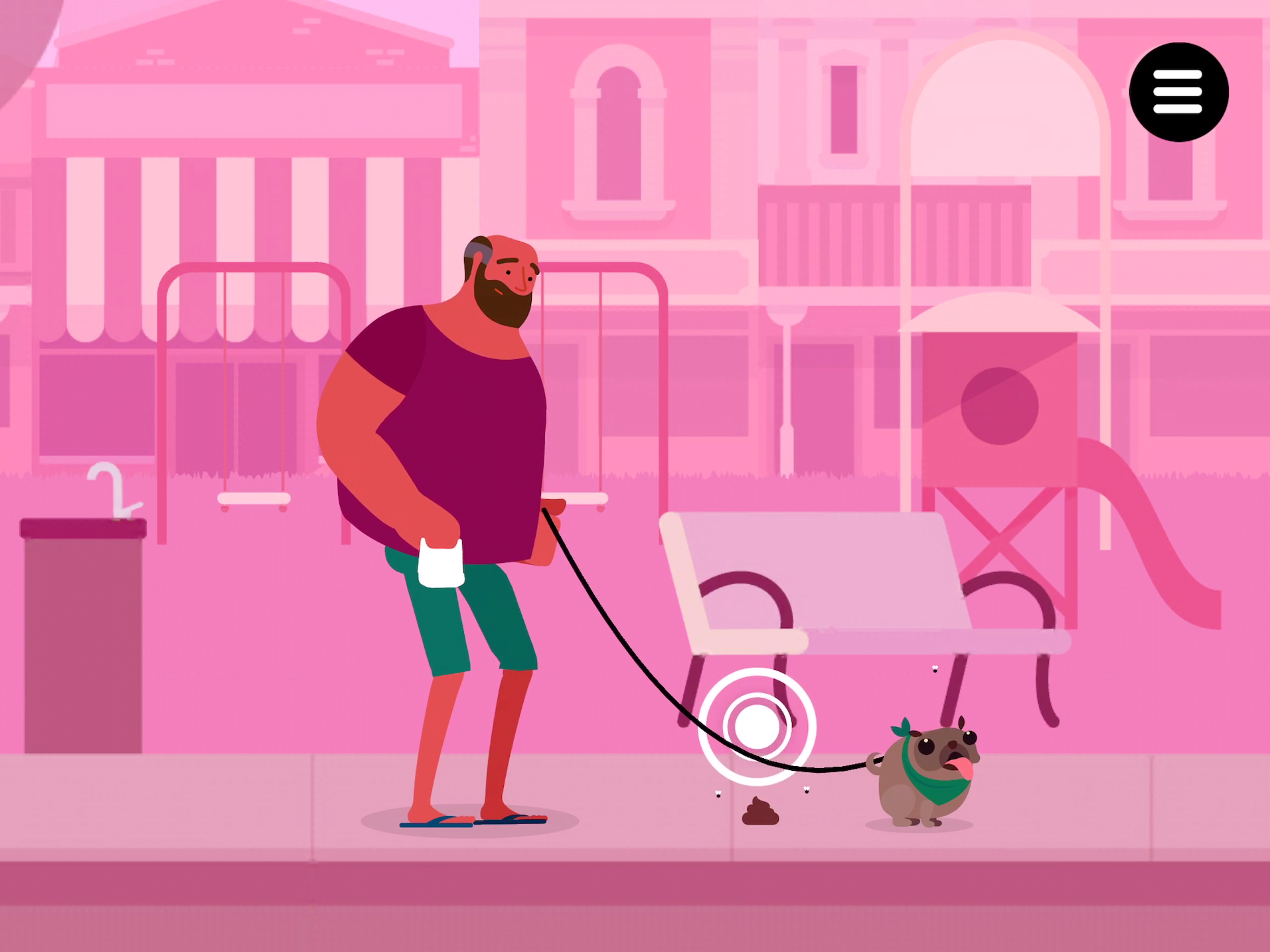
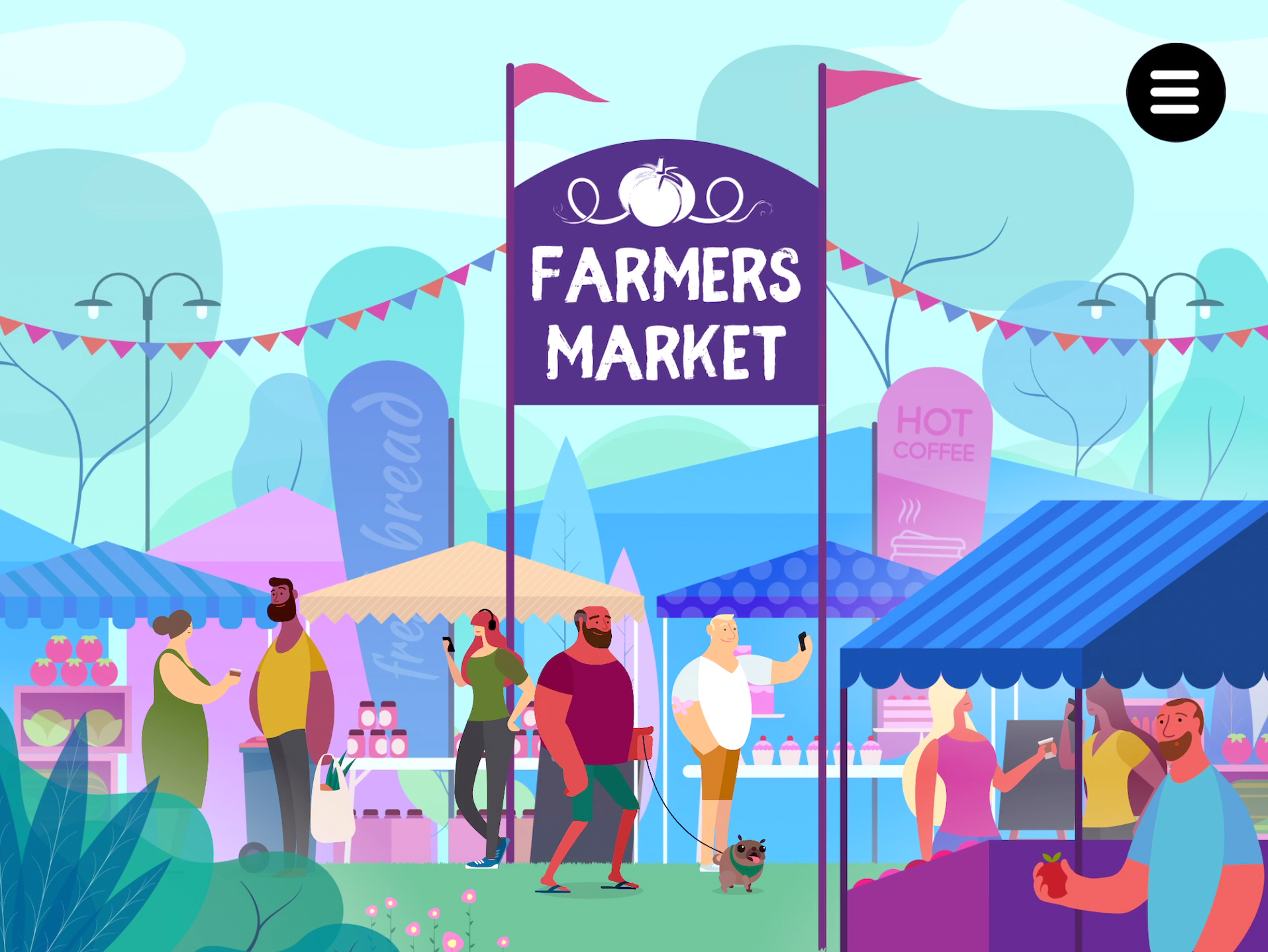
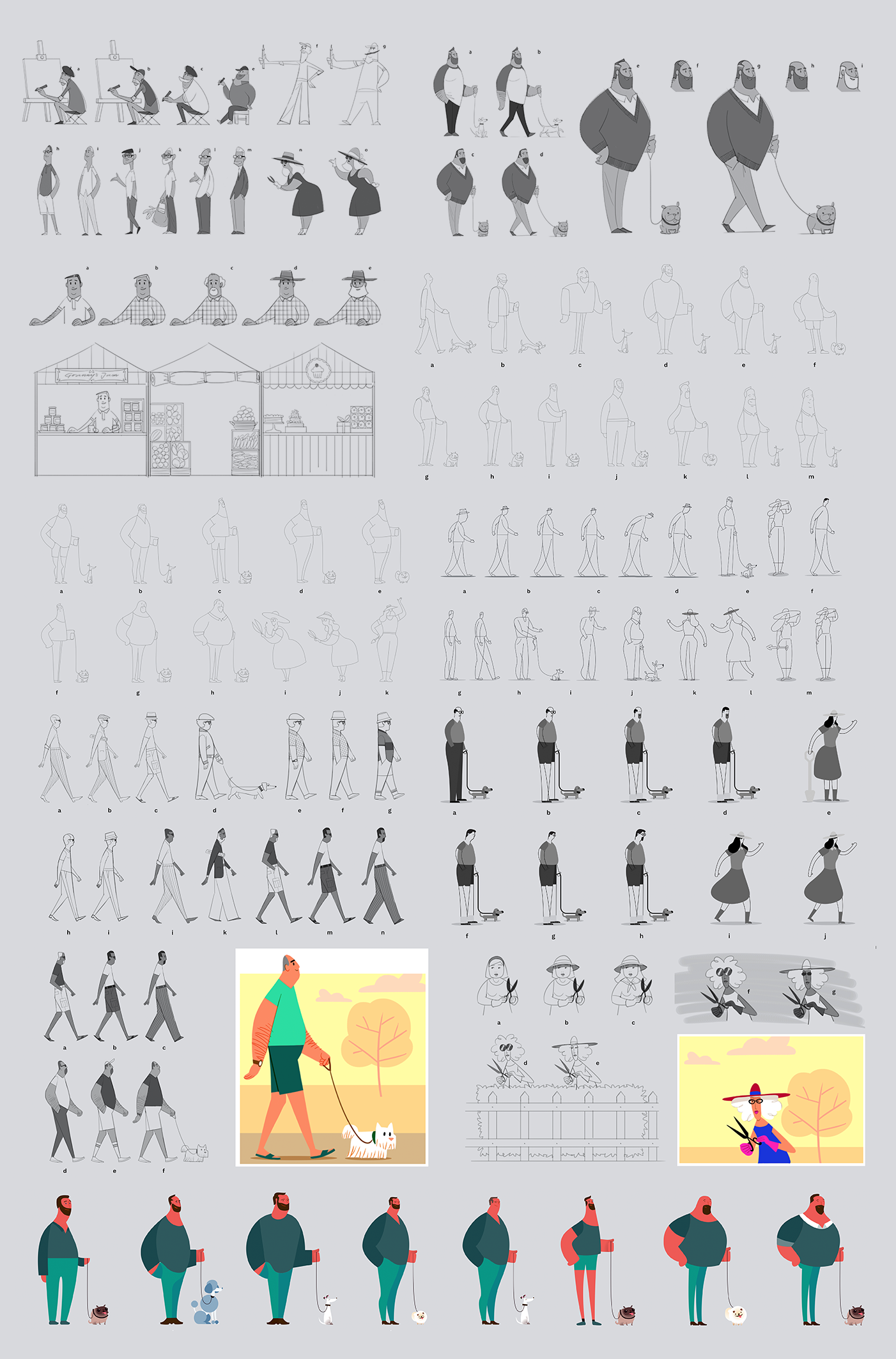
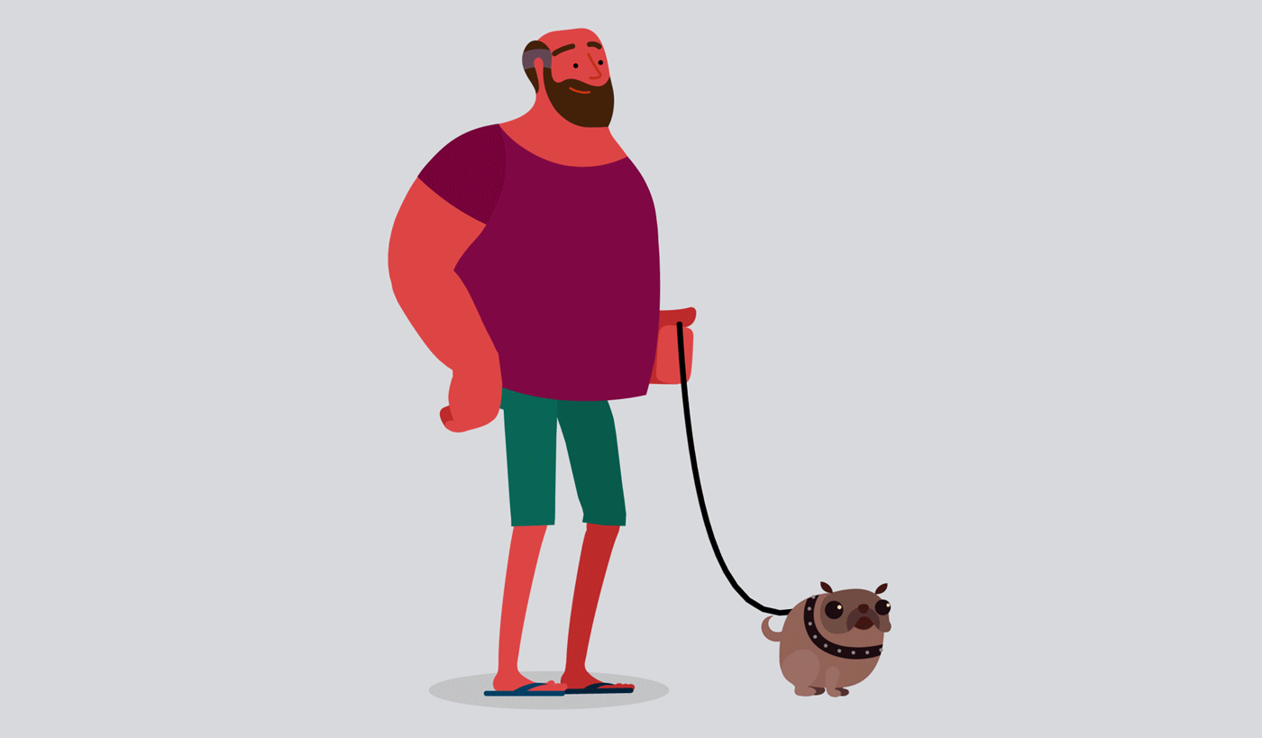
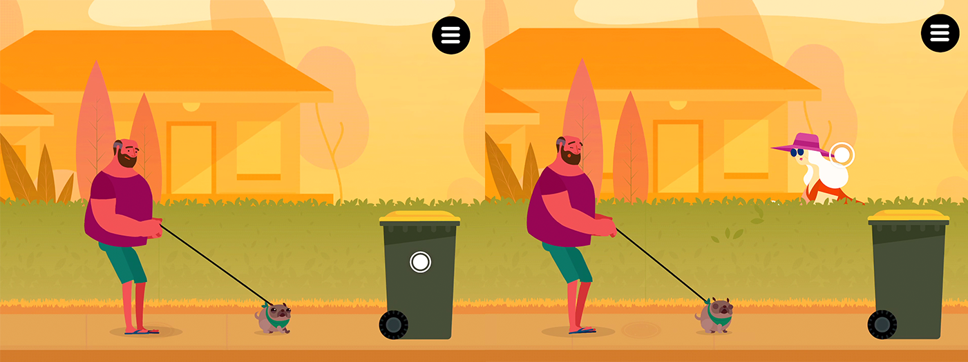
The story would follow the day in the life of George, a man in his 50’s who is starting to experience Wet AMD. George needed to feel like a likeable and familiar person, not too much of a caricature, but enough personality that he wasn’t going to feel too generic.
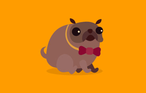
In our minds, George was a tradesman who was used to working with his hands. A solid no-nonsense guy who loves footy, but equally relaxed and easy going - nothing is going to phase him. Always at his side is his naughty, but undeniably cute pug: Ralf.
When designing the pair, we played with the idea of juxtaposing scales to help lighten the tone of the story. The idea of this large ‘tradie’ bloke walking his cute little dressed up pug has brought a smile to every person we’ve seen use the app.
Although George is going through an informative journey of discovery, learning about his vision impairment, the shenanigans that George and Ralf get up to along the way are opportunities to bring a bit of humour to a fairly serious topic.
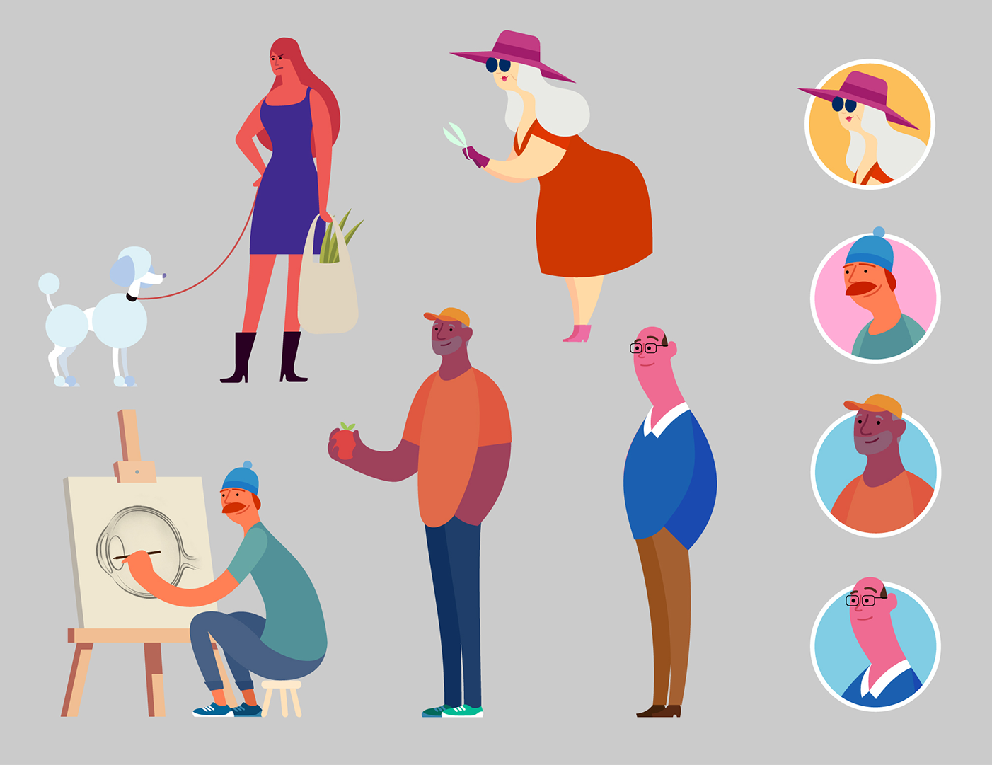
REST OF THE CAST
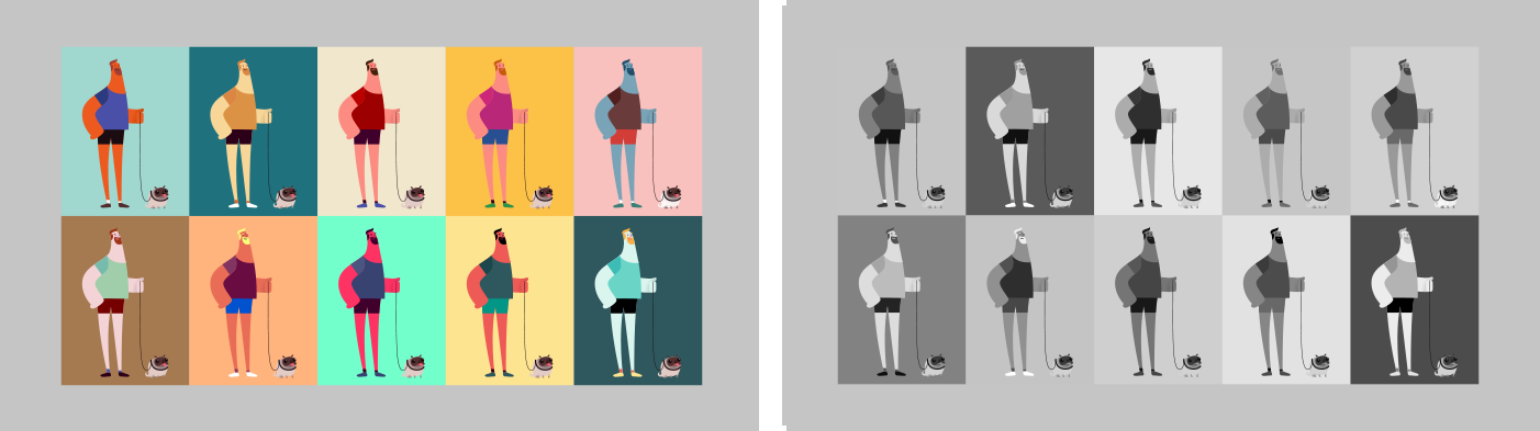
Since George and Ralf would be the key story drivers in this setting, their design would help inform the rest of the visual DNA of the other characters. The characters were all created from strong clean shapes with rounded forms. Each character has a unique silhouette that helps to distinguish them and give them a unique identity.

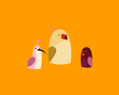
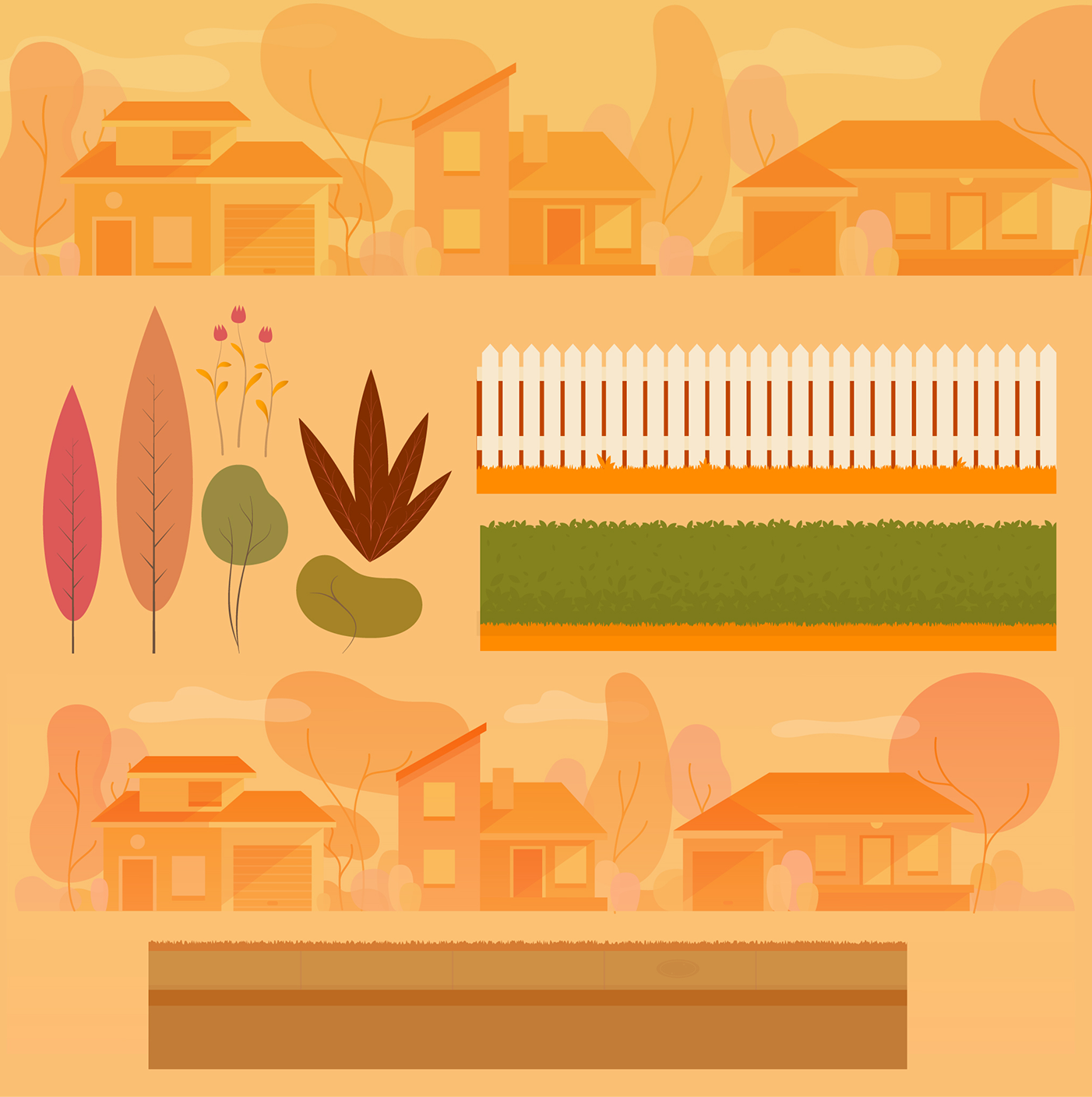
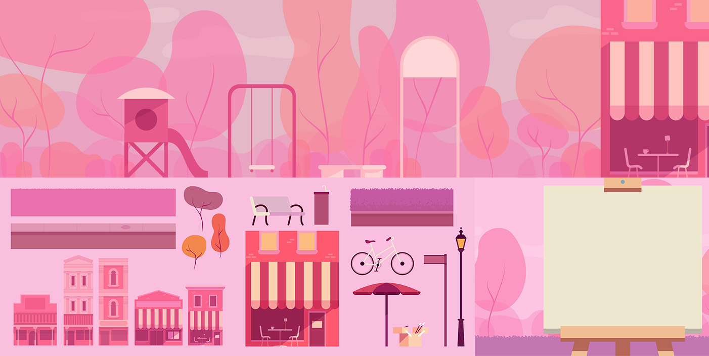
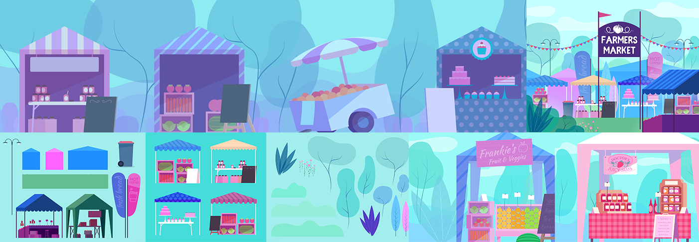
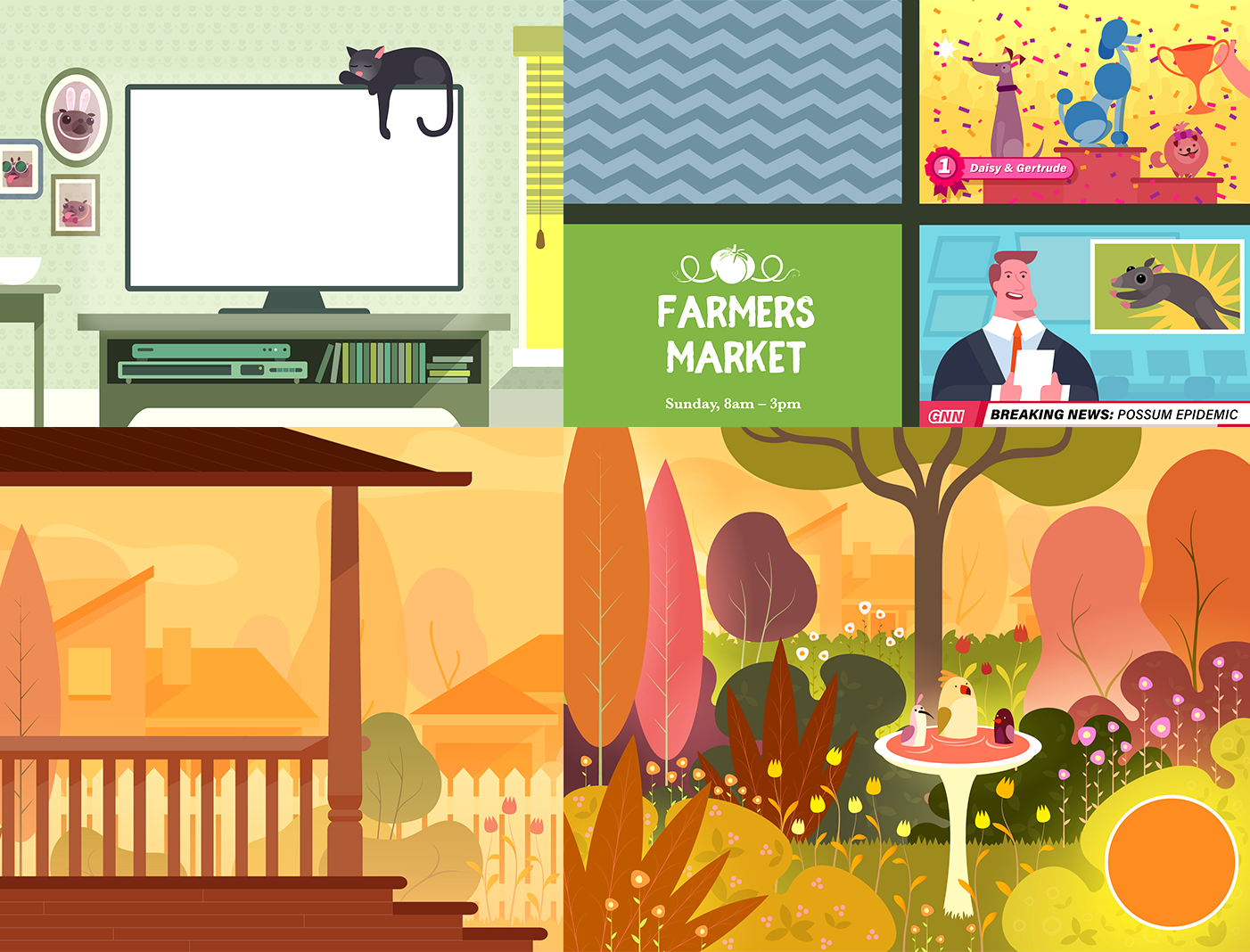
WORLD AND ITS INHABITANTS
In tandem with designing the characters, it was important to consider the design of the environments that they would operate in as well.
To avoid too much visual clutter, we aimed to push the tonal range of the background right back where possible. There needed to be just enough detail to make sure the user understood where they were, but not too much that it might start to compete with the foreground elements.
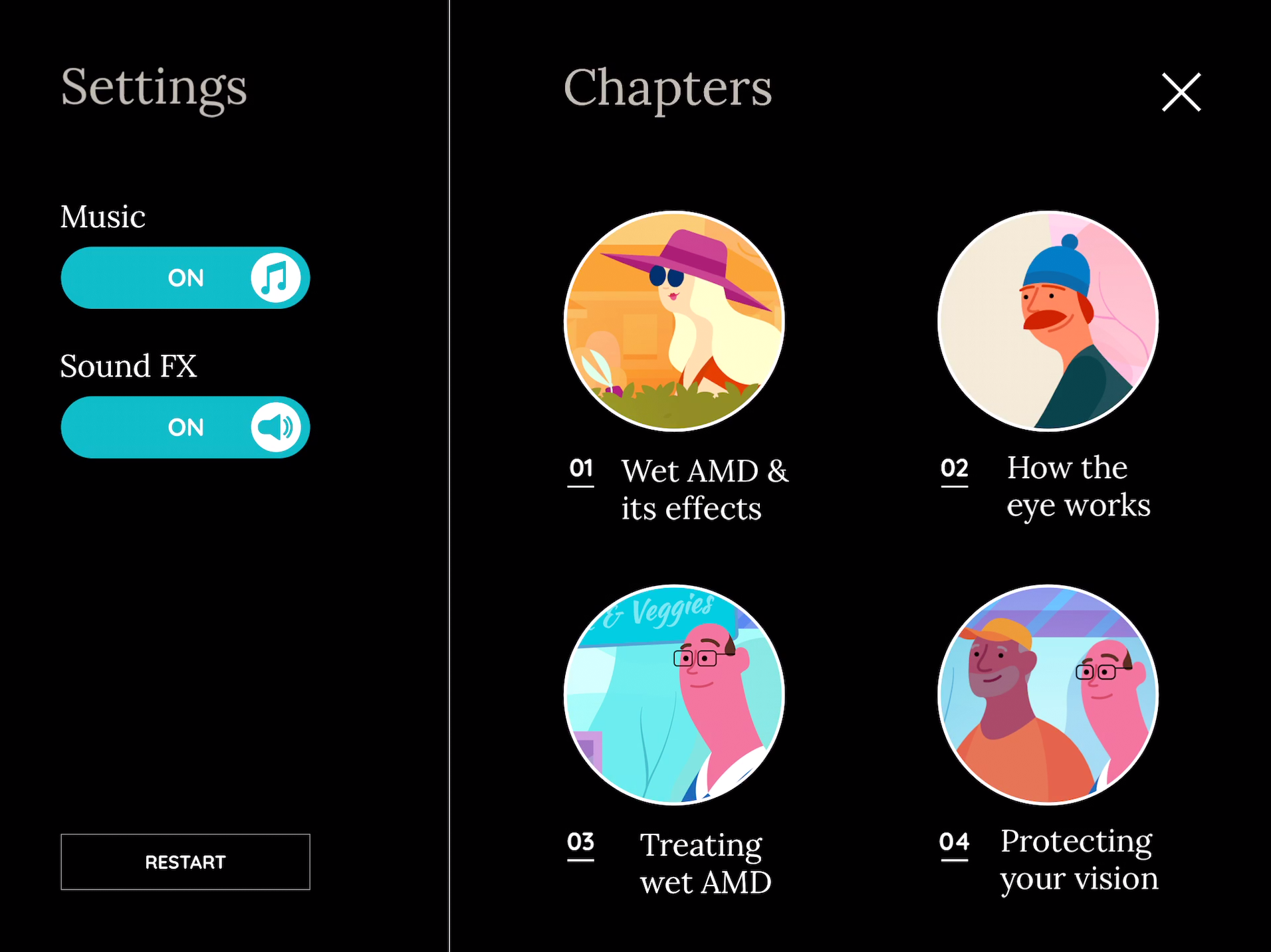
We gave each chapter of the journey it’s own colour palette to help differentiate them and bring some visual interest to the world.

INTERACTIVE MOMENTS
Although the story being developed was largely a narrative that informed the user as a one-way interaction, we wanted to include moments during the experience that were influenced by the user. Since we were wanting to develop an interactive, artwork rich experience, the app was built in the game engine, Unity3D, with all the characters animated in Spine.
All the interactivity was intended to be very light - we didn’t want users struggling with complex interactions or ‘game mechanics’ and being unable to progress. However, small moments of interaction can really help to draw people into what’s happening in the story.

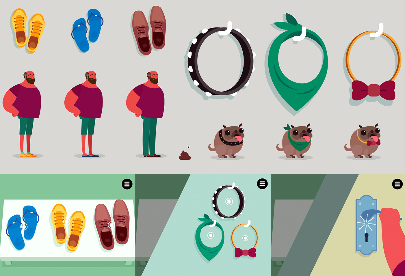
CUSTOMIZATION
There were three different types of interactive mechanics that we employed. The first was customisation. The user would make small choices for George and Ralf at the start of the experience which were manifested all the way through the rest of the experience. Although minor, these small moments give a sense of agency over what is largely a linear story.
INTERACTIVE MOMENTS - CHARACTERS / WORLD
The second form of interaction was one where the story would hold on a point, waiting for the user’s engagement to continue the story. We wanted these moments to feel as natural as possible and opportunities for the user to digest what’s happening in the story before choosing to continue.
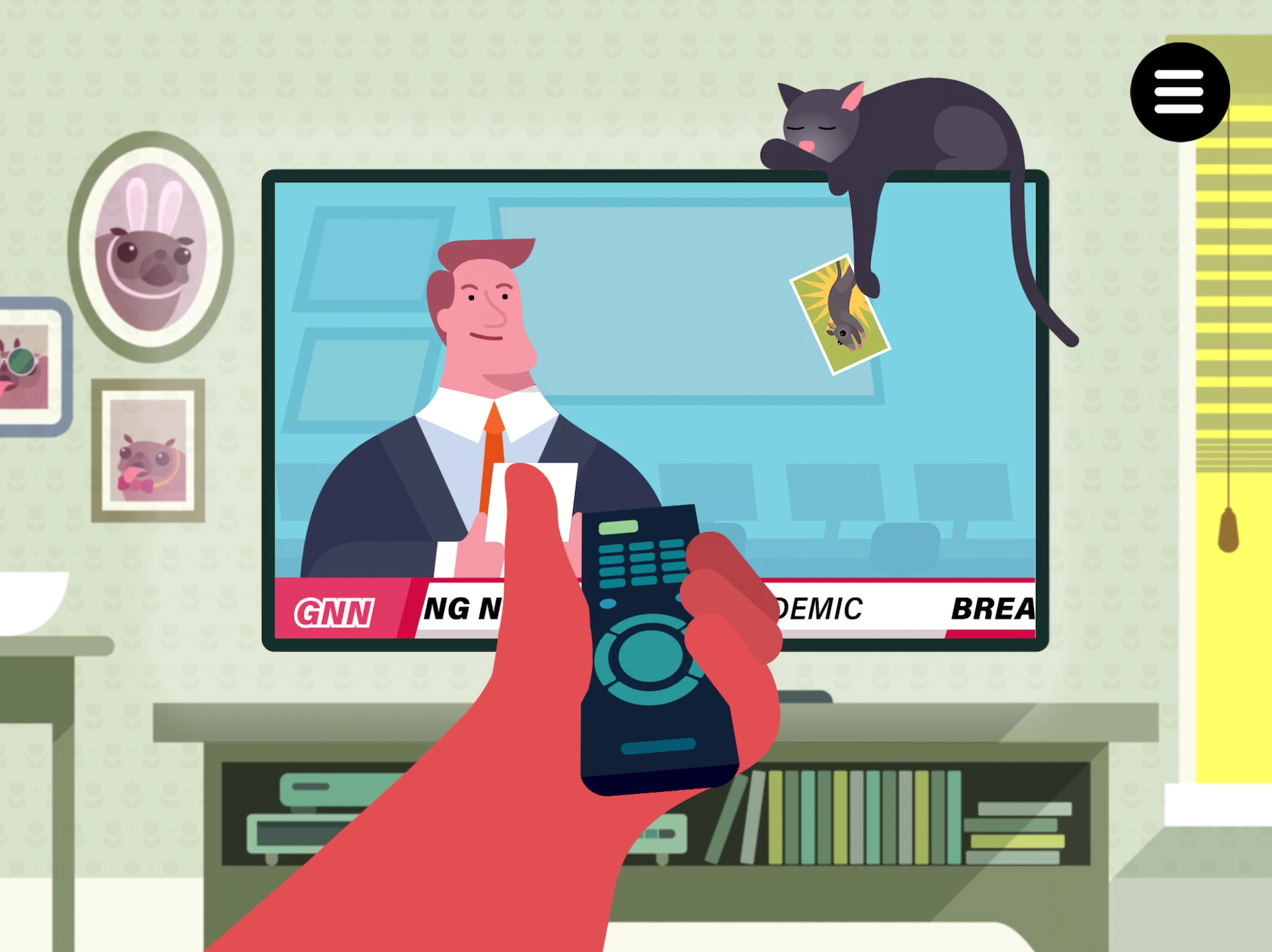
INTERACTIVE MOMENTS - VISUAL EFFECTS OF WET AMD
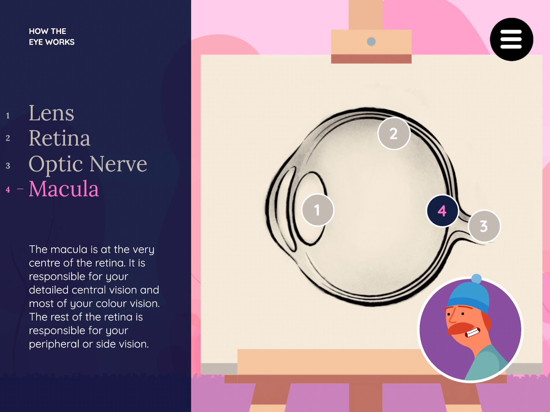
One of the key moments in the experience was displaying the effects of Wet AMD to the user as a visual overlay. Laura (George’s neighbour) explains what the symptoms of Wet AMD look like - this is visually backed up in the experience with visual effects that distort the world accordingly. Rather than illustrate the symptoms into the artwork, the effects are applied over the top of the scene using Shaders. This allowed us to control the degree of the effect as well as seamlessly transition between effects without interrupting the animation.
INTERACTIVE MOMENTS - FUN
We used the moments (interactive and animated) between the key information chapters as opportunities to introduce a bit of fun and humour. Ralf was usually the primary culprit here, and his shenanigans carry the engagement for users from one chapter to the next. Since there’s a lot of information to take in, and some of it can be quite dry, it was important to include something that would break the tension and lighten the narrative.

UI DESIGN
The same considerations and challenges defined our approach when designing the UI. We created a UI system that complemented and worked seamlessly with the different artwork in each of the five sections.
Factoring the more mature audience, we needed to strike the fine balance in ensuring the UI was both engaging and functional.
After doing various type tests on our selected demographic, we chose a direction that provided a more editorial feel for legibility and credibility due to the nature of the information we were communicating.
SKETCH + STARK + ZEPLIN
Since the UI would display the key information the characters were talking about on screen, clarity for a variety of different users was paramount.
The UI was primarily created using Sketch and Illustrator since the visual style of the design was more graphic in nature.
Designing the UI to be accessible was a priority, especially since we are communicating to people with visual impairment. We used the Stark plugin through Sketch, which gave us the ability to check contrast levels and simulate different forms of colour-blindness.The tool allowed us to make sure all of the UI was created to be compliant with WCAG 2.0 standards.
To assist with seamless collaboration between design and development, we used Zeplin to help manage this process. Zeplin was an indispensable tool because it allowed us to maintain the integrity of the final designs. Apart from giving the designer reassurance that it’s done properly, it also takes away a lot of the fiddly visual tasks off the developer’s plate.

THANK YOU!
We had a tremendous time working on this project and it’s always so much more gratifying that we’re creating something that can be useful for people that are going through a difficult process. McCann were amazing to work with and gave us great creative freedom to explore the world visually and interactively - we look forward to working with the team on the next one!
CREDITS
Creative Direction
Kate Chisnall (McCann Sydney)
Writer
Vanessa Reynolds (McCann Sydney)
Art Direction
Kate Chisnall
David Way (Watermark Creative)
Producers
Yeilani Figueroa (McCann Sydney)
Amy Rush (McCann Sydney)
Ben Beadman (McCann Sydney)
Artwork
David Way (Watermark Creative)
Concept Art
Simon Shaw (Watermark Creative)
Pawel Zawislak (Watermark Creative)
David Way
UX Design
David Way, Nicholas Harris (Watermark Creative)
Shannon Jahnel Lanktree (Watermark Creative)
Bettina Way (Watermark Creative),
UI Design
Bettina Way
Animation
Shannon Jahnel Lanktree
David Way
Technical Direction
Nicholas Harris
Development
Josh van den Heever (Roam Creative)
Nicholas Harris
Audio Design
David Liversidge (Big Tree Studios)
VO Recording
Nylon Studios