
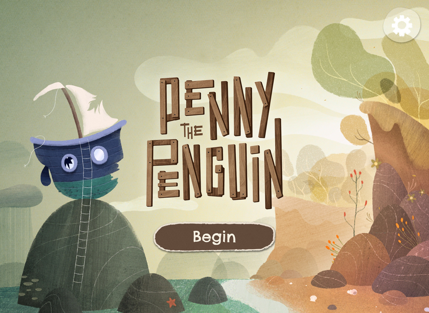
Penny the Penguin
It’s never too early to learn valuable lessons about the important things in life… We were approached by Colenso BBDO Auckland to work with them in creating an app for BNZ that would help teach financial literacy to kids between the ages of 4 and 5.
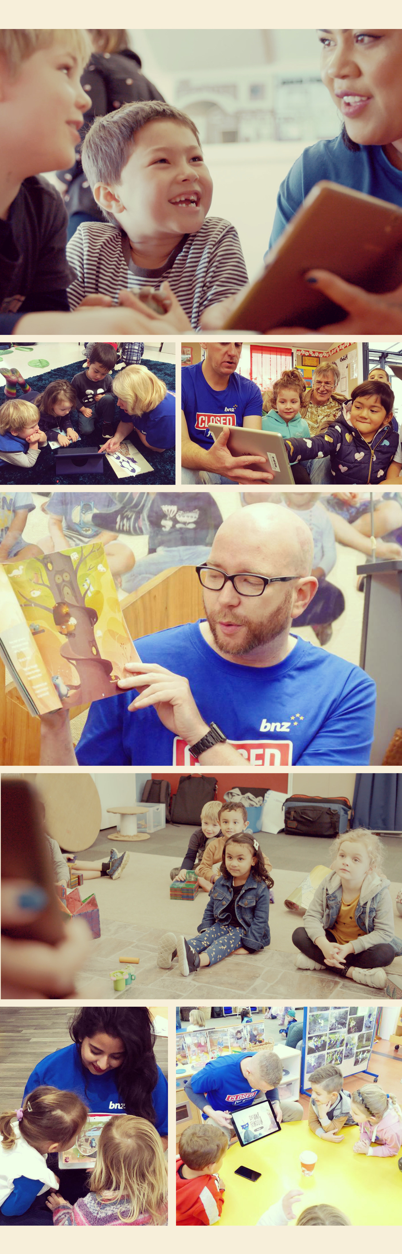
Every year, BNZ close their doors for a day to go out into the community and help out where needed, and as a part of this year’s campaign, they were visiting early learning centres and preschools to teach kids the difference between “needs” and “wants”.
As a part of that initiative, we were tasked with creating an experience that had a simple story behind it, but would teach kids the difference between things they wanted and things they needed.

Needs vs Wants
Working closely with Colenso, we designed a world in which Penny (a seasoned ocean explorer) was caught in a storm which badly damaged her ship, “The Blue Whale”. She found herself shipwrecked off the shores of a strange and mysterious island, located somewhere off the coast of New Zealand.
Penny made a list of the things she needs to repair her boat, and sets off to explore the island - meeting a bunch of quirky characters along the way whom she trades with for the items she needs!
The experience is designed to be something that allows children to play and explore with a very simple set of tasks laid out for them. Rather than simply telling the user which item they must select, the experience allows the child to pick what they think is right - try it out - and see where the results of choices takes them. A very tangible way of understanding the principles we set out to communicate.
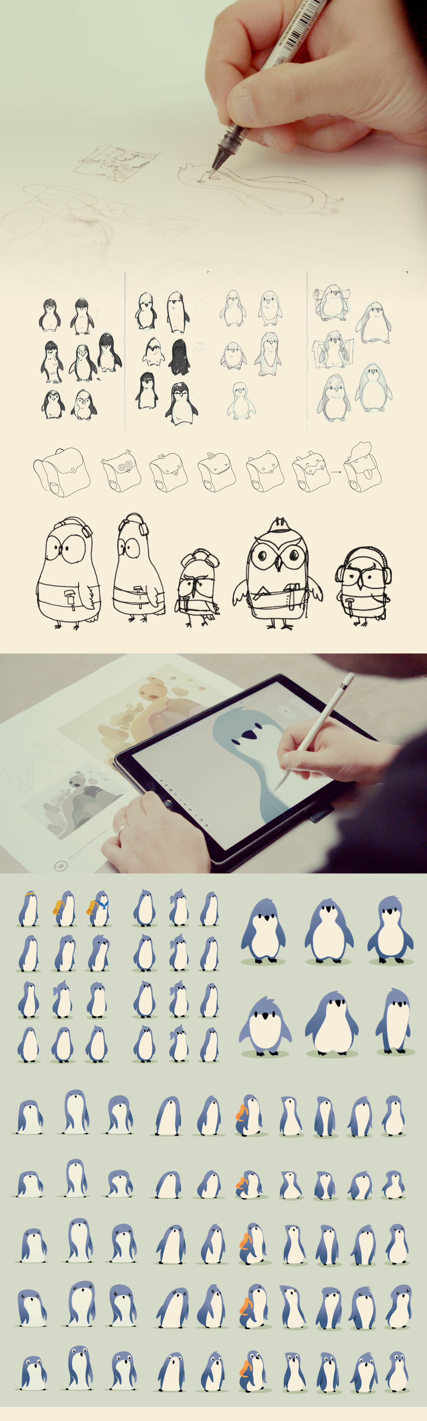
Penny
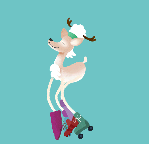
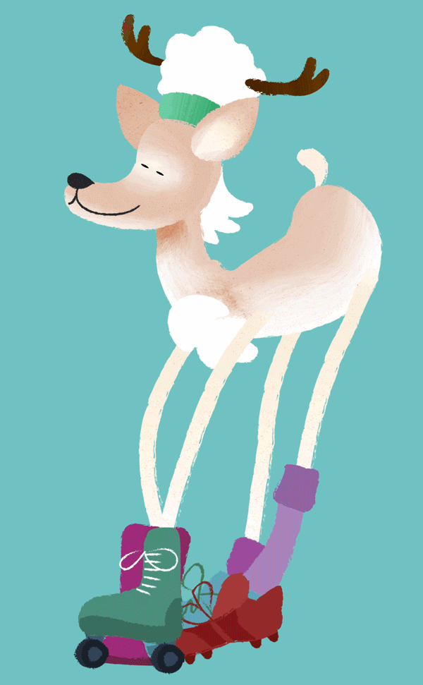
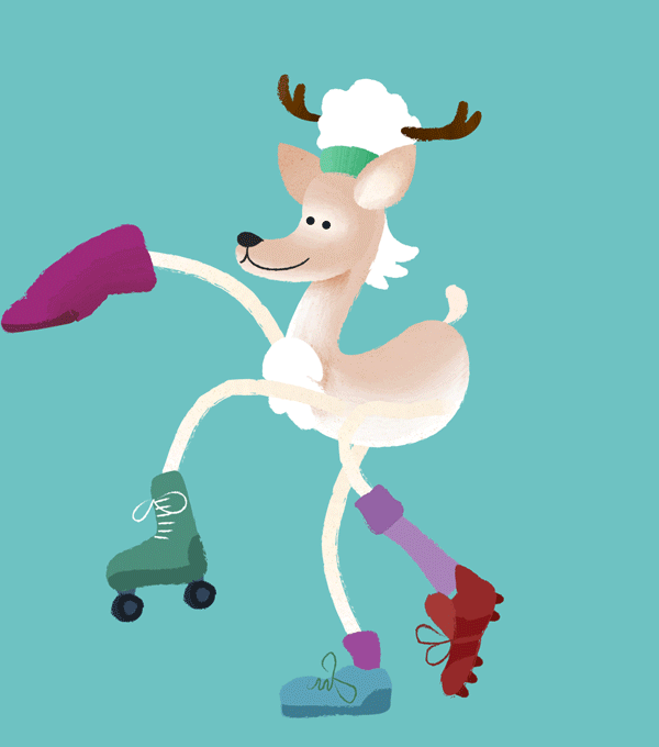
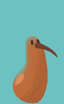
In designing Penny, we wanted to create a character who felt cute, but confident, brave and perhaps a little bit naive, but ultimately very sure of herself. As she journeyed through the world with the user, we wanted her to feel independent enough that she never felt afraid - but vulnerable enough that the user would want to help her out.
We explored a number of different silhouettes for Penny, looking for a balance between an adorable blue penguin shape and a character that’s agile enough to walk and jump (or at least hop) around a bit.
Apart from her shape and colour, we looked into small accessories that would help to explain her character. We gave her an orange backpack which would compliment her grey-blue skin and subtly allude to her explorer, curious personality. It’s also very practical to store the stars she intends to swap for the items she needs.
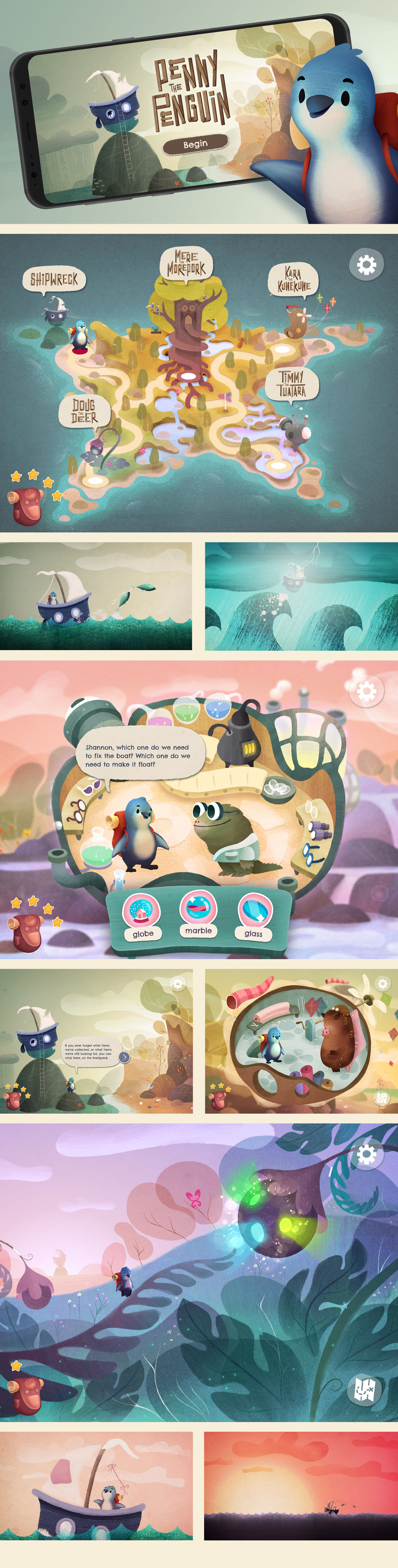
The Island
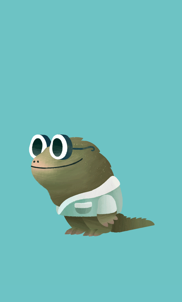
Since Penny was going to be shipwrecked onto a mysterious island, the concept team had a huge design space to play with in creating who, and what, was in the world. The more imaginative and interesting the better!
We started with working out the items that Penny would need to fix her boat. These had to be somewhat logical so that users could understand what Penny needed to do.
Once we had established that list, we looked at how much we could push the idea of where Penny could find those items and who she might be trading with. We wanted these places to be concepts that kids would find fun and interesting, rather than what would be most rational.
As examples:
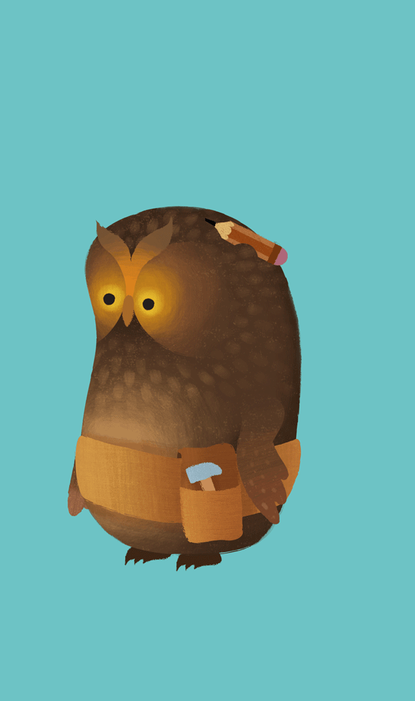
Instead of just finding a piece of wood on the ground, Penny would need to visit Mere the Morepork to get the planks she needs. Mere is a wise old owl who loves crafting beautiful handmade wooden toys in her tree-house workshop.
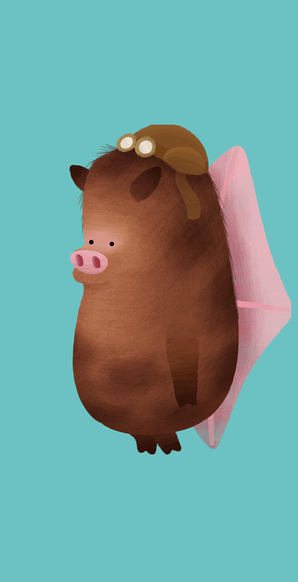
To fix the sail, Penny would need to get fabric from someone. In the game, Penny visits Kara the KuneKune to get what she needs. Kara is an amazing kite designer and infatuated with flying. She’s inventing a way of launching herself into the skies to disprove the theory that pigs can’t fly!
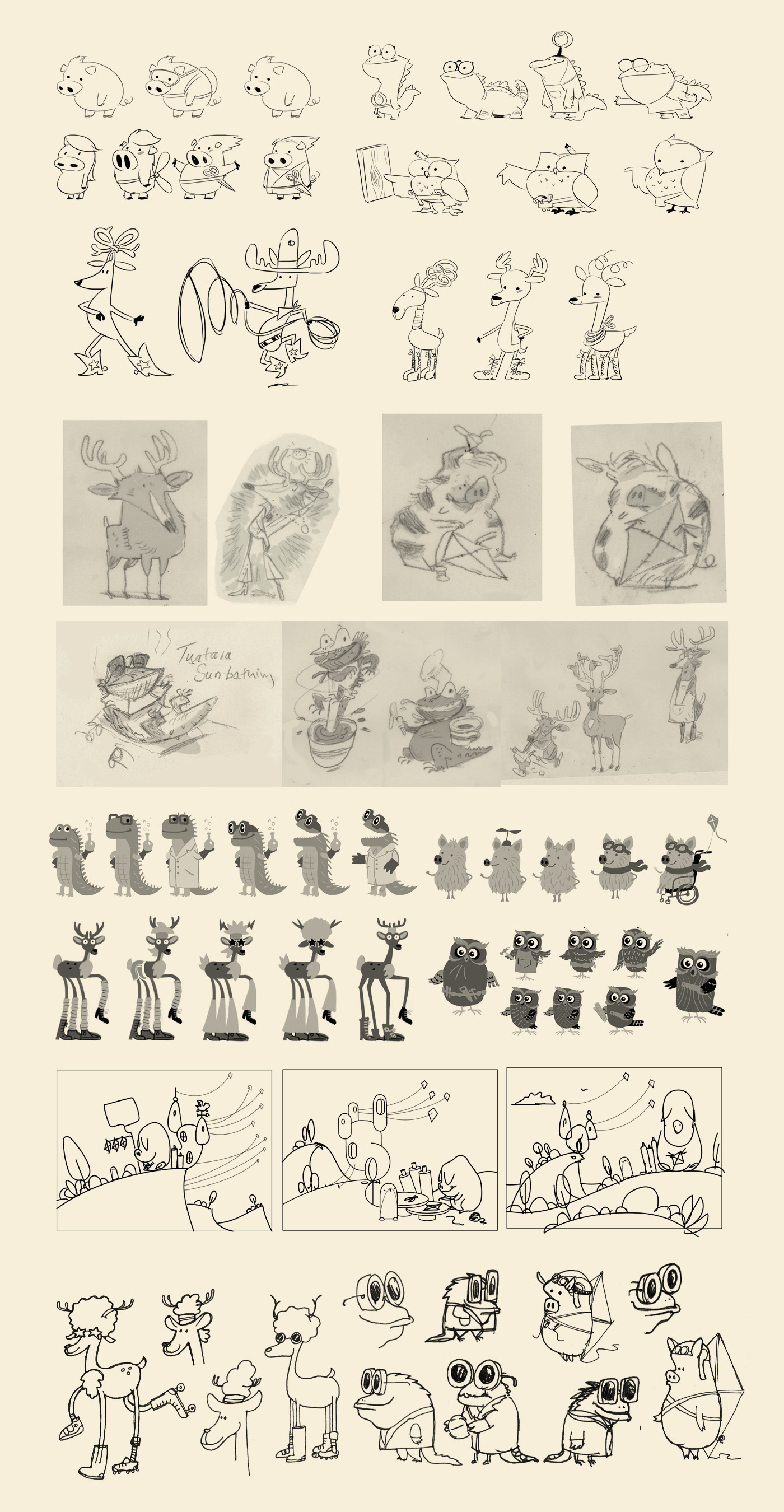
We’re fortunate enough to have a number of highly creative people in our team - so instead of leaving the concept designs to one or two individuals, we asked 5x different artists to each explore different ideas about who these characters are and what the world might look like.
Each person gave us their own unique take... and from the huge body of work that came out of that process, we were able to cherry pick the concepts that we thought worked the best and form a very quirky, unique world.
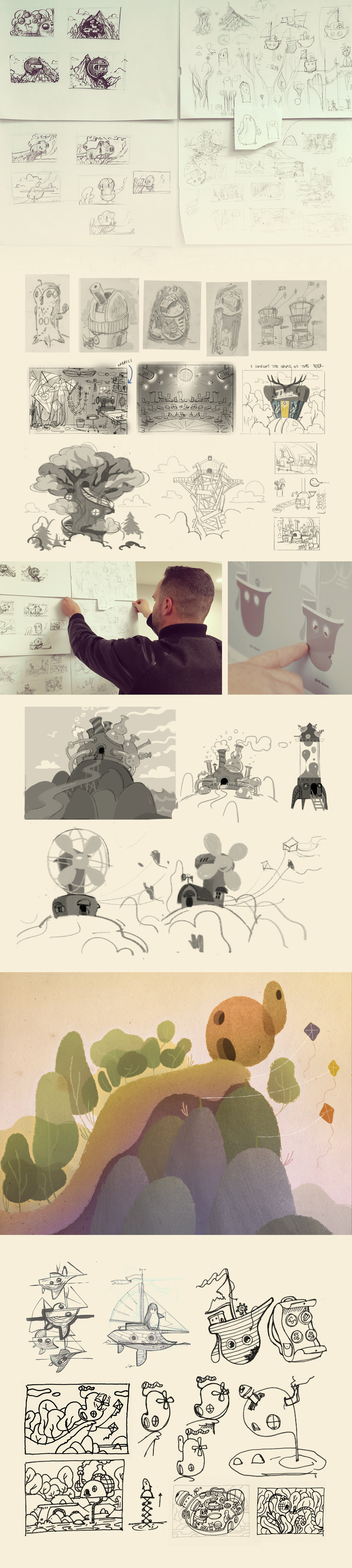
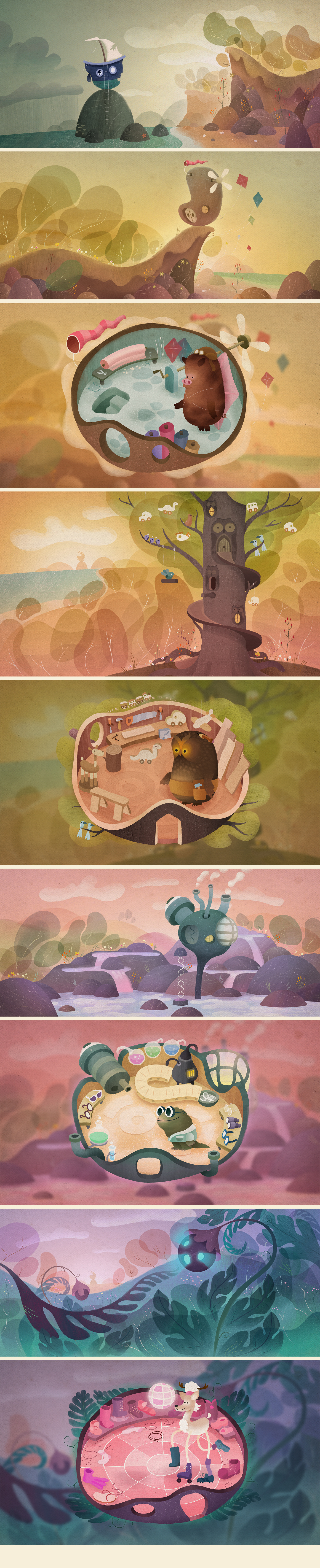
A deliberate design decision at the start of the project was to create large open scenes that invited the user to pour over and explore. Throughout the experience, users can discover little interactive moments in each location, which injects a little extra surprise and delight along the journey...
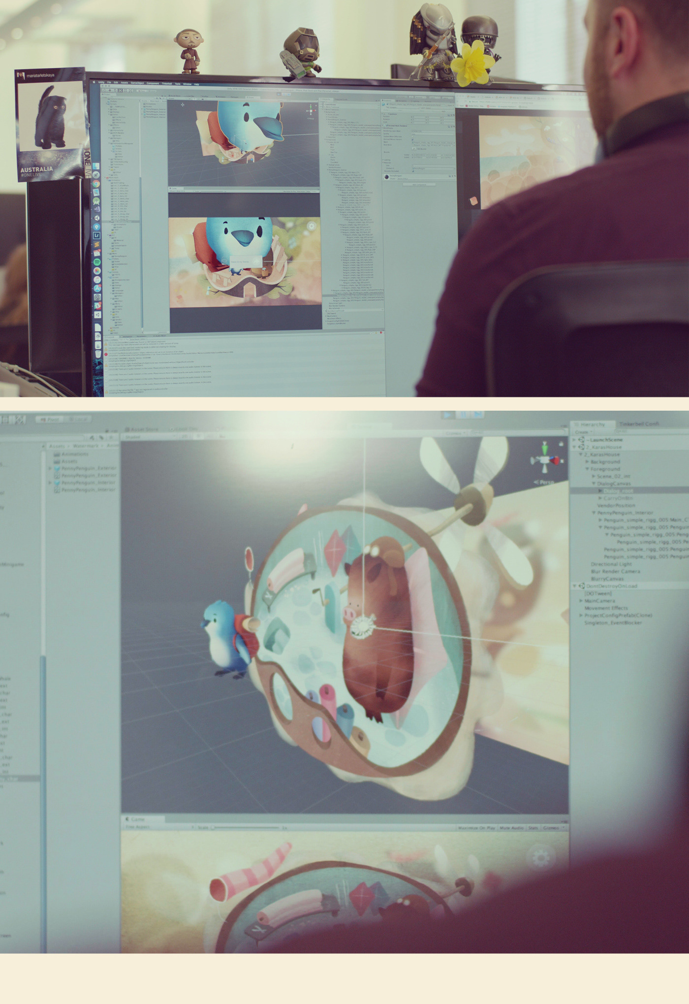
Development
As with any interactive experience, ensuring that everything is working under the hood is just as important as the content on the front end. Working with the Roam Creative team, we were able to really explore a range of interesting rendering shaders and item management systems that was useful for this and future projects. The Roam team have built an amazing set of tools for us to use in Unity3D to refine and smoothen the creative pipeline - which simply buys us the resource to put more love into the craft!
UX/UI
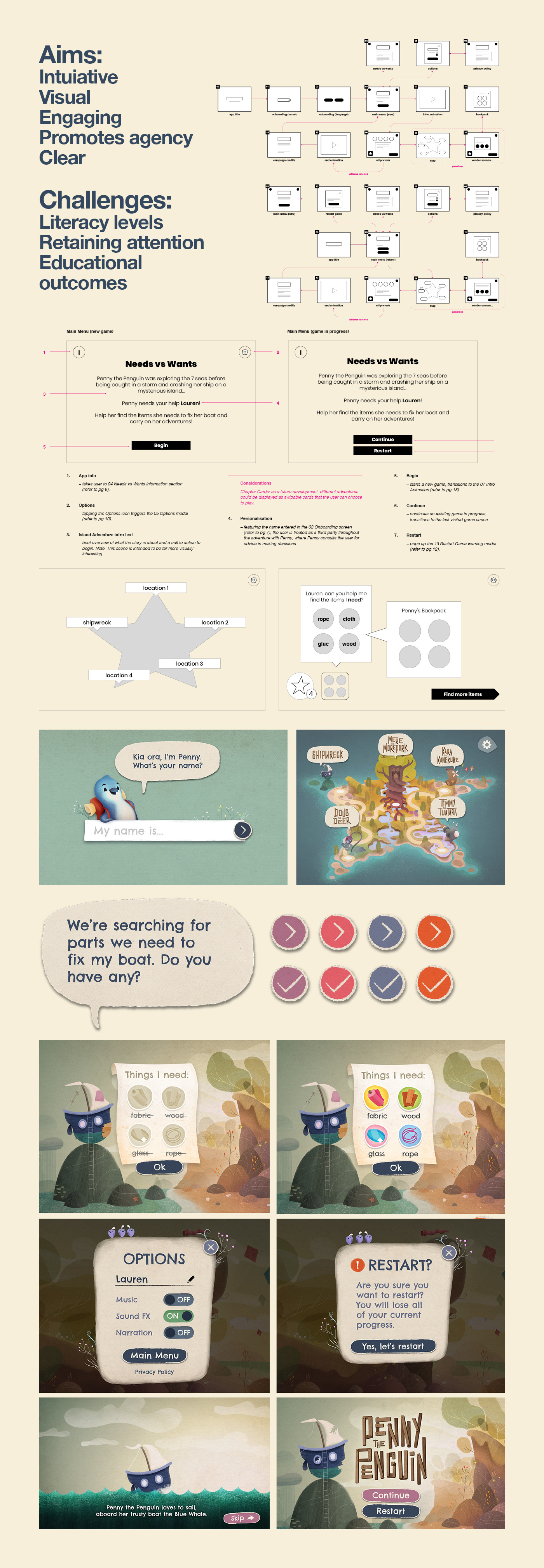
Unlike a linear interactive storybook, Penny the Penguin required users to make decisions about where they wanted to go, and what they needed to do. This required careful planning in designing the UX and consequently the UI to feel as intuitive as possible for a younger user.
In some cases, the user might not be at a literacy level where they can read the text or labels, so creating a very visual interface is important to ensure everyone can enjoy the story without feeling lost, stuck or confused. In addition to children being able to use the app independently, we needed to consider situations where a parent / adult might be reading the story to the child or perhaps to a group of kids (as was the case in the BNZ ‘Closed for Good’ event).
The UI design direction needed to also balance legibility with looking complementary to the visual aesthetic of the world. Younger readers sometimes find it difficult to read fonts that have ‘artistically designed glyphs’ so it was important to ensure that the design approach was practical and functional in addition to being a beautiful GUI to the experience.
Thanks
We’d like to give a special thanks to the Colenso team for bringing us onboard and making the journey of making Penny an absolute blast! It’s always a pleasure to work with such talented people. We'd also like to thank everyone who worked on the project and poured so much love into it - we’re all very proud of the final result.

Credits
Creative Direction
Kim Ragan (Colenso BBDO)
Maria Devereux (Colenso BBDO)
David Way (Watermark Creative)
Art Direction
David Way (Watermark Creative)
Simon Shaw (Watermark Creative)
Simon Stuart (Colenso BBDO)
Script / Story
Holly Sutton-Williams (Colenso BBDO)
Production
Elle Kiddie (Colenso BBDO)
Helen Darwin (Colenso BBDO)
David Way (Watermark Creative)
Artwork
David Way (Watermark Creative)Simon Shaw (Watermark Creative)
Nicholas Harris (Watermark Creative)
Anton Petrov (Watermark Creative)
Daron Parton (Watermark Creative)
Dave Follett (Watermark Creative)
Daron Parton (Watermark Creative)
Dave Follett (Watermark Creative)
Animation
Mauricio Bartok
Shannon Jahnel Lanktree (Watermark Creative)
David Way (Watermark Creative)
UI / UX Design
Bettina Way (Be Creative)
David Way (Watermark Creative)
Interactive Design
Nicholas Harris (Watermark Creative)
Shannon Jahnel Lanktree (Watermark Creative)
David Way (Watermark Creative)
Development
Josh van den Heever (Roam Creative)
Nicholas Harris (Watermark Creative)
Nicholas Harris (Watermark Creative)
Music & Audio Design
Shane Taipari (Franklin Road)