
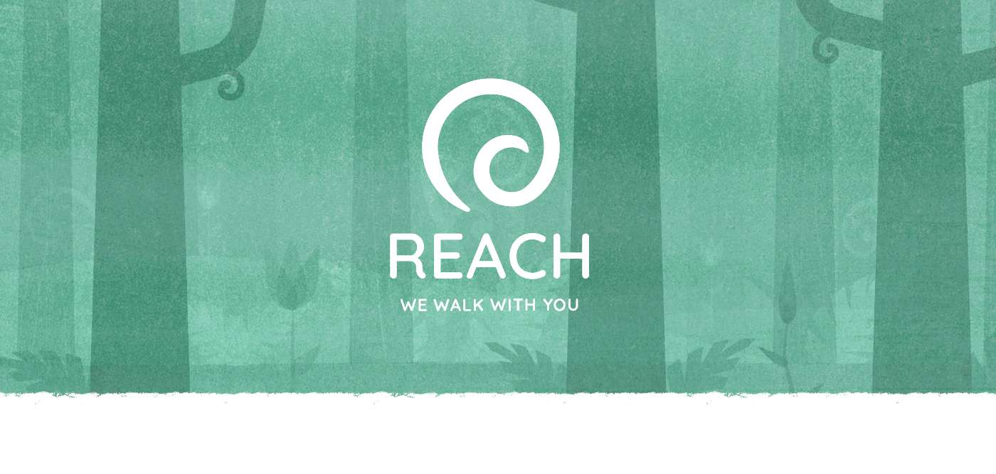
Watermark was approached by Catstone to work with them and Black Sheep in creating a new brand rollout for the New Zealand REACH programme.
The project would include developing a new identity, website, updated supporting collateral and an animation that would help convey the idea of what REACH is.
REACH is a programme which aims to help people who are finding it difficult to re-enter the workforce after having been on an injury or sickness benefit. It collaborates with Work & Income New Zealand and the Waikato District Health Board to coach and heal clients over a 12 week period, with the intention of not just helping them find a job placement, but to first address other areas of their lives that could have barriers for them developing to their full potential.
Apart from being a very interesting and fun project to work on, the knowledge that the work we create could possibly help someone was a massive motivation as well.


In working with the Catstone team in designing the REACH world, several important considerations arose from early discussions. The world needed to be a recognisable environment (not too fantastical or abstracted), but stylised in a way that would encourage its reading to be metaphorical rather than too literal.
Since we were exploring sensitive issues and topics, we wanted to create a world in which our characters felt inclusive of all different types of people, and that viewers would find aspects of the story they could relate to, without needing to see themselves represented directly.
Rather than recreate the real world we know into the animation, we created one that is familiar, however the characters are less representational. In this world, problems are solved in unique and engaging ways, allowing people to draw parallels between their own situations and those reflected in the narrative. This also placed us in a position to utilise a more illustrative approach to convey complex thoughts and ideas through visual metaphors and parables.
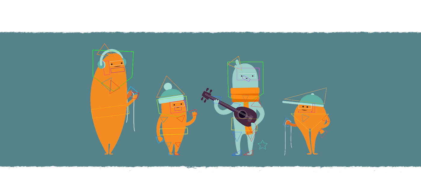
Our initial drawings led us to design simplified character forms that felt endearing and relatable, without being caricatures or too comical.
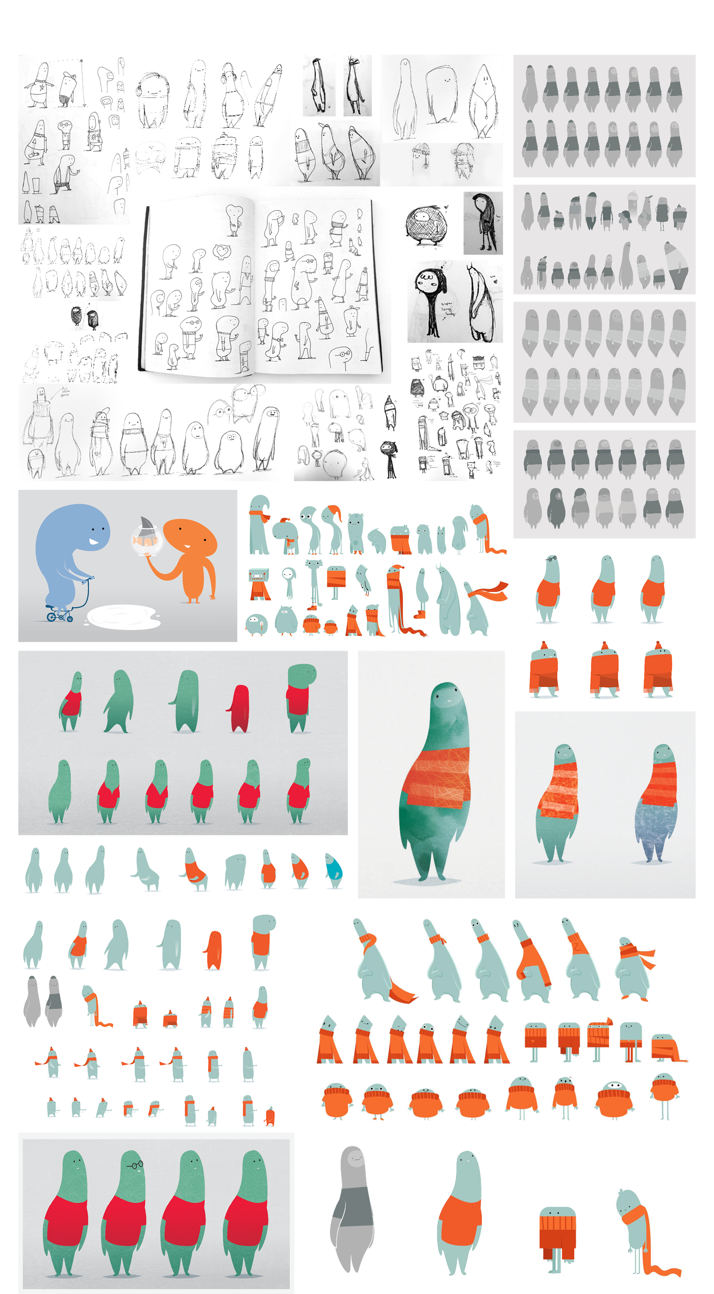

Building on the initial character concepts, we worked with the Catstone team to refine the character designs to fit the sort of messaging the project was aiming to convey.
The process involved a reduction from the large body of drawings to a small, filtered selection of characters which we felt were a good platform to build from. At that point, we began exploring different variations and expressions with the intention of making sure we felt we had fully exhausted as many of the design possibilities as we could.
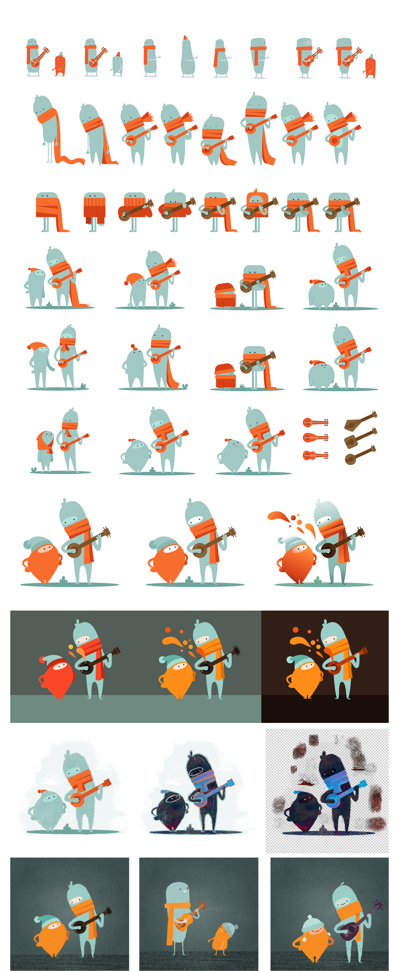

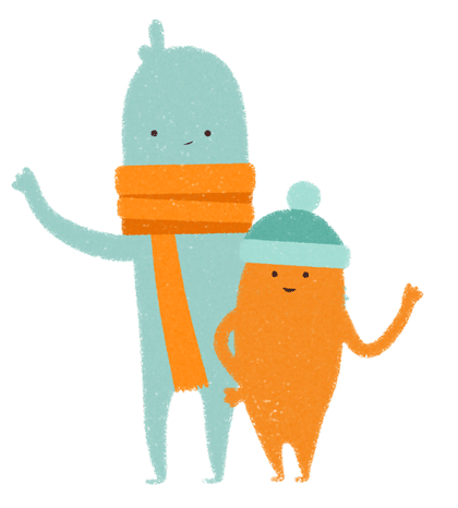
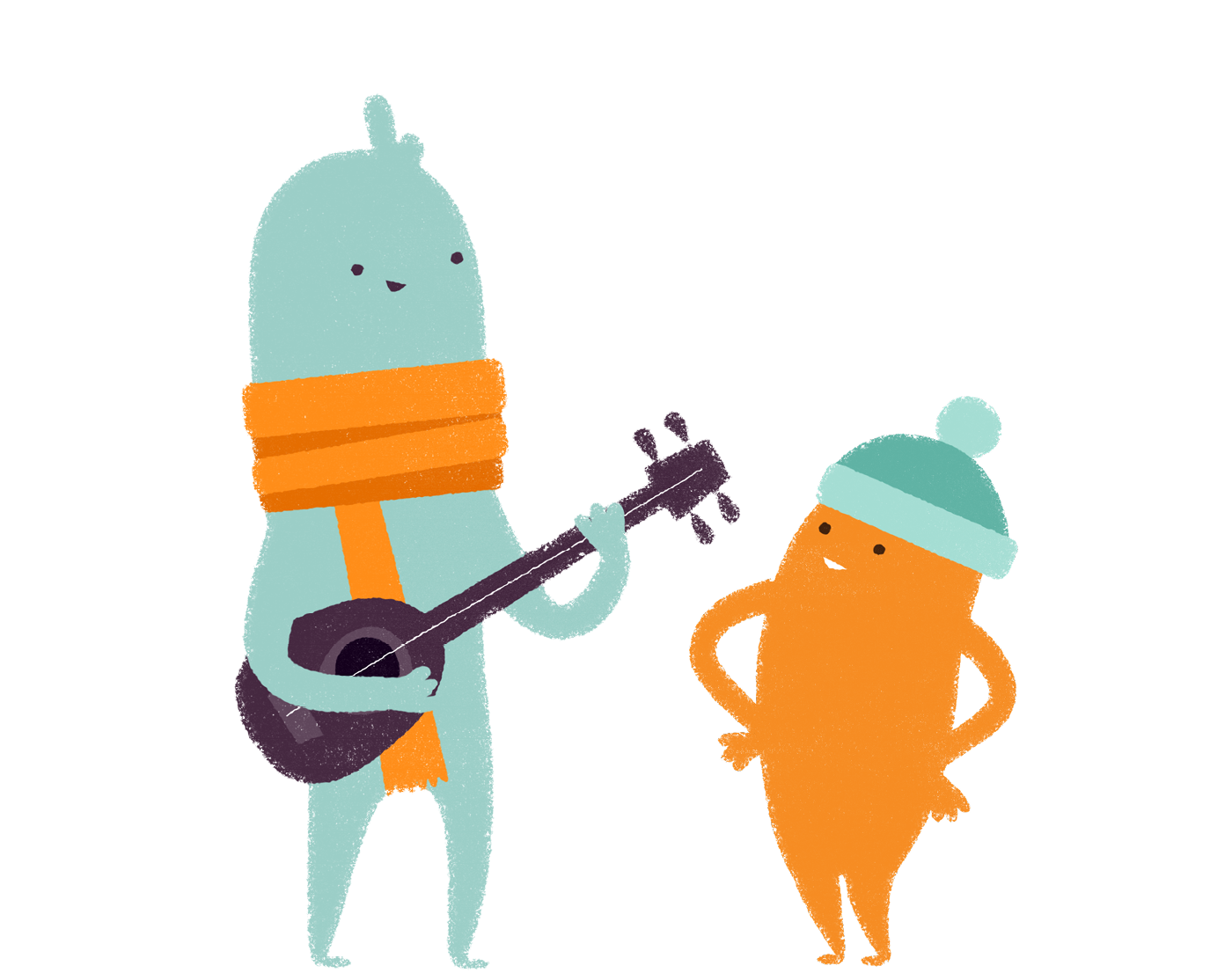
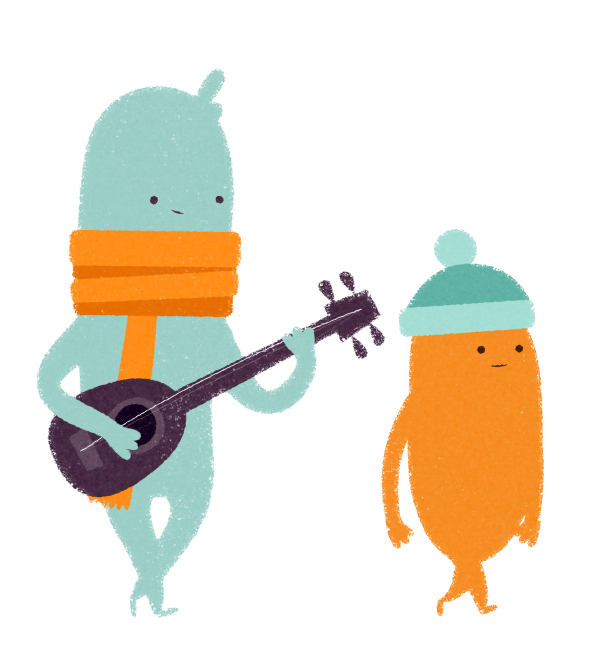
We avoided the ‘REACH character’ (Pai) being taller than our hero character (Folm). We didn’t want Pai to come across as an authoritarian figure, nor did we want Folm to appear to be weaker or inferior. Although both are stylised characters, including a hat and scarf into their designs allows them to be a little more relatable as ‘people’. All the characters that are a part of the REACH programme in the story are ‘REACH orange’ and are complemented by the other blue characters they’re trying to help.

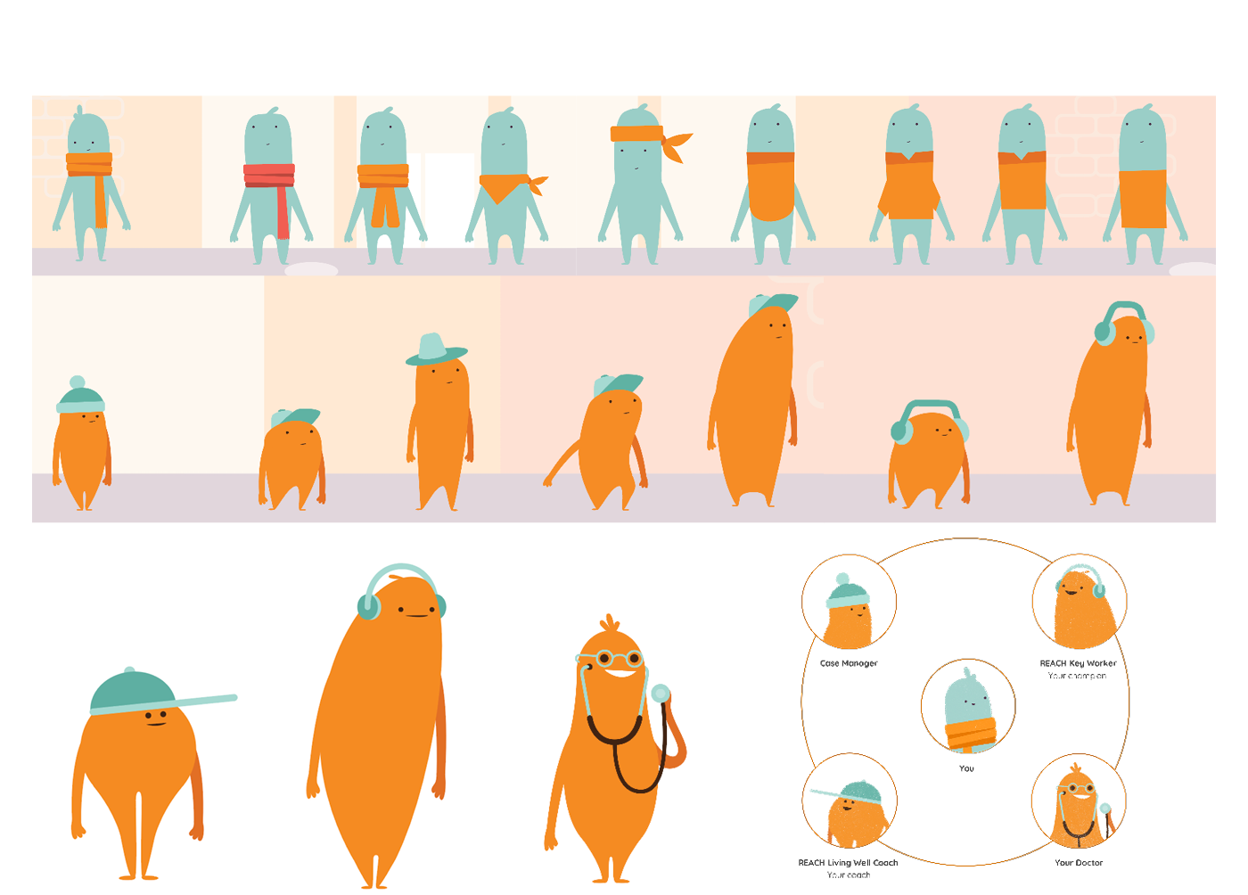
Once we had arrived at our final character designs, we extended the visual language to create other inhabitants of the world. As our protagonists journey across the landscape, they are introduced to helpful REACH characters - who all follow similar design principles, but are unique in their own subtle ways, implying the idea that everyone is different.

Integral to the story is the backdrop behind Folm and Pai as they navigate through the world. We wanted the world to feel stylised and interesting, but hint at a few familiar New Zealand-esque cues to bring it back home. As Folm grows, he is able to see through the dreary haze around him, appreciates the richness in life’s little details that surround us.
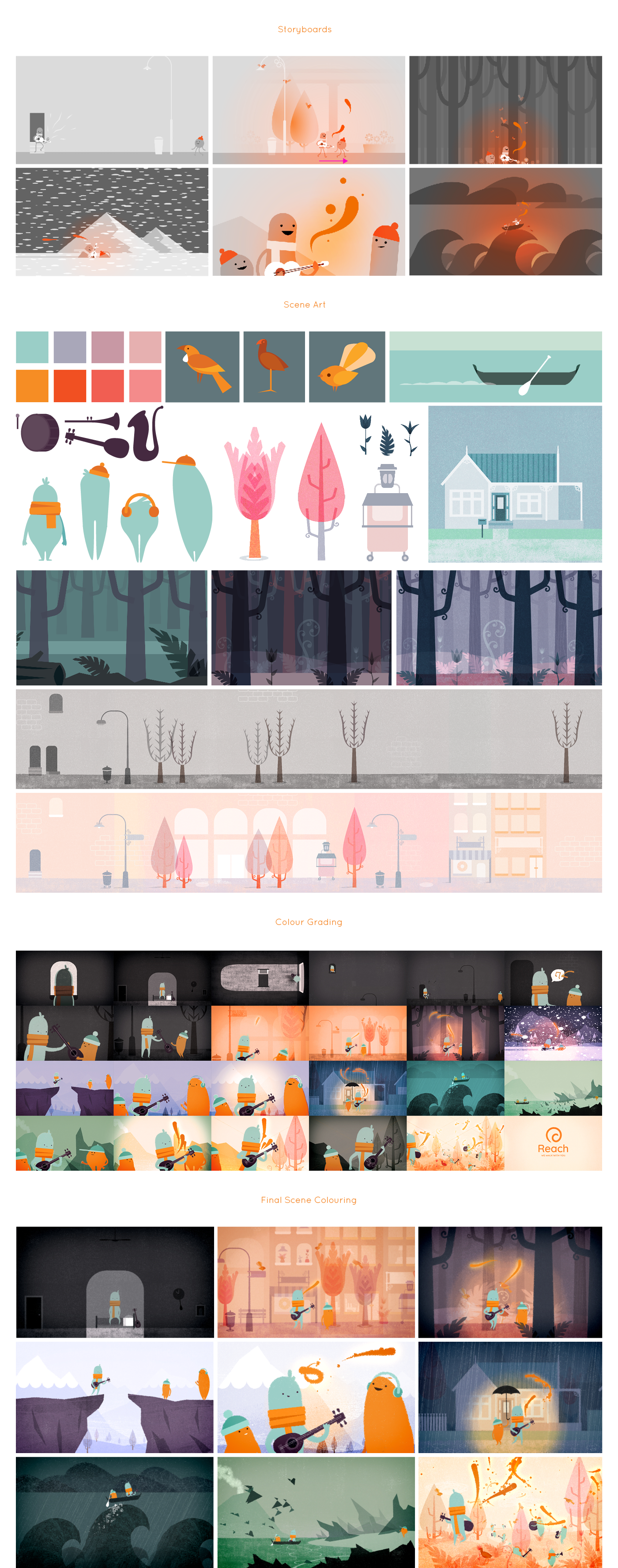

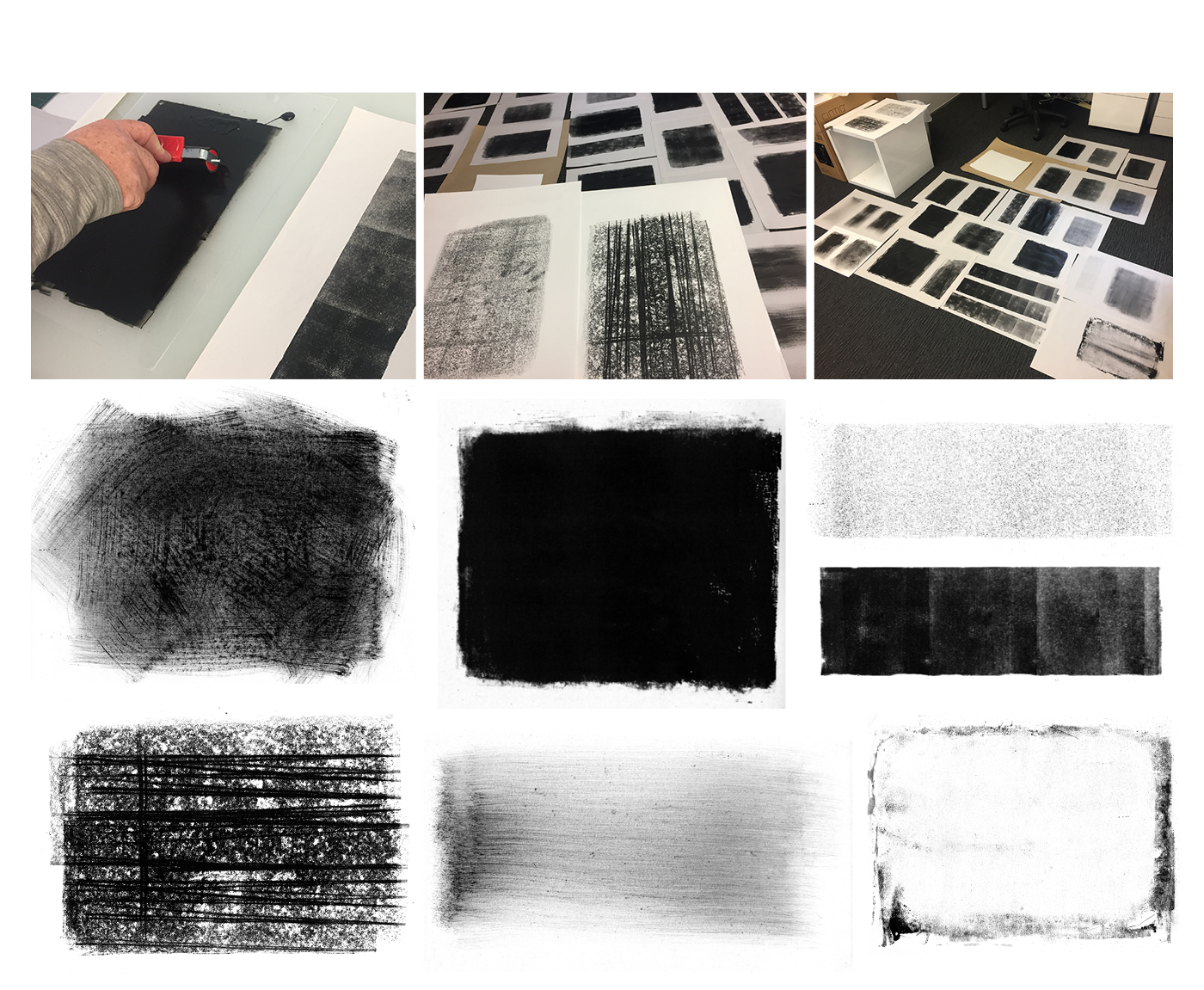
Since we were telling a story about characters who weren’t perfect and in constant change, we needed the animation treatment to convey a sense of imperfection and a hand-made ‘human-touch’ as well.
The purity of an actual hand painted cell animation was out of scope for this project, so we explored methods of bringing texture and visual distress to the artwork via digital tools like After Effects, Photoshop and Painter.
The artwork for each character was set up and animated via a 2D animation rig. For this project we used a combination of After Effects’ puppet tool and the PuppetTools plugin with custom null shapes to create the rigs.
As a part of the design phase, the animation team explored possible tools and techniques that might create a ‘print-process’ aesthetic to the piece. With the raw illustrative approach, we looked at using drawn masks and animated linework to reveal details in the animation as Folm played his music.
To give us the most flexibility with the artwork, the characters were brought into After Effects as layered Illustrator files and passed through several processes of texturing to roughen up the ‘cleanliness’ of the vector artwork.
One of the highlights was actually getting inks and print tools out to make real textures we could use for the animation. Nothing beats actual hand printed textures so we spent a day creating hundreds of different patterns and images.

Music played an integral part of Folm’s story and as such, the sound design in the animation needed to complement the visual design and vice versa. We worked closely with David Liversidge from Radiate Sound to establish the tone and pace of the story and how that might be expressed through the sound. David recorded a palette of interesting musical instruments (including the bizarre and fascinating ‘Seagull’) which he used to develop the underlying audio bed - a strangely familiar melody and intriguingly unique.

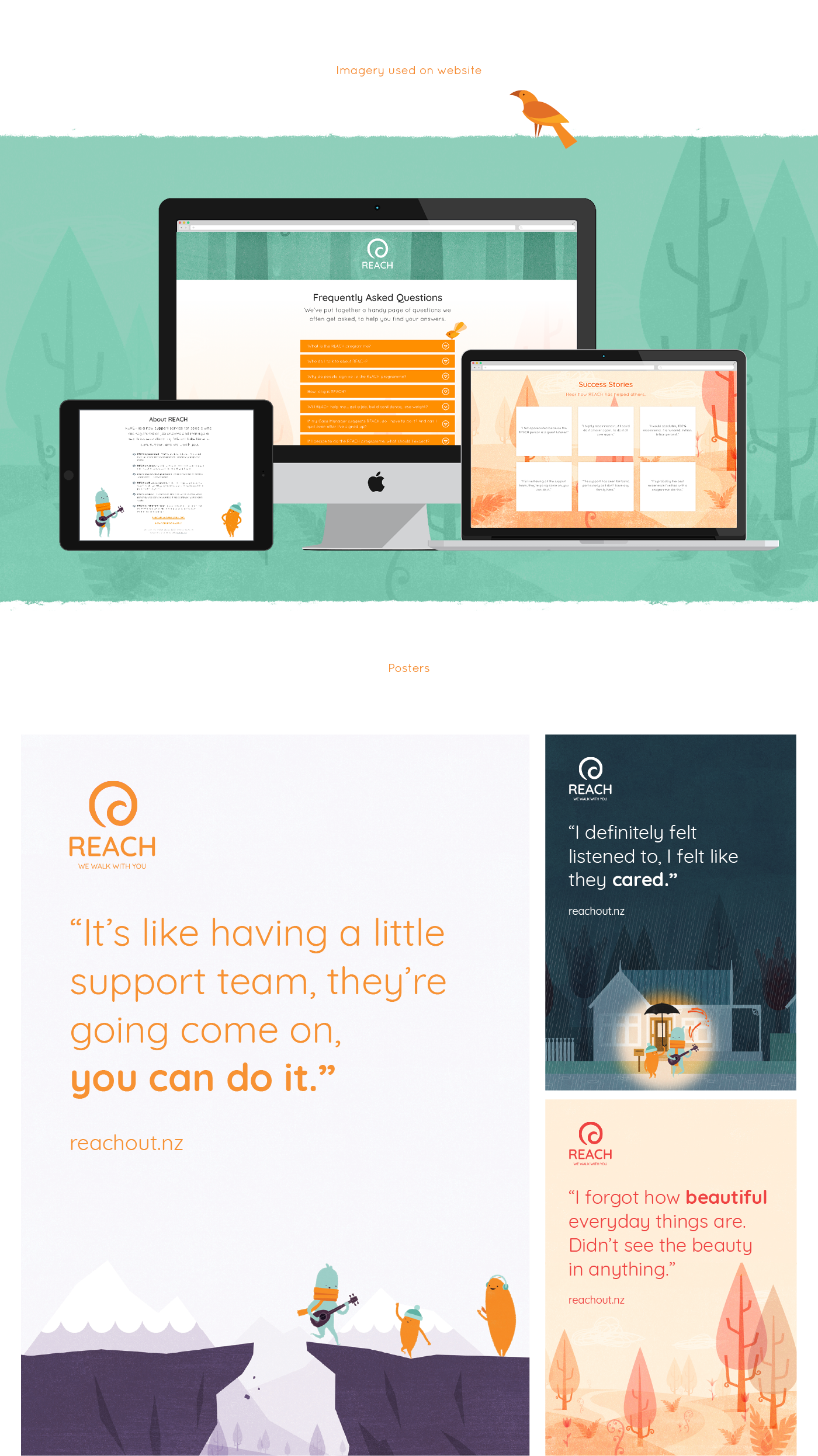
Central to the development of the new REACH rollout was a new identity and website (thanks to the Catstone and Black sheep crew!). Working with the designers at Black Sheep, Watermark provided artwork (from scenes within the animation) to be used as visual accents in the website and supporting collateral designs.


One of the most enjoyable and fun projects we’ve had the pleasure of working on - huge thanks to all the people involved!
Catstone
Steve
Strategic Lead
Jo
Team lead and SME
Tui
Project lead and SME
Watermark
Dave
Creative Direction, Illustration, Animation
Shannon
Illustration, Animation
Simon
Illustration
Black Sheep
Keinen
Project Manager
Hayden
Branding, Website & Collateral Design
Kelly
Branding, Webstie & Collateral Design
Radiate Sound
David
Musician, Sound Designer
Musician, Sound Designer